Archive for 2016

Games Interactive: World’s Most Ornery Crossword
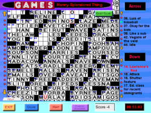
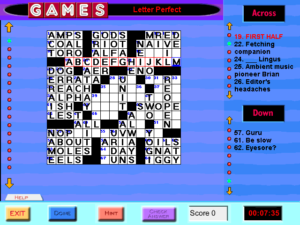
gi-wmocGames Interactive seems to have only one World’s Most Ornery Crossword. I suppose that’s fitting. The magazine only ever carried one per issue, as a sort of capstone to the “Pencilwise” section. If they had published more than one at a time, it would cast doubt on the “World’s Most” claim. Things are no different here.

There are two distinguishing things about World’s Most Orneries. First, there’s the size. The grid is 25×25, which is larger even than the Sunday puzzle in the New York Times. The makers of Games Interactive decided not to fit this all onto the screen at once, instead making it scroll vertically, even though they really didn’t need to. Even under the constraints of the game — running at 640×480 resolution, with a 43-pixel header and a 50-pixel footer — there’s room enough for 25 rows of 15-pixel squares, which is large enough to hold the font used for the clues, along with a black line separating rows and a two-pixel margin. As it is, we instead have 19-pixel squares. 25 rows of 19 pixels takes 475 pixels. So perhaps 19 pixels was chosen because it’s the largest size that they could use and still fit an entire World’s Most Ornery Crossword on a 640×480 screen. If so, it’s too bad they messed it up by using up vertical space with headers and footers.

Selecting a word, whether with keyboard or mouse, automatically scrolls the grid to make the entirety of that word visible. This is fortunate, because the scrollbar is unreliable. Navigating between words with the arrow keys is also broken: trying to move up or down instead moves the cursor a bunch of spaces left or right. I haven’t probed this deeply, but I’m guessing that the navigation code is assuming a 15×15 grid, the size of all the easy crosswords in the collection.

The other distinguishing feature of the WMOC is that it has two sets of clues: the Hard Clues and the Easy Clues. In the magazine, the Easy clues were printed on half of an adjacent page, with the intent that you’d use the Hard clues by default and could switch to Easy by folding the page over. Resorting to Easy always felt a little like cheating, but it was at least a relatively honorable form of cheating. In Games Interactive, there’s a button for switching to Easy, but, interestingly, it only affects the currently-selected word, minimizing the cheat factor.

There’s another cheat mechanism shared by all the crosswords in the game: the Hint button, one of the few ways that the puzzles in this game benefit from being computerized. Pressing this button deducts a point from your score and reveals a random letter in the current selected word, possibly a letter you’ve already filled in correctly. I’ve resorted to requesting hints on a few occasions when the puzzles expected me to know the names of athletes or musicians, but it’s not clear to me if it hurts your score less than just getting a letter wrong. Anyway, even though Easy is cheaty, and the game treats it as such, it doesn’t consider it to be the same sort of cheaty as Hints. Easy doesn’t affect your score at all. The only motivation you have for not dropping down to Easy is your own sense of honor — which is the case for a lot of computer games, come to think of it.

Games Interactive: Crosswords

gi-crosswordI guess it’s time to move on to the Crosswords section. Actually, I’ve done a fair number of them already. I wanted to get a jump on them simply because it’s by far the most numerous section, and also I find they make a good palate cleanser between other puzzles. They’re so reassuringly easy! Games Magazine gives its puzzles a difficulty rating from 1 to 3 stars, and the puzzle selection menu in Games Interactive displays these ratings. All the puzzles in the Crosswords section, without exception, are rated at 1 star.

“But not all of the crosswords in Games are easy!” you may be saying. “Some of them are even World’s Most Ornery!” Those are off in the Special Crosswords section, along with the Cryptics. We’ll get to that. Keeping the easy crosswords separate from the hard ones is a good idea if you think your players are going to let the game select them at random, because a one-star ordinary crossword and a Cryptic are certainly not adequate substitutes for each other. But then, as I’ve said, I don’t think the randomization feature in this game is at all useful.

The crossword UI here is less annoying than I remember. When I first played it, it was weirdly slow to respond to input. I had seen web-based crosswords written in Javascript that were more responsive, and I didn’t really understand what it could be doing that was more wasteful of resources than running in circa-2000 Javascript. After a general system upgrade failed to make it noticeably better, I concluded that it must actually have some kind of deliberate built-in delays. But it runs so much better on a machine built approximately 15 years later that I guess it really was just wasteful code after all.

The UI is actually mostly pretty reasonable. At any moment, there is a cursor at one square in the grid, and an entire word space highlighted, along with its clue. You can navigate arbitrarily by clicking on either the clues or the grid, but I don’t like doing that. Because interacting with a crossword consists mainly of typing in words, I want to keep both my hands on the keyboard most of the time. And it lets me do that. Pressing enter moves to the next clue, cycling from the last Across to the first Down and vice versa. In the easy puzzles, I can fill in most of the grid on a single pass through the full clue list, so navigating this way is optimal. The harder ones are another matter. There, I want to go straight from filling in a word to considering the clues that cross it. You can move the cursor around arbitrarily with the arrow keys, but there’s one problem: when you do that, it automatically switches you to an Across clue. You can switch to Down by clicking the current square with the mouse, but as far as I can tell, there’s no way to do it from the keyboard. I haven’t looked at other computer crossword interfaces in a long time, but I’m guessing that by now there’s a semi-standardized hotkey for that, known to all enthusiasts.

There’s also a bit of a problem with erasure, because it uses the Backspace key for that. Backspace normally deletes the letter before the cursor, but if it applied that rule consistently, you wouldn’t be able to delete the last letter in a word. So it applies it inconsistently instead. I think what I’d really like to do is use the space bar to erase the current square and advance the cursor as normal. That is, I want it to act like a text editor in overwrite mode. As it is, the space bar moves the cursor forward without changing anything — which is the same thing that all unrecognized keys do.

Games Interactive: The Rest of Logic

Paint By Numbers must have been good training for Battleships, either in solving technique, or in attaining the right mindset, or simply in finding patience. Whatever the reason, I’ve managed to power my way through the rest of them.

Not that I got them all right. Oh, I had a good run of solutions that were recognized as perfect, but then suddenly it judged a couple in the last set as massively wrong. I’m not sure what to think about this. I said before that some puzzles were ambiguous, but I’m no longer convinced this is really true — it could just be that I failed to spot my own mistakes. Certainly my lengthy run of correctness suggests a lack of ambiguity in the puzzles, and in the ones I got correct, I often spotted and corrected inconsistencies just before submitting. On the other hand, there are enough outright mistakes in the game as a whole that it’s very easy to lose faith in its correctness. One of the trivia questions references a picture that isn’t included, at least one of the crosswords has a word that extends into a black square, at least one of the word puzzles under Special Crosswords contains typos in its word list that make it literally impossible to solve completely, and so on. Things that you’d expect QA to catch. But I suppose I’d trust the game about the Battleships more if I had a better idea of what it thought was wrong in my solutions. When you submit a Battleships solution, the game displays corrections highlighted in pink, but the corrections cover up what the grid was like before the corrections were applied.

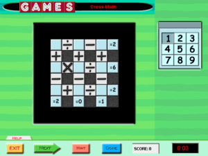
gi-crossmathBattleships done, I finished going through the rest of the Logic section (apart from Paint By Numbers). The only repeated puzzle type I haven’t mentioned yet is “Cross Math”, which is sort of like a generalization of magic squares. You put the digits from 1 to 9 into a grid, but instead of each row and column having the same sum, each row and column must satisfy a unique equation. I find that these puzzles are best approached mainly through trial and error, aided by a certain amount of deductive reasoning to limit the number of possibilities, like “The first operation in this row is division, so either the first number is composite or the second number is 1”.

Then there are some one-offs, most of which aren’t really logic puzzles. Like, there’s one about matching dance step diagrams to their names, which seems like it belongs in the Trivia section to me. I was so dissatisfied with my score on this one that I retried it until I did it perfectly, and discovered that even perfection was rated as only 20% (or 50% with the time bonus). Presumably the wrong maximum score was entered for that puzzle. Just another of those little mistakes that make me lose faith in the thing.

Another of the puzzles belonged better under the Visual category. It shows a picture of a complex arrangement of gears, and asks which direction you have to turn a handle at one end of the whole chain to make the gear at the other end turn clockwise. The arrangement is three-dimensional, with gears at different angles, and the picture is so low-resolution that I was never quite sure what was going on in the joints where a shaft met another shaft at an angle. Nonetheless, I managed to get the right answer, if only because even a completely random guess comes out right half the time when there are only two possibilities.

There’s only one one-off puzzle in the Logic section that I’d call a proper logic puzzle, and it’s one of those ones where you have to figure out attributes of a group of objects on the basis of clues. Specifically, this one was themed around a television schedule, and had clues like “The shows that air at 8:00 on Tuesday through Friday have first letters that are alphabetically consecutive” and “The three shows with colors in their names all air on the same day”. This is a type of puzzle that’s only made less convenient by computerization. Solving it takes pencil and paper. The in-game grid of time slots doesn’t help particularly.

On my first attempt at this puzzle, I really thought I had run into ambiguity again. I had a partial solution that seemed to satisfy all of the clues, so any way of filling in the rest of the shows had to be valid. So I entered a solution, received a low score, and concluded that there must be a clue missing. Only the next morning did I think that I might have gotten a clue wrong, by thinking in terms of what’s showing at 10:00 when the clue was actually about what starts at 10:00. (Some of the shows are two hours long, so airing at 10:00 and starting at 10:00 are not the same thing.) And sure enough, paying attention to the exact wording revealed exactly that, and with that additional information I was able to solve the puzzle. So the mistake was mine, but on the other hand, it was way too easy to believe that the game had left out crucial information.

Games Interactive: Paint By Numbers

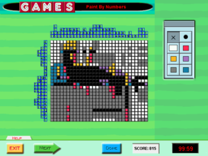
gi-paintI’ve been sampling various puzzle types, but wound up spending most of my time on Paint By Numbers. This is Games Magazine’s name for the puzzle more often known as “Picross” or “Nonograms”. Games Magazine was one of the first publications to print nonograms in America — possibly the very first — so I don’t think they can be blamed for picking a nonstandard name. You’ve probably seen this puzzle type before, but just in case, here are the rules: A monochrome pixelated picture is encoded in terms of the runs of black tiles in every row and column. Thus, if a row is labeled “3”, then it contains three consecutive black tiles and all the other tiles are white, and if it’s labeled “3 8 5”, then it contains black tile runs of length 3, 8, and 5, in that order, all separated by at least one white tile. It’s a puzzle that gets a lot of mileage out of a simple ruleset.

Once again, the puzzles are grouped into sets that have to be solved together, even though each individual puzzle is quite substantial on its own. Solving an entire set is basically a full workday, and this weekend I’ve already done two of the four sets available. I think I’ll have to leave the rest to next weekend. I’ve found it easier to stay with these puzzles over a span of hours than I did with Battleships, possibly because the puzzles themselves give a stronger sense of internal progress. Solving them is a matter of laying visible foundations, which gradually turn into sensible structures. An isolated pixel becomes a line, a line becomes the stem of a flower.

The UI here could be better: it doesn’t recognize any sort of hold-and-drag, so every tile you want to set has to be clicked individually. It does, however, provide the one affordance I was wishing for in the Battleships puzzles: the ability to take notes on the grid. Although the solution is always entirely black-and-white, the game lets you draw in five other colors, just so you can mark the uncertain tiles in different ways. For example, I mostly used grey for areas where I had no ideas, red and orange for marking the possible extents of a specific run, and occasionally purple for shapes that I just wanted to try out to see if they worked.

There’s actually a sixth color you can mark tiles with, but it is vital that it never be used. That’s because it is exactly the same color as the white tiles. It just doesn’t count as white when the game evaluates your solution. How did a UI failure like this happen? My speculation is that at some point in development, the tiles defaulted to a color other than white. This would really have been better; as it is, I usually wind up coloring most of the grid grey anyway, tile by tile, click by click. If the game once had “white” and “default color” as distinct notions, that would explain why the UI has separate “white” and “erase” buttons. But, I speculate, at some point, probably late in the development process, a decision was made to make the grid start off white, just like it is in print, even though there was still this distinction between “white” and “default” internally and in the UI. This explanation is plausible to me because it seems like a lot of this game’s sins stem from adhering to how things were in print.

Games Interactive: Wordplay

Setting the Battleships aside for a bit, I skip to the “Word Play” section, where Games Interactive puts all its word puzzles that aren’t crosswords. Disappointingly, it doesn’t feature cryptograms. The cryptogram is a form that really benefits from a computer interface, removing the drudgery and letting you focus on the figuring out.

Instead, has four puzzle types: Bulls Eye (or Bullseye, or Bull’s-Eye — the game isn’t terribly consistent about this sort of thing), Quote Boxes, Mind Flexers, and Solitaire Hangman. Why these four out of all the nonstandard word puzzles Games Magazine has ever done, I don’t know. Solitaire Hangman is an especially odd choice. The whole appeal of it in the magazine was the ingenious cross-referencing mechanism they had invented for playing Hangman in a static, printed medium. Think about it for a moment. How do you make it possible to look up the positions of one particular letter without making it too easy to inadvertently get extra information about other letters? It’s not an easy problem, and the puzzles provided a way to observe and appreciate the solution they had come up with. Whereas in the computer version, it’s just, well, Hangman. There have been computer Hangman programs for decades, and this is not fundamentally different from any of them.

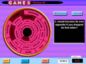
gi-bullseyeThe Bulls Eye puzzles give you a set of words to be matched up one-to-one with a list of unusual criteria, like “consists entirely of letters from the second half of the alphabet”, or “can be broken into two words for men’s garments”. Some of the answers are difficult at first, but they get easier as you use up the possibilities. It’s called “Bulls Eye” because the word list is presented in a circular formation, which is a bit rough and hard to read in the game. There’s no in-puzzle reason for it to be this way. I vaguely recall a puzzle like this from the magazine had some clues that actually took advantage of the arrangement of words, like one of the clues made reference to the relationship a word bore to the words immediately surrounding it or something. But there are no clues like that here, and so the words might as well be just arranged in a list. You page through the clues with “Next” and “Previous” buttons. The instructions state that you can also navigate the clues by clicking on numbers, but there are no numbers to click on. Just another symptom of what went wrong with this whole collection.

Mind Flexers are similarly based on matching words or short phrases with clues, although it blurs the distinction between clues and answers. The idea is that both items in a pair describe the same thing through puns or other wordplay, frequently involving inserting or moving whitespace. For example, “pet duck” gets paired with “touchdown”, and “dozen” with “meditate”. With these pairs of definitions, often one straightforward and one not, it has something of the same feel as a cryptic crossword, albeit far easier. It does start feeling repetitive before long, though, even in the small selection found here. That down-in-the-sense-of-feathers gimmick gets used a lot.

Quote Boxes are made by taking a quotation, arranging it in a grid, chopping it up by columns, and then mixing up the letters in each column. It’s the closest thing this game has to those cryptograms whose absence I was lamenting, and is susceptible to some of the same solving techniques, such as looking for common words like “the”. It’s a serviceable puzzle form, meatier than the others in this section but not too long or difficult, even though it’s senselessly put into groups just like the Battleships. The choice of quotations is decidedly middlebrow and inoffensively bourgeois, even when the source of the quotation is Ayn Rand or Virginia Woolf. It somehow seems even moreso when accompanied by the game’s fedora-jazz soundtrack. I haven’t looked at Games Magazine in many years; is this really the sense of taste it had? I can’t really say I object. I’m pretty middlebrow myself, if I’m honest. It just seems more obvious here than I remember.

At any rate, I’ve made my way through the entirety of Word Play in a single session. I wasn’t planning on this, but I kept making such good progress that it seemed a shame to stop. This whole section seems like it must be what they had in mind in setting up the main menu. I could even imagine requesting puzzles at random from here, if there weren’t so few. Goodness knows “I want to play six rounds of hangman” isn’t an unreasonable thing.

Games Interactive: Time and Scoring

Three times now, I have attempted the third of the five Battleships sets in Games Interactive, only to give up and quit the game at the fourth or fifth grid because I couldn’t stand to sit there hunting for answers a moment longer. I frequently do spend hours at a time playing puzzle games, but somehow, the sense of being constrained makes it chafe. At any rate, this set has just proved more difficult than the first two sets, possibly because the solutions aren’t unique, which limits my ability to solve them through logical deduction alone. At some point, my solving techniques must shift to trial and error, which is exactly what the UI makes inconvenient. Unfortunately, the makers of the game don’t seem to have realized that the solutions aren’t unique. When I submit solutions that are as far as I can tell perfectly valid, sometimes it marks some tiles as incorrect. 1EDIT 13 June 2016: I no longer believe this to be true. See today’s post.

Yes, the game lets you complete puzzles without solving them correctly. The Trivia section would have been a great deal more troublesome otherwise. It gives you a score based on what proportion you got right, multiplied by a factor determined by how long it took. Thus, it’s hard to get 100% on a large puzzle, while small ones tend to yield multiple hundreds of percents, even if you get large portions of them wrong. That time factor is a large part of what motivates me to try to actually complete the Battleships sets in a single sitting, rather than take a break in the middle with the game still running and the timer still ticking.

And yet, if I really wanted to maximize my score, I’d let the timer override my desire for completeness. I’d zip through all the grids, filling in every tile that I could figure out quickly and leaving the rest empty, just to get through it all in enough time to get a very large time multiplier. I’m not doing this, because it would be clearly and obviously missing the point of logic puzzles. And yet this is the behavior that the scoring system is set up to reward.

But at this point, I’m not above recording my answers to the first several grids in Battleships 3 so that I don’t need to figure them out afresh every time I want to make another attempt at the set. This is essentially an offline way of saving my progress, which is something the game should be allowing me to do anyway.

References
1 EDIT 13 June 2016: I no longer believe this to be true. See today’s post.

Games Interactive: Battleships

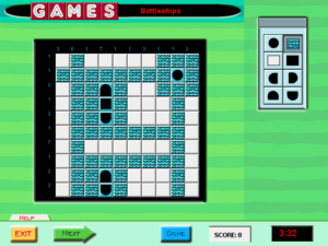
gi-battleshipsGames Interactive doesn’t really have an explicit win state, but I’m taking “do all the puzzles” as the obvious goal. To that end, I’ve started plowing through them all in order. I’ve already gotten through the entire Trivia section, but the next thing after that is the Logic puzzles, which starts with multiple Battleships. I’m pretty sure that this is the stuff that caused me to shelve the game on my first installation.

It’s not that I dislike the Battleships puzzles. I like them quite a lot, or at least I did in their original form. Understand that every game here is a reprint from the magazine. I had done Battleships puzzles before, and likely some of the very same ones that appear in this game. They’re basically a cross between the board game Battleship and Picross: you have to locate a collection of ships of varying length on a 10×10 grid, on the basis of the number of ship tiles in each row and column. The rules have enough restrictions on top of that to keep it interesting.

Transferring this puzzle type to a computer has the same basic disadvantage as it does for other similar logic puzzles: it loses you the ability to make notes on the grid. I do this a lot, and not just for Battleships. In Sudokus, if I don’t know what’s in a square but can narrow it down to two or three possibilities, I’ll mark those possibilities in faint pencil, the better to explore their consequences. Taking my paper away forces me to do it all in my head (or provide my own paper, although I haven’t gone that far yet).

But that’s a small matter. The worse thing that this game does is completely unnecessary: it puts the individual Battleships grids into groups of six, which it treats as one puzzle, so that you have to solve all six of them at once. There’s no way to play just one of them and save your progress. A typical Battleships puzzle takes me something like ten minutes to solve, and an especially difficult one — of which there seems to be at least one per set — can take twice that. So to get credit for any of these puzzles, I have to spend more than an hour at a stretch on them. Why? Because these puzzles were originally printed six to a page. That is the only reason.

To add insult to that, there’s the matter of how you progress from one puzzle in a set to the next. Just filling a complete answer into the grid isn’t enough. You have to confirm that it’s what you want. Now, part of the basic UI shared by all puzzles of all types is a pair of buttons at the bottom of the screen, one labeled “Next”, the other labeled “Done”. Which of these do you think you should press? If you guess wrong, the game won’t bother evaluating your current grid to see if it’s right. It will interpret your button press as giving up on it, and it will proceed to the next one without any feedback indicating that this is what it did, until the very end of the sequence, when it informs you that you scored 0% on the whole thing. (The correct answer is “Done”.)

Games Interactive: Main Menu

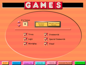
gi-mainSo, let’s get right to it. This horse isn’t getting any deader. My criticism of Games Interactive, a work that no one cares about, begins at the main menu, which starts with a transition animation that’s out of sync with its sound effects. When I first played the game, I figured this was a symptom of my machine being too slow, but no, that’s just how it is. But that’s a trivial matter. The greater problem is that the whole design of the main menu is completely at odds with the game’s content.

There are a lot of puzzle games that let you pick individual puzzles out of a menu, and in most cases, their selection menus work pretty much the same way. You’re shown a bunch of levels, usually as names in a list or icons in a grid. You select one of them and the puzzle starts. When you’re finished with the puzzle, the game sends you either back to the selection menu or directly to the next puzzle in sequence. This is all fairly natural and intuitive, but it’s too simple for the makers of Games Interactive. Instead, you start with a menu that lets you choose a number of puzzles from 1 to 15, and whether you want to pick them from a list or let the game pick them at random. If you choose to pick them yourself, you go to a list where you check off as many checkboxes as you said you wanted puzzles, then press a “play” button to solve them in sequence. If you choose randomization, you can narrow the selection down by broad categories such as “Trivia”, “Logic”, and “Crossword”.

The default setting, which the menu reverts to on every visit, is to play six puzzles chosen at random from all categories. It’s inconceivable to me that anyone would actually want this. For one thing, I don’t see why you’d commit to solving six puzzles in a row instead of asking for one puzzle, solving it, and then seeing if you’re still in the mood for another. But even choosing one randomly-chosen puzzle is questionable. Sure, I can appreciate wanting a surprise, but it doesn’t exclude puzzles that you’ve already solved, and solving puzzles twice isn’t how puzzle games work. Also, there’s a great deal of variability in the size and length of these puzzles. Some are sets of trivia questions, which you just answer right or wrong, one after another, and finish with in a couple of minutes. Others are 25×25 “World’s Most Ornery” crossword puzzles, or entire collections of multiple Picross puzzles. Asking for six random puzzles is basically saying “I want to commit to a session lasting somewhere between fifteen minutes to several hours.”

In short, whoever designed this menu seems to have had a very different sort of game in mind, one composed of units that are uniformly bite-sized and replayable. The puzzles here are heterogeneous, and replayability is never a strong feature of puzzles. This is just one way that the makers of this game failed to handle their material well. I’ll describe more soon.

Games Interactive

So, about those terrible Games Magazine puzzle anthologies. They’re both on the Stack. In fact, the first Games Interactive from 1999 is, I think, the only game to leave my Stack and later return to it. I accidentally mailed my copy of the CD-ROM to Netflix in one of their DVD return envelopes a number of years ago, at a time when they were new enough that they didn’t yet have a process in place for returning it. I thought that was it, that the game was lost to me forever, and I wasn’t really too unhappy about that. But just a few months ago, I found another copy in a set of old game discs that a coworker was giving away, as happens periodically at my workplace. So let’s give it a whirl!

But first, it’s time for one of those technical problems stories that long-time readers of this blog know and love. My Windows machine reacted to the Games Interactive disc in a strange and mysterious way: it treated it as empty. That is, it was capable of reading the disc enough to display its name and custom icon, and to show its capacity as “0 bytes free of 76.6 MB”, but when I opened the disc, it showed me no files, even with “Show Hidden Files” enabled. Actually, that’s not quite true: for some reason, it showed one file as queued for writing, as if I had inserted an empty CD-R. Fortunately, I still have an obsolete Macbook with a CD-ROM drive. Its battery is long gone, but it still works if it’s plugged in, and it was capable of reading the files off the disc and writing them to a thumb drive for transfer to the PC.

That done, and the installer run, and after some fiddling around with compatibility modes, the game insisted that I needed to insert the disc before it would start. This worried me a little, considering that the system couldn’t detect any files on the disc, but fortunately, it seems that all this check cared about was that there was a CD-ROM with the right name available; if it found that much, it let things proceed. Of course, once it was past that check, it immediately tried to read files from the disc and failed. But this too was solvable. The entire thing is written in Macromedia Director, and previous experience with Director games suggested that it would be willing to use files in the install directory in preference to the CD. So I just moved the entire contents of the thumb drive over. With that, I almost had it working. It ran without errors, played the opening logo videos, and brought up the main menu.

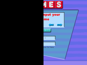
gi-halfThere was just one problem: Only the right side of the screen was visible. The left side was solid black for as long as the game was running, even when I alt-tabbed to a different app. This would interfere with playing the game.

Looking closely at the intro sequence, it looked like one of the logo videos was playing wrong. I think this may be the result of the video starting while the graphics card was still trying to figure out how to switch to 640×480 resolution. It played in wrong colors, and used only the left side of the screen, the part that went black afterward. Well, if the logo videos are causing problems, they were at least inessential. There were three .smk files in the install directory — ah yes, Smacker! That takes me back. Deleting those allowed the game to start up without problems, and I’ve successfully run a few puzzles without further errors.

Unfortunately, the puzzle of getting it working was the fun part. Tune in next time for griping about the game itself.

Cat Girl Without Salad

The new Humble Monthly bundle contains a game written specifically for the bundle and available nowhere else. That actually isn’t new; the previous three bundles had similar exclusives. But this time, instead of a slim piece of indie nonsense, it’s a slim piece of nonsense by an established company: WayForward Technologies.

I’ll always think of WayForward mainly as the perpetrators of a couple of terrible puzzle anthologies licensed from Games Magazine, but they’re probably better-known these days for the Shantae series, platformers starring a kooky bellydancing genie. Cat Girl Without Salad is clearly descended from that, despite being a shoot-em-up instead of a platformer. It takes the “kooky girl” aspect and turns it up a few notches. There’s so much kooky banter in the game that it can’t be limited to the cutscenes, and instead plays out nonstop while you’re playing the game, providing an extra distraction. I’ve commented before on similar talking-orthogonal-to-gameplay in Advent Rising and GTA, but I think this is the first time I’ve seen it done in a shmup.

More than that, though, the wackiness even affects the core gameplay, which is where humor in games belongs. The basic idea is that your weapon power-ups all imitate different genres of game. So, for example, you can collect a “platformer gun”, which fires little man who runs rightward and jumps when you press the fire button again, or a “dance gun” that fires much more powerful bullets when you hit buttons in time with a DDR-like arrow cascade, or various other things. Note that you still have to dodge incoming fire while playing these minigames. It’s long struck me that the fundamental challenge of the shmup is paying attention to two things at once — that is, aiming at enemies while dodging their bullets. Bullet Hell shooters de-emphasize aiming in favor of dodging. With its complicated weapons that require more attention that just firing them, Cat Girl Without Salad does the opposite.

Apparently the whole thing started off as a joke, an April Fool’s Day announcement from a few years back that promised “elements from several gaming genres, including puzzler, platformer, shmup, action, shooter, adventure, strategy, fighting, rhythm, arcade, horror, tactical, RPG, TPS, RTS, and visual novel“. I’m generally down on April Fool’s Day on the Web, but every once in a while, this happens. Someone decides to take their outlandish claims and make them real, or as real as reality allows. And that’s a good thing.

« Previous PageNext Page »