Pool of Radiance: Combat UI

I haven’t made a lot of progress in Pool of Radiance; I’m really only beginning the urban renewal of the city of Phlan (going through the slums, rousting out the squatters and slaughtering them with cold steel). I’ve honestly been avoiding it. Not because of any moral qualms — if there’s one thing D&D has taught us, it’s that there’s nothing bad about charging into someone’s home, killing them, and taking their stuff, as long as they’re the wrong race. Rather, I’ve been putting it off because the combat UI is so abysmal.
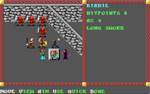
por-combatCombat, unlike navigation, is conducted in a third-person tactical icon-based view, with mechanics similar to playing D&D with miniatures. (This is where the icons that you customized during the character creation stage come in, which I suppose means that the whole color-selection interface is analogous to painting your minis.) That is, it’s turn-based, with each combatant taking actions in an order determined by an initiative roll. (Initiative seems to be re-randomized every round, which I think was officially part of the rules of D&D at the time, although it was often house-ruled away.) There’s nothing really objectionable about the underlying mechanics here, and I do appreciate the way the battlefield is based on the actual arrangement of walls around you when the encounter occurred. My objection is the way you interact with it. It involves far too many keystrokes, and they’re often odd choices of key.

For example, suppose you want to hit someone next to you. You’re expected to press “A” for “Aim”, then select a targeting mode — either cycling through possibilities with the “N” and “P” keys, or using the arrow keys to select a target with a cursor. Why not have both selection modes active simultaneously? Alternately, why not remember what targeting mode the player selected last time and have it automatically use that one until the player explicitly asks to switch? Or suppose you don’t want to attack — it’s the magic-user’s turn, and you’re out of spells, so you just want to move back away from the monsters. You have to enter Movement mode, then use the arrow keys to move, then hit the enter key or “D” (for Done). But “Done” doesn’t mean you’re done: you have to additionally choose whether you’re actually through with this character for the turn or take additional actions from your new position or defer so another character can act and then resume later. This is probably the most consistently aggravating thing. I understand the need to be able to say “I’m done with moving but I still want to do something else”, but I want to say “I’m all done” frequently enough that I should be able to do it with a single input.

It may seem that I’m straining at gnats. After all, I’m talking about single extra keystrokes here. But they’re not really single; they’re repeated over and over again. What the underlying game mechanics really demand is something more like a roguelike interface. And to its credit, the game takes one small step in that direction: if you’re in Movement mode and you bump into a monster, this is interpreted as taking a melee attack. All I really want is to be able to activate other commands from this mode without exiting it, and to not have to hit an extra key to enter it.

Fortunately, the game provides a command, “Q” for Quick, that puts a specific character on autopilot, making them exactly the same kind of mindless killing machine as the enemies. Unfortunately, there’s no obvious way to turn it off, and it seems to stick between encounters. I’m going to have to read up on this in the manual.

To make things worse, the movement/targeting controls are set up for the standard PC numeric keypad, with the Home, End, PgUp, and PgDn keys in the diagonals. This is bad for me because I’m trying to play it on a laptop that doesn’t have that arrangement. On this machine, those keys are normally done via chords: Home (representing left-up in this game) is fn+left, End (left-down) is fn+right, PgUp (right-up) is fn+up, and PgDn (right-down) is fn+down. Avoiding diagonal movement is impracticable, so as I see it, I have four options: I can learn to get used to these chords (bothersome), I can stop playing on the laptop and only play at home (also bothersome; if I’m going to play a game of this vintage, I at least want the convenience of playing it wherever I like), I can carry an external keyboard with me to plug into the laptop whenever I feel like playing it elsewhere (yeah right), or I can try to figure out how to remap keys in DOSBox. The last is clearly the most reasonable solution, but I don’t know if it’s really doable, because the game binds other keys to context-specific commands more or less at random (that is, by their initials).

Pool of Radiance was ported to the NES. I’m having trouble deciding if the interface there would be better or worse. On the one hand, the roguelike interface I advocate here would be pretty much impossible with the limited number of buttons. On the other hand, the same limitation would enforce some simplicity: none of this nonsense about pressing the A key then the M key to enter manual targeting mode if there is no M key. But then, entering diagonals with an NES controller can’t be easy either. Perhaps I should count my blessings.

Might and Magic: UI

So, let’s talk user interface a bit. Might and Magic is essentially menu-driven, in a pre-GUI way. Nearly all interaction takes the form of single keystrokes, and all the applicable commands in the current context are displayed on the screen. In navigation mode, a big chunk of the screen is devoted to displaying an unvarying list of everything you can do. If the action you select requires you to make further choices, such as which object to use or which monster to attack, further lists will be presented (along with the option to back out and choose a different action by pressing Esc).

The one big exception to this is spellcasting. You choose spells by pressing two numbers, one indicating the level and one indicating the spell within the level, but the game doesn’t tell you what numbers correspond to what spells. In fact, the spell names and descriptions are found nowhere in the game itself, only in the documentation. More than a third of the manual is devoted to spell lists. This is something of a drag on combat at first, because you have to keep breaking your attention away to look up the number for the spell you want to cast, but it doesn’t take long to internalize the more frequently-useful ones. In Wizardry, you learn to associate the word DIOS with a basic level-1 healing spell; in Might and Magic, you develop the same association with the key sequence C-1-4.

The problem with this is that C-1-4 doesn’t always mean “cast the basic level-1 healing spell”. If the character who you wish to cast is is out of mana, the “C” option isn’t even part of the menu, and pressing it has no effect whatsoever. But you’ll press it anyway, because, having internalized that key sequence, you’re not looking at the menu any more; you’re typing it more as a gesture. The stranded keystrokes after the C are still meaningful, though: they make you switch to character 1 in your party roster and then immediately to character 4. This surprises the player, and therefore is not ideal behavior for a UI. And it could be avoided simply by accepting the full gesture and issuing a “Not enough MP” message afterward, like it does when you’re not completely out of mana but don’t have enough for the spell you’ve chosen.

My other major complaint is with menus that seem unnecessarily hierarchical. From the start menu, for example, you have to choose a town to start at, and from there you get a party-selection menu showing the player characters currently in that town. I’m only playing with one set of characters, and sometimes I forget which town they’re in, so I have to search through them all. This means going back to the main menu repeatedly. Switching from one town roster directly to another is not an unreasonable thing to expect — the game manages to switch directly between character details just fine. Similarly, entering a shop gives you a menu that lets you choose who’s shopping and what they’re shopping for (weapons, armor, miscellaneous items), but once you’re in one of the sub-menus for buying items, you can only change the character who’s buying by backing out. If I’m buying new armor, I’m probably buying new armor for multiple people.

It’s not all bad, though. That same shop menu also has an option for giving all the party’s gold to the current character, which is really useful (and simpler than doing it through the character menus). But it’s only useful because the game keeps a separate inventory for each character, which is an unnecessary complication, as Final Fantasy proved.

In fact, I’d say that Final Fantasy — which is also highly menu-driven, and came out around the same time as Might and Magic — generally provided a better UI. It was created for a digital gamepad, which is essentially the same thing as a keyboard, but shaped differently and with fewer keys — much fewer in the original NES version. But that limitation spurred innovation: without enough keys to give every menu option a unique keystroke, they had to come up with a simpler and more general menu-selection UI based on highlighting choices with the D-pad. It’s not a perfect system — in particular, it’s unwieldy for long menus — but it has the advantage of being easily improvable without changing the core interaction, as later ports proved.

IFComp 2008: Search for the Ultimate Weapon

One last game and I’m done for the year. This one is loosely inspired by the legend of Wu Mei, 17th century kung fu master. Spoilers follow the break.
Read more »

IFComp 2008: The Missing Piece

Another GUI-based RPG by C. Yong, the author of last year’s The Lost Dimension. Spoilers follow the break.
Read more »

IFComp 2008: Project Delta

Spoilers follow the break.
Read more »

Magic: The Gathering – Battlegrounds

mtgbg-duelIn writing about Etherlords, and before that about Puzzle Quest, I made mention of how much they drew from Magic: The Gathering. Well, there’s one sort of game you’d really expect to draw from M:tG, it’s a game specifically based on the M:tG license. There have been several.

The most straightforward adaptation is undoubtedly Magic: the Gathering Online, which is exactly what it sounds like: a system for playing M:tG against other humans over the internet. Before that, there was a single-player RPG-like title, called simply Magic: the Gathering, that used straightforward M:tG duels for combat, and before that there was Battlemage 1Or, more fully, Magic: the Gathering — Battlemage. It seems to me that Richard Garfield kind of painted himself into a corner with respect to names for derivative properties. “Magic” is a generic enough word that you really need the subtitle “the Gathering” there to positively identify the franchise, which results in these multiply-subtitled derivatives. I don’t know what I’m going to do about naming these blog posts., a realtime variant.

Since M:tG itself is about as realtime as chess, Battlemage was a quite loose adaptation, and perhaps better described as an action game inspired by M:tG. It kept the basic notion of a duel between wizards who summon monsters at each other, and a mechanic of regenerating mana, but the mere fact that it was realtime changed the character of the game fundamentally, and not for the better, in my opinion. Where M:tG is essentially about showing off how clever you are, the hectic pace of Battlemage basically prevented me from thinking while playing it. As I remember it, my mind was mostly occupied with trying to remember how to use its user interface, which seemed unbelievably awkward to me for time-constrained use, ignoring obvious mechanisms, such as using the mouse to select spells, in favor of paging through lists with the arrow keys. (I didn’t understand this at the time, but the whole UI was just a minimal conversion of the Playstation version.)

Battlegrounds, released in 2003, was the last attempt at a new M:tG-based title. It’s essentially a remake of Battlemage. This isn’t obvious at first, because the presentation is so different — Battlemage used an overhead 2D view and a largish scrolling map (probably intended to give the player time to react to the opponent’s summons, but it also had the effect that you never knew what was going on outside of your current window), while Battlegrounds has a smallish side-viewed 3D arena more reminiscent of a fighting game like Mortal Kombat, or possibly tennis. But it’s still realtime and hectic, and the whole thing is obviously designed around the PS2 controller, even in the PC version.

Maybe I’m mellowing, but it seems to me that Battlegrounds is more successful than Battlemage was. Duels are typically over with quickly, one way or another, and seem to be turning puzzle-like — you may not have time to think during a battle, but you can certainly devise tactics between times. However, it’s definitely not as faithful to M:tG as Etherlords.

References
1 Or, more fully, Magic: the Gathering — Battlemage. It seems to me that Richard Garfield kind of painted himself into a corner with respect to names for derivative properties. “Magic” is a generic enough word that you really need the subtitle “the Gathering” there to positively identify the franchise, which results in these multiply-subtitled derivatives. I don’t know what I’m going to do about naming these blog posts.

Tempest 2000: Controls

Tempest had a knob. Rotary controllers of this sort weren’t uncommon in videogames of the day — why, the very first videogame to hit it big, Pong, used a pair of knobs. But they’re not common on today’s home computers or gaming consoles. (As far as I know, the last console to provide knobs as a standard feature was the Atari 2600.) I suppose the steering wheel controllers sometimes used for driving games are effectively a knob variant, but that seems cumbersome for the purpose. (If you’ve actually tried using a steering wheel to control a non-driving game, I’m curious about how well it worked.)

The usual way to compensate for this on a PC is to substitute the mouse, which works pretty well — like the knob, it’s effectively an analog device, allowing quick and precise movement by mapping motion on the screen directly to motion of the controller. It doesn’t work quite as well as for Tempest as it does for Pong and its ilk, though. Pong maps the rotary motion of the controller to linear motion on the screen, so switching to a controller that uses linear motion actually makes the mapping a little simpler and more direct. Tempest, on the other hand, has genuinely rotary motion on screen. Any mouse-based control scheme is going to wind up either (a) moving the player in the opposite direction from the mouse motion some of the time, or (b) being more complicated than the simple two-direction spinning of the original.

Now, Tempest 2000 has the additional handicap of having been developed primarily for the Atari Jaguar, a machine that had no knobs, no mouse, not even an analog joystick. It was built with a digital D-pad in mind, and the port supports nothing better. I might as well use the keyboard; switching directions is slightly faster that way. It’s probably not as bad as it sounds, though. The art of using digital controls to simulate analog ones is well-developed by now, and probably familiar to most gamers, if only subliminally. But it does suffer the inversion problem already noted about mouse controls. Pressing left moves you clockwise and right moves you counterclockwise, even when you’re at the top of the tube, where clockwise is right and counterclockwise is left. One gets used to this, but it’s easy to get momentarily confused, and every moment of confusion is a potential death.

Not every level in the game actually involves a closed curve — about half of them have endpoints, and are equivalent to lines. They’re lines bent into various shapes (one of the early ones is in a V shape that always makes me think of the Videlectrix logo), but motion on these levels is essentially linear rather than rotary. Does this make it easier? Not always! Context and perspective are important here. Some of these levels put the line above the middle of the screen, so that the monsters are below you — think of the normal tube-like view, but with the bottom half of the tube cut off. Or rather, don’t, because if you do, you’ll expect the controls to be inverted, like they are on the top half of a full tube. They’re not: left means left and right means right, just like you’d expect. The fact that I find these levels so confusing shows something about how quickly intuitive expectations can be changed.

Puzzle Quest: UI

At its core, the way you interact with Puzzle Quest is identical to the way you interact with Bejewelled. On a PC with a mouse, this means that you have two ways of swapping gems: either click on the two gems that you want to swap, or hold and drag one gem in the direction of the thing you want to swap it with. Either of these two input methods suffices for any swap you can make, and indeed it took me a while to notice that two existed. I’ve been clicking rather than dragging, and only discovered the dragging version accidentally, when my hand joggled too far during a click — something that’s happened often enough that I wish I could turn the dragging off. It isn’t even just a harmless annoyance: when you accidentally enter an invalid swap — which is to say, one that doesn’t form a row of 3 or more — you lose 5 hit points and your turn ends. The hit points don’t hurt so much, but failing to act can be devastating.

The presentation, though, can and does go beyond that of Bejewelled, for the simple reason that there’s more to present. There’s a good deal of information on the screen — hit points, mana levels, spell names and costs — and even more available through tootips — both combatants’ skills, the effects of their equipment, descriptions of spell effects. Whenever any aspect of the game state changes, the change is indicated through glowy particle effects over the appropriate part of the display. This is a nice touch. I’m seldom watching the particle effects, since they occur at the exact moment that the board changes and I’m anxiously scanning it for exploitable patterns, but they register in a near-subliminal way.

QfG5: UI

My last session was short, and I didn’t really discover anything new. So in this post I’ll critique the user interface.

Quest for Glory V is basically a point-and-click game, like most of Sierra’s adventure titles after King’s Quest V. 1In fact, the last Sierra game that had a text parser and 16-color EGA graphics was QfG2, which seems to use a kind of transitional hybrid engine with features of both SCI0 and SCI1 (the engines used by KQ4 and KQ5 respectively). For example, the hero sprite generally has four orientations in Sierra’s EGA games and eight in their VGA games. QfG2 is the only exception, with eight orientations in EGA. But unlike earlier Sierra point-and-click games, including the previous two QfG games, it doesn’t provide a verb menu. Clicking on stuff generally performs the obvious action: “pick up” if the thing clicked on can be picked up, “talk” if it’s a person, “go” if it’s an exit or bare ground, etc. In some cases, multiple actions on a single object are supported by popping up a menu. In fact, it’s exactly the same sort of menu as is used for conversation. Double-clicking makes you run, a nice feature, especially since you only need to single-click to pick a new destination once you’re running — most locations are wider than the screen, so running all the way to a different exit requires you to click repeatedly as the screen scrolls. (Alternately, you can also move about using the arrow keys, but that’s even more cumbersome, as it forces you to navigate around obstacles manually.) Right-clicking, or left-clicking a button in the UI controls on the bottom of the screen, switches you to “examine” mode, something that’s signalled by a visual change in both that button and the mouse cursor. This is all nicely discoverable without reading docs.

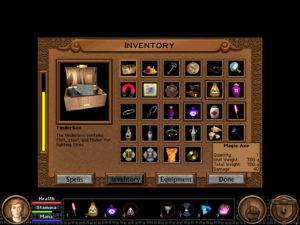
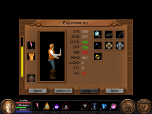
qfg5-inventoryThere are two parts to using inventory items. First, you can bring up an icon-based inventory dialog by clicking another button in the main controls. Every icon has a tooltip giving its basic stats, and double-clicking an icon brings up a dialog box with more detailed information and a basic “use” or “equip” button. qfg5-equipmentItems can also be equipped from a special interface in a separate tab of the inventory dialog. This provides no new capabilities, but it helps you by gathering the relevant information together: showing you what you have currently equipped, reducing the display to equippable items, and displaying all potentially-affected stats, so you can observe how they’re affected by different items. It bears mentioning that whenever you look at your stats, things that have gone up since you last saw them are displayed in green and things that have gone down are displayed in red, making it easy to tell which stats an item affects even if you’re not paying close attention. I suppose most of this is fairly standard in RPGs by now, but that’s because it’s a really good design. Spells are treated the same as inventory items, but have their own tab.

I’m less enamored with the other half of the inventory UI: the way you apply them to the rest of the world. This is done through a quick-select toolbar with nine numbered slots, something that’s been an indispensable part of RPG interfaces since Diablo at least. 2There are probably earlier examples, but as far as I can tell, Diablo is the game that popularized it. Once you’ve dragged an item or spell from the inventory to the toolbar, you can “Use” it via the keyboard, which is handy for things that you need to use frequently, such as healing pills. You can also click on an icon to switch to point-and-click-adventure “apply this item to other stuff appearing on the screen” mode, or double-click it for the same detail window as you get from the main inventory. My main beef with this mechanism is that it’s the only way to apply inventory items to the environment. You can’t switch to “apply item” mode directly from the inventory dialog; you have to drag the item onto the toolbar first and then use it from there. That may be OK for RPGs, where you tend to use the same things repeatedly, but for adventures, where exceptions are the norm, the “quick select” actually slows you down. I have a backpack full of items that are only useful in one or two situations, so they’re never already on the toolbar when I need them.

Also, there’s a little conceptual inconsistency that confused me at first. Remember, any item can go into the toolbar, even a weapon. In fact, when you start the game, your starting weapon is already in slot 1. Pressing the key corresponding to a weapon toggles it, equipping it if it’s unequipped and vice versa. This is effectively a mode change: equipping a weapon doesn’t have a direct effect, but changes the action you perform when clicking on an enemy. Offensive spells are conceptually similar to weapons, so the player 3By which I mean me. But I’m not alone on this: other people have reported similar confusion in the forums I visited while looking for help with bugs. is likely to try to use them the same way at first, and it doesn’t work. You have to click on the spell icon to cast it at something; just pressing the number is always interpreted as casting it without a target, which only works for spells that affect the player character (like Levitate) or the general area (like Calm). I’m not sure what the best solution to this is. Obviously you could make things consistent by taking away the weapon-toggling, but being able to switch between combat and non-combat modes quickly seems important, so I suppose I’d resolve it by introducing more inconsistency, which hardly seems like a solution at all.

Playing a spellcaster adds a mana gauge to the display and the “spells” tab to the inventory, and in both cases they’re added in places that didn’t even look empty when I was playing as a Fighter. The Thief has additional capabilities too, but the game doesn’t add anything to the GUI for them. This is a break from the previous games: QfG3 and QfG4 put Thief skills into a special section of the action menu, similar to how they handled spells. In QfG5, they’re handled either through Thief-only inventory items or additional menu options: click on a locked door, and you get “Pick lock” appended to the normal list of “Listen”, “Knock”, and “Force open”. This is mostly handled well, although I have to wonder why a guy who was scaling walls with his bare hands four games ago is now completely dependent on his rope and grapple.

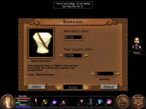
But there’s one Thief skill that can’t be used from the GUI at all, and it’s a very important skill: Sneak. Sneaking is a mode, not an action, and there’s no GUI button for it, so the only way to toggle it is through the keyboard. I’ve noted before how certain actions in combat can’t be performed without the keyboard, and it still it seems like a bad move to me, even putting aside the flakiness of keyboard events in this game. qfg5-haggleThis is a game that’s clearly dependent on the mouse (as there’s no other way to target environmental objects), and the mouse alone is sufficient for 99% of the things you do in the game. Even the haggling interface allows you to alter your offer price by clicking on +1/-1 buttons. (It would be impractical to use this for prices in the thousands, but the option is there all the same.) But there’s that 1% of cases that can’t be handled through the game’s dominant input device, and it rankles.

References
1 In fact, the last Sierra game that had a text parser and 16-color EGA graphics was QfG2, which seems to use a kind of transitional hybrid engine with features of both SCI0 and SCI1 (the engines used by KQ4 and KQ5 respectively). For example, the hero sprite generally has four orientations in Sierra’s EGA games and eight in their VGA games. QfG2 is the only exception, with eight orientations in EGA.
2 There are probably earlier examples, but as far as I can tell, Diablo is the game that popularized it.
3 By which I mean me. But I’m not alone on this: other people have reported similar confusion in the forums I visited while looking for help with bugs.

Myst V: UI

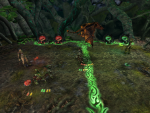
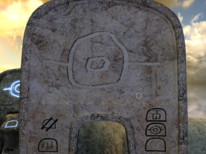
myst5-slateMyst V does a couple of novel things with the user interface. For one thing, it gives you a choice of what UI you want to use. First-person adventure games have basically gone through three stages. First there’s the static view: the camera is fixed in place, and you click hotspots to move and turn. Then there’s panning views: you click hotspots to move, so there’s a finite set of nodes you can move between, but turning is continuous, controlled by the mouse in some way. Finally, there’s full continuous 3D movement, like in a first-person shooter — something not done often in adventures, but it has been done. Myst V supports all three modes.

One might reasonably ask why. “Classic” mode was, after all, originally a product of technological limitations. Myst is made of a bunch of still images stitched together. Myst V is not. So why pretend that it is? I suppose that some people just prefer to play that way. I generally prefer “Advanced” mode — full 3D movement — because the ability to look at things from arbitrary angles aids comprehension. (One of my biggest problems in Myst IV was finding movement hotspots in outdoor areas.) But in fact I have occasionally switched to “Classic” mode when in difficulty, because the hotspots can act as a sort of guide. If there’s someting important, there’s probably a spot you can click that makes you look straight at it.

It’s worth noting that, even in free-movement mode, you use the old-style interface to climb ladders. I don’t just mean that you click on the ladder to climb it, I mean that you click on the ladder twice: once to look at the ladder and automatically shift into “Classic” mode, and once to climb it. It seems unlikely that it would have been designed this way if the designers had been thinking primarily in terms of free movement.

The other major UI experiment is the drawing interface. Each of the four main sub-worlds features a slate that you use to give instructions to the Bahro. You do this by drawing shapes with the mouse. It’s a reminiscent of the “gestural” interfaces used in Black & White and early versions of Darwinia before the designers realized how difficult and annoying it was. It’s a bit different here, though, because you don’t have to (and in most cases can’t) draw the shapes in a single continuous stroke, which lessens the annoyance factor somewhat. But it’s tricky to draw with a mouse — especially if, like me, you normally use a trackball for games 1A Logitech Cordless Optical Trackman, for what it’s worth — not to be confused with the Logitech Cordless Trackman Wheel or other similarly-named products. It’s the best pointing device I’ve ever used, especially for first-person games like this one. My only complaint is that there’s nothing holding the ball in except gravity, so whenever you drop the device, the ball comes out and rolls under the couch.. And unlike in other programs you might use to draw pictures with a mouse, there’s no eraser tool and no “undo”. If you make a mistake, you have to wipe the whole slate and start over. I’ve tried hooking up a Wacom tablet 2 “Do you begin to understand the power of the Tablet? Surely it begins to pull you. Its strength grips you. Look around. Without the power of the Tablet, this would be left solely to your dreams.” — Esher, Wacom spokesman. for these bits, but it interacts strangely with the game, sending the cursor zooming into corners suddenly. This doesn’t happen with that tablet under other applications. But at least the game doesn’t ask you to draw shapes more than once. Once you’ve got a drawing that the Bahro understand, it’s automatically saved where you can retrieve it with a click.

Recognizing shapes is one of those things that’s traditionally difficult for computers to do, so it’s unsurprising that the game can get it wrong. It’s generally good at rejecting things that aren’t quite right — frustratingly so at times, given the difficulty of drawing. But there was one occasion when I drew a shape completely wrong, and the game decided it was a close-enough match to a different shape, one that looked even less like what I had drawn to a human eye. There may be something going on where the game remembers the last shape you had the opportunity to see and is more lenient about matching it. Usually there’s a single order in which you can discover them, but this level was an exception. Later in the same level, I actually managed to skip a puzzle when the Bahro carried the slate to its final destination without being instructed to do so, perhaps as a result of another mistaken match. Whether these two mistakes are connected, I don’t know. I played through the level a second time, because I don’t like skipping puzzles accidentally, and didn’t hit any false positives that time.

References
1 A Logitech Cordless Optical Trackman, for what it’s worth — not to be confused with the Logitech Cordless Trackman Wheel or other similarly-named products. It’s the best pointing device I’ve ever used, especially for first-person games like this one. My only complaint is that there’s nothing holding the ball in except gravity, so whenever you drop the device, the ball comes out and rolls under the couch.
2 “Do you begin to understand the power of the Tablet? Surely it begins to pull you. Its strength grips you. Look around. Without the power of the Tablet, this would be left solely to your dreams.” — Esher, Wacom spokesman.

« Previous PageNext Page »