Evolution: Environment and Migration

I’m still consistently losing. Or rather, consistently giving up when it’s clear I’m going to lose. I’ve started loosening up a bit with regards to deciding when that is, though. It doesn’t do to be too disheartened at the opponents beating you out to evolving a new species: in order for it to do them any good, they have to keep it from going extinct. And most new species have a bit of a handicap there, in that their ideal environment isn’t the same as that of the species that spawned it — that being more or less the point of speciation.

Environment has two components: terrain and temperature. The unit description window — the same one that indicates a unit’s population and how well it’s feeding — mentions the ideal terrain type and temperature for that unit’s species; more detailed information, including how well it survives in each terrain, is available in the species details. It’s easy to fall into the trap of paying attention only to the terrain type, because that’s highly visible: every tile on the map is decorated according to its terrain. But the temperature seems to be even more important to survival, and it’s displayed in a place that users tend to ignore: the info bar at the bottom of the window. It displays the temperature and terrain type for the tile currently pointed at by the mouse pointer — which is to say, it only starts to display useful information when you’re looking at a different part of the screen. It’s invaluable once you start paying attention to it, but I feel like the fact that the info bar is used at all, let alone for such a crucial feature, is a real sign of how new the idea of Windows as a gaming platform was. People didn’t really know how to use it, but they were willing to experiment.

So, when you get a new species, it’s a fragile thing, ill-adapted to its environment and in need of nurturing. Which is kind of the opposite of how evolution is supposed to work, but regardless, the top priority is to get it to its ideal environment before it dies out. Even once it’s there, the environment doesn’t last forever. Plains turn to desert, mountains rise, the climate changes — sometimes catastrophically, as in a major asteroid strike. About all you can do is send your creatures to as many different places as possible and hope for the best. Which you want to do anyway: you don’t want your creatures competing with each other for food. (In extreme cases, I’ve contemplated marching my obsolete creatures into the ocean to make room for the new guys.) No, you want them competing with the opponets’ creatures for food. My greatest competitive successes so far have not been a matter of out-evolving the opponents, or of fighting and killing them, but of driving them away by out-breeding and out-eating them. Which is how invasive species work in real life, so hooray for accuracy.

Spreading your population out isn’t trivial, though. In order to get a unit from one ideal feeding ground to another, you typically have to cross areas not suited to the unit’s needs at all, and while it’s crossing those zones, its population will drop. This is how oceans work, by the way. You can send any species on a trek across the water, and it’ll just walk on it like it’s a blue carpet, not even slowing down. But while it’s out there, it won’t get any food at all. Birds can colonize remote continents more easily than most creatures, but that’s not because they have any kind of in-game-modeled flight attributes. It’s because they can move faster, and thus can cross more ocean before starving to death.

Evolution: Mechanics and Strategy

Posting very late today. Playing the Cenozoic scenario turned out to be an even worse morale-wrecker than attempting a full game. Because life is already pretty well advanced, it isn’t long before the opponents start developing the immediate precursors to potentially intelligent life, such as elephants and parrots and australopitheci, all while I’m still struggling to get out of the small-ratlike-creature phase. Seriously, I need to figure out how they’re managing it. The one trick I’ve figured out so far is to send my newly-spawned creatures out to colonize new territory as soon as they’re fit for the journey, thereby lessening the demands on the land and increasing the rate at which the population increases.

To explain this in more detail: Each “creature” visible on the map actually represents a herd or colony or something — at any rate, a local population. This was not clear to me in my very first struggles with the game; I had to read the manual to really understand it. When you click on a creature, you get a little pop-up window with details on that creature, including a green bar labeled “Population”. I think that when I first saw this I assumed it referred to the worldwide population of that species, but no, it’s the population of that particular “creature”. It essentially functions like hit points for the group. It fills or empties according to how well the creature is feeding; if it fills completely, the creature splits in two. So in this way, the game is more like a simulation of unicellular life than of tetrapods.

Having lots of creatures of a particular species isn’t good simply because it gives them a better chance of surviving. Each living creature also contributes to the rate at which its species accumulates “evolution points”, which is to say, research into development. Evolution points are automatically spent on three things, in proportions you can set on a per-species basis: improving feeding (and thus population growth), improving combat ability (against another species which you specify — predators use this to predate better, prey species to resist predation), and developing a new species (which you specify). It’s a lot easier to evolve a species that’s populous and well-fed, which seems a little iffy to me — doesn’t natural selection play a more prominent role in situations marked by desperate competition to avoid starvation? But I suppose we have to make some concessions to gameplay. The rule for strategy games is that success is rewarded with more success.

At the very beginning, it obviously makes sense to devote most or all of your evolution points to feeding. But there seems to be a point of diminishing returns there — the detailed species information has another of those green bars indicating how close to its maximum feeding-efficiency potential it is, and this bar seems to only asymptotically approach filling up completely. At some point, it makes sense to devote more and more points to speciation. I suspect that part of my problem is that I haven’t yet discovered the sweet spots for this transition. Do it too late, and the opponents will get the new species before you. Do it too soon and it cuts into the feeding points that would be otherwise growing your population and increasing your evolution point income, with the end result that, again, the opponents beat you to the new species.

You may be thinking “So what, so the opponents beat you out to a few early species. If you have the largest population, you’ll catch up.” Just one problem: When an opponent beats you to a species, it cuts you off. Each species can belong to only one clade at a time. Like the Wonders in Civilization, if someone else beats you to a species you’re in the middle of developing, the points you sank into it just go to waste. In one session, the opponents actually claimed all possible developments from one of my species, leaving it unable to develop further until one of said species went extinct and became up for grabs again.

You may wonder how it’s possible to compete at all in a situation like this, given that speciation is like a branching tree. Claim any common ancestor of all mammals, and you prevent anyone else from developing any mammals at all, right? The game has a way around this, and it’s one of the weirdest things about it in its implications: evolution in the game is what the manual calls “polyphyletic”, which is to say, any given species can evolve through multiple possible routes. Most major branches of the tree of life start out as bundles of about five or six possible common ancestors; not at all coincidentally, six is the maximum number of players. The options from these junctions aren’t entirely equivalent — for example, any of the early mammals can be developed into Miacis and and thence into the entire order of Carnivora, but only one, the Alphadon, can also give you thylacines.

But are thylacines worth it? From the point of view of someone pursuing intelligence, they’re something of a dead end — but then, so is the entire order of Carnivora. But there are strategic reasons to pursue as much diversity as you can: the increased ability to withstand global disasters, the ability to colonize more types of terrain and deny your opponents their exclusive use, even just the points it gives you at the end of the game. Moreover, thylacines and carnivores are predators, and thus have the ability to attack opponents’ creatures — something that you tend not to get on the routes to intelligence. (Saurosapiens notwithstanding — they’re descended from velociraptors.)

But that’s all quite theoretical to me at the moment. Anything I say about advanced strategy is just a repetition of what it says in the beautiful, rigorous, and oft-consulted manual.

PQ4: UI

Most of Sierra’s adventure games used standardized UIs, but the standards went through several iterations. The very earliest Sierra adventure games were illustrated text adventures, where all interaction went through a text parser, and the graphics could be turned off at will. King’s Quest introduced the AGI engine, which added interactivity to the illustrations through an on-screen avatar that you moved around with the arrow keys or a joystick, and this marked the beginning of what we tend to think of at the Sierra-style game today. But it wasn’t until King’s Quest IV, the first game to use the SCI engine, that they added mouse support, and even then, the text parser remained the primary way of entering commands. Only with King’s Quest V did they start making true “point-and-click adventures” — a few years after their chief rival, Lucasarts (then known as Lucasfilm Games). This was basically the final standard Sierra interface, and this is the stage at which Police Quest 4 was made.

Now, the Lucasarts UI at that point was basically a menu for building text commands. You had a menu of verbs at the bottom of the screen, and the nouns were provided by clicking on objects in the scene or in your inventory. Sierra’s approach was different: instead of textual verbs, there were icons. Click on an icon, and it changes the cursor. The icons varied from game to game, but typically included a walking-legs icon for “go to”, an eye for “examine”, and a hand for a general “use/manipulate/pick up”. The last is something that Lucasarts games would split into multiple verbs, allowing the player to specify what they wanted to do more precisely. With the Sierra version, I often don’t know what effect clicking the hand on something is going to produce. Click the hand on a person, and, depending on context, it might be interpreted as an attempt to shake their hand, or to push them aside, or grope them, or tickle them. (In the course of playing PQ4, I’ve encountered all of these.) Lucasarts experimented with their own version of a body-part-oriented action menu in Full Throttle, and it had pretty much the same problem. If it is a problem — there’s something to be said for a game that surprises you, and Coktel’s Goblins series made a virtue of it by making it pretty much the point of the game.

These icons aren’t the only verbs, though. Inventory items are also verbs. That might seem strange if you’re unfamiliar with the kind of UI I’m describing, but what I mean is that they can be assigned to the cursor just like the action icons, effectively creating the verb phrase “Use [object] with…” Now, one big difference between the Sierra point-and-click UI and the Lucasarts one is that Sierra made verbs into modes. Once you assign an action to the cursor, it stays there until you change it. This, combined with the obtuseness of some of the puzzles, yielded the “use every item on every other item” syndrome. If you have an apple in your hand, and you don’t know what it’s for, it’s easy to just go around clicking it on everything until something happens. I really haven’t had a problem with this in PQ4, though, perhaps because the use of objects in this environment tends to be obvious. I have a gun and a badge, but when I get stuck, I’m pretty sure it isn’t because I haven’t applied them to the right inanimate objects.

One other thing about the Sierra UI from King’s Quest V onward: it was designed with full-screen graphics in mind. In KQ5, the icons were hidden until you moved the mouse to where they were located, along the top of the screen. (PQ4 puts its action icons at the bottom.) In KQ5, this had the effect that anything in the top inch or so of any scene had to be purely decorative, because there was no way to click on it: if you moved the mouse cursor there, it would be immediately covered up with action icons. Now, by PQ4, they had come up with a way around this: the icons only appear when you move the cursor all the way to the bottom edge. But at the same time, PQ4 makes such measures unnecessary by not using that part of the screen after all! The scene takes up only part of the screen, making a sort of pseudo-letterboxed effect; at the bottom, when the icons aren’t visible, their place is taken by filler, the words “Police Quest” in big letters on a crude stone-effect background. They might as well leave the interface there all the time — and in fact they give the player that option: you can “lock” the UI in place. But why not just make it that way automatically? It smells of compromise between opposing design goals, or perhaps code reuse with unintended consequences.

The Humans as Lemmings Clone

There should be a name for works that imitate another work but completely miss the point, taking the superficial details while leaving out the basis of the original’s appeal. As Sleepwalker is to Sandman, as Ai Yori Aoshi is to Love Hina, as most bad fantasy novels are to Lord of the Rings, so The Humans is to Lemmings.

To someone looking at The Humans for the first time today, it may not be clear that it’s a Lemmings imitation. It was very clear in 1992. Lemmings was in the ascendant, and would be on the mind of anyone making (or purchasing) a level-based puzzle game with a 2D side view. Add to that the “save the tribe” aspect, the control over multiple identical and undifferentiated beings, the puzzles based around sacrificing some of your guys to save the rest, the music — ye gods, the music. Lemmings had this gloriously cheesy pop music that would be embarrassing in any other context, but seemed like just part of the fun there. The Humans does something similar, but with more of a cartoon caveman style, which is to say, a boogie beat and an emphasis on simple percussion such as hand drums and xylophones (or synthesized approximations thereof). It’s odd that this style says “cartoon caveman” so strongly, especially since our most culturally prominent caveman cartoon, The Flintstones, doesn’t use it at all, but there it is.

It also plays a lot like Lemmings overall, and not just in good ways. Most of the time, your attention is on the problem of getting multiple beings from point A to point B. Doing this usually involves multiple stages, where each stage is an opportunity to screw up. When you do so, you have no choice but to start over from the beginning: there are no save points within levels. So on the tougher levels, you wind up repeating the earlier stages a lot — a common pattern in action games, but not so much in puzzle games, where the pleasure is in figuring things out. But it serves to pad out the time required to play it to completion. Even worse, both games feature time limits on levels. While this can be part of the puzzle, challenging you to figure out how to complete your objectives as efficiently as possible, mostly it’s just a way to make sure that you don’t complete a level successfully on your first try, even if you don’t do anything wrong.

One of the more overlooked innovations of Lemmings is that it was one of the first games to figure out how to take advantage of the mouse in a realtime context. There had been games that used on-screen buttons to awkwardly give the player’s avatar orders at one remove, and there had been games that used the mouse to control the player’s avatar directly as a kind of joystick substitute, but the makers of Lemmings were clever enough to realize that the very concept of “player’s avatar” was an unnecessary assumption, a by-product of joystick-centric gameplay that a mouse-based game could do without. Instead, it took an approach similar to what would later become the RTS genre. At no point in Lemmings did the player assume direct control over a lemming’s actions; you could switch them from one mode of activity to another, but they were fundamentally autonomous beings that would march ahead without instruction. The result was an active world, one where things were always happening, sometimes more things than the player could easily pay adequate attention to.

And this is the part that The Humans gets wrong. It’s still plugged into the joystick paradigm, giving you direct control of one human at a time while everyone else just stands there and waits. Actually, that’s not quite true: when you pick up a torch or a spear, you can switch to a mode where you stand there waving it to fend off enemies, and remain in this mode when you switch control to someone else. This is the most Lemmings-like of the actions you can perform, and has obvious precedent in the “Blocker” role from that game. It’s also the least-often-useful thing you can do with a spear or a torch. It’s understandable why they did it this way: they were aiming at console ports, something that Lemmings always did awkwardly, and heck, even on PCs, not everyone had a mouse back then. But the end result is the opposite of Lemmings‘ active world. It’s a passive world, one that’s reluctant to even shoot at you.

Heimdall: Inventory

It sometimes happens that readers of this blog see me point out something interesting-sounding or overlooked about a game, and decide to play it for themselves. If anything in my writing has tempted you to play Heimdall, let me be clear that this is a seriously mediocre game. The lack of clear separation between quest-important inventory and ordinary RPG-level objects is just about the only interesting thing about it, the player’s attention is too often focused on coping with the user interface rather than on the game content, and, as foreshadowed by the character generation system, the game’s four main modes (sailing, dungeon exploration, combat, inventory) seem to all have been designed separately, without much consideration towards making a unified whole in either design or functionality.

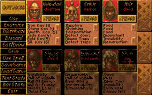
heimdall-inventoryLet’s talk about the inventory interface a bit, because that’s the one mode that I haven’t described in detail. Actually, the game calls it the “options” interface, and it does indeed contain the save/load buttons, but personally, I think of an “options” interface as something external to gameplay, which this definitely is not. So I’ve gotten used to thinking of it as the inventory interface, because that’s what you use it for most of the time. I’ve spent a substantial fraction of my playtime just shuffling loot around among my characters’ limited inventory slots. Most of the scrolls I pick up, I discard after Heimdall identifies them, but before he can do that, he has to have them in his personal inventory, which often requires freeing up an inventory slot taken up by something else he just picked up. Possibly because he’s the one doing the fighting, Heimdall is always the first to pick things up, which means his is the first inventory to get clogged. Money stacks, as do keys (with a separate stack for each key type), so it’s efficient to give each stacking thing to a single person. I decided early on that I’d just keep them all in Heimdall’s inventory, so that they’d automatically stack when he picked them up and minimize the amount of shuffling needed. But the number of distinct key types grows over the course of the game, to the point where this approach may be backfiring: Heimdall doesn’t have many inventory slots left precisely because he’s loaded with keys.

One big problem the inventory interface has is a lack of feedback. There are no rollover effects of any kind to let you know what’s clickable — no highlighting, no changing text field, not even a change in the shape of the cursor. Perhaps this concept only gained traction with the advent of the web. Since web pages freely mix clickable text links with unclickable text, they have to provide as much feedback as they can, and indeed have provided all three of the mechanisms I just mentioned since day one. And yet, there still exist people who don’t understand hyperlinks, and who never click on a link that doesn’t explicitly say “Click here”. Such a person would be utterly lost in Heimdall. It takes some flailing at the beginning to figure out that the action buttons that require objects (such as “Use”) require the object to already be selected before they’ll do anything, especially since some of them still don’t do anything if applied to the wrong sort of object. It also takes a while to get used to the fact that “Give” is only used to give items to NPCs (an action I’ve only had to perform explicitly once in the entire game so far; usually they ask for what they want and you agree via a confirmation dialog), while swapping items within your party is done with “Distribute”.

The worst part is that the parts of the interface that look the most clickable — the word “Options” in the top left and the word “Items” attached to each character — aren’t. They’re on beveled plates that look like buttons, but they’re just title text. This may be a matter of modern expectations coloring things, though. I don’t know when beveling of UI elements was invented, but it certainly didn’t become a prominent part of the user experience until Windows 95.

Ultimately, all my complaints come down to the same thing: this is a game that expects you to read the manual in order to learn how to interact with it. This was a much more common assumption in the old days. I remember that time, and it wasn’t a good assumption then either. People have always treated the manual as a device of last resort. It just took the games industry a while to realize this, and to understand that the solution was to accommodate players, not to retrain them.

Heimdall: Combat

It suddenly strikes me that Heimdall, as an RPG with realtime movement and isometric perspective, could be seen as anticipating Diablo. It took me this long to notice this because it doesn’t play like Diablo at all. Core to Diablo is the lack of separation between exploration and combat: monsters chase you around the map, attacks take place in the same realtime system as movement. That’s not the case here. Exploration is realtime, and combat is realtime, but they’re different realtimes.

As in Desktop Dungeons, all encounters are bound to fixed locations, and involve only one enemy. Sometimes you can see the enemy just standing there waiting, usually blocking a passageway. Other times, it’s a surprise: you’re walking down an empty corridor and you’re suddenly told that a monster has snuck up behind you. As with the pit traps, I can’t really see the surprise encounters as helping the game. For one thing, they’re only a surprise the first time, and I’ve been tending to go through a lot of the islands multiple times, due to not having the right keys to get to the best treasures the first time. I may even need to replay from the beginning soon: a possibly-essential item seems to have vanished from my inventory, whether through glitch or careless click.

Although you have six characters in your crew, you can only take three of them at a time ashore, and only one at a time can fight. (These vikings clearly get their ideas about battle from kung fu movies.) Combat is mainly a matter of clicking the on-screen “attack” or “defend” buttons at opportune moments. An animated illustration of the enemy takes swings at you and sometimes dodges. You can watch this to time your actions, but frankly, I don’t think I do significantly better by this approach than by just mashing “attack”.

But then, sometimes pressing the “attack” button doesn’t do anything. I’m halfway to convincing myself that only the text of the word “attack”, rather than the whole area of the button, is clickable. If true, horrible! I know that my earliest attempts at attacking failed simply because I hadn’t selected a weapon yet. This is something you have to do at the beginning of every fight; the game has no memory of what you’re wielding, and no notion of a default weapon, even if you’re carrying only one. Fortunately, every combat starts with a “Do you want to run away?” prompt that can be answered with a Y or N from the keyboard. This gives me an opportunity to position my mouse over where I know the button for my weapon will appear, so that I can save valuable seconds at the very beginning. And it’s kind of terrible that the game has me thinking like that.

Secret of the Silver Blades: Getting Started

So! Let’s get to it. The silver blades: what is their secret? I don’t know. I don’t even know what the silver blades are yet. The game opens with no mention of them, presumably because they’re secret. Instead, we have (ye gods) a something-evil-in-the-mines opening. Well, fair enough: the series hadn’t tackled this cliché yet.

First impressions: They’ve really devoted some attention to improving the engine this time around. The visual presentation hasn’t changed much (apart from reorganizing the character sheets and adding some new wall textures), but they’ve added support for two major pieces of add-on hardware.

One is the Ad Lib sound card — yes, just the original Ad Lib, not the Soundblaster, which means that we just get FM synthesis, not sampled sound effects. Laugh all you want. The Ad Lib was a tremendous improvement over the previous state of the art, the PC internal speaker. It doesn’t seem to get used much here, though: the only bit that really takes advantage of it is the intro sequence, which has background music. Still, even that little goes a long way toward making the game feel more professional than its predecessors.

The other new hardware is the mouse. This makes a big difference in a fundamentally menu-driven game. But then, the menu system had gone through something of an overhaul anyway, mostly for the better. Vertically-aligned menus are now navigated with the up/down keys instead of the difficult and unexpected home/end of the previous two games. Consequently, I’m having to retrain myself; I keep reaching for the wrong keys here. Of course, using the up/down keys like this means that you can’t scroll through a menu and use the up/down keys for movement within the world at the same time, and accordingly, movement has been separated out into its own mode. I complained about having to manually switch into movement mode in combat in Pool of Radiance, but it’s not so bad in this context, because once you’re in movement mode, you tend to stay in it for a long time. In combat, you had to switch back every round.

So I’m a bit disappointed to see that we’re back to having to manually switch into movement in combat as well, undoing one of CotAB‘s chief improvements to the UI. But you can’t have everything, I suppose.

CotAB: Final Battle

The final area of Curse of the Azure Bonds does something singularly cruel: it locks you into a final 16×16 map sector until you either die or win the game, sending unlimited numbers of random encounters at you as you explore, while not letting you rest at all — the power of the sole remaining bond compels you to keep on moving. Since your supply of both spells and hit points is limited, it behooves you to find your way to the final chamber, where you confront the demon Tyranthraxus, as efficiently as possible. In other words, the solution is to explore thoroughly, mapping all the while, until you stagger half-dead into the final encounter, and then restore an earlier save and do it right this time. And while you’re at it, take a moment to trek back across the country to that one city that has a magic store and pick up some healing and speed potions for everybody. Speed potions are the key to killing powerful creatures quickly in this game, letting your warrior-types get in extra blows. Sure, the Haste spell does the same thing, and doesn’t cost you money, but money flows like water at this point (it got so I wasn’t even picking up platinum pieces any more), and it’s better to save your precious, unrenewable spell slots for something more directly deadly.

Really, though, the limited amount of spellcasting you can do in the endgame doesn’t matter as much as you might think, because by this point in the game you’ve doubtless picked up a bunch of wands and other spellcasting items, some (all?) of which can even be used by warrior-types. And if you’re at all like me, you’ve hoarded them without using them, so they’re all at full charge. Tyranthraxus has an army defending him, but what with one guy using a Wand of Fireballs, and another guy using a Necklace of Missiles (the missiles being fireballs), and another guy just plain casting Fireball, the defenders don’t last long. The fireballs don’t affect Tyranthraxus, though. He’s basically a fire god, but I don’t think that’s why; I think he just has a high magic resistance. D&D didn’t really do much with intrinsic elemental resistances at this stage in its history. Even the Efreets 1I suppose I should pluralize it as Efreeti, but I want the plurality to be unambiguous — unlike the AD&D Monster Manual, which left a lot of players thinking that Efreeti was the singular. Curse of the Azure Bonds itself uses the term “Efreetis”. that I encountered earlier could be hurt by my fireballs, and they’re from the Elemental Plane of Fire, for crying out loud.

I don’t think I mentioned the name Tyranthraxus in my writeup of Pool of Radiance, but he’s the end boss there as well, albeit possessing a different body. And he retains some of the same habits, like letting strangers wander his territory unmolested by patrols as long as they mention his name when questioned. It’s different here, though, because until you get rid of the final bond, saying that Tyranthraxus is your master is actually the truth. Also, there’s good reason for those patrols to leave you alone: Tyranthraxus actually wants you to come to his lair, where his master plan would come to fruition, were it not for a last-second NPC-thrown monkey wrench. He turns out to be something of a puppet master in this game, manipulating you into ridding yourself of the first four bonds so that he can have exclusive control over you. That mysterious cloaked figure who I thought was probably Elminster? Not Elminster. Elminster doesn’t show up at all. Perhaps he was only mentioned in the manual to fool the player as I was fooled.

Anyway, that’s another Gold Box game down. By now I’ve pretty much gotten used to the user interface, including the peculiar key combinations required for diagonal movement on my laptop. (I did try an external keypad, but found it even more awkward than the combinations.) But also, the user interface is improved over Pool of Radiance in a number of ways that weren’t obvious at first. Remember how I said that what the game really needs in combat is something more like a rogue-like interface, where you can just move the current character without hitting a key to go into movement mode? CotAB supports something very close to that: there’s still a separate movement mode, but you automatically switch into it from the main action mode when you press a direction key. So, yay incremental improvements! Let’s hope they keep coming.

References
1 I suppose I should pluralize it as Efreeti, but I want the plurality to be unambiguous — unlike the AD&D Monster Manual, which left a lot of players thinking that Efreeti was the singular. Curse of the Azure Bonds itself uses the term “Efreetis”.

Curse of the Azure Bonds

So, going straight from the first game in the Pool of Radiance series to the second, what’s changed?

Well, first and most obviously, it’s higher-level. PoR started you out with freshly-minted level 1 heroes and guided them to level 6, 8, or 9 (depending on character class), at which point additional experience points simply pile up, any additional leveling deferred until you import the characters into CotAB, which takes you as far as level 10, 11, or 12 (again depending on class). CotAB doesn’t even support low-level player characters; newly-created ones start at level 5.

Higher levels means more complexity: more new spells, more new special-case rules that kick in at high levels. A level 10 Thief, for example, has a chance of successfully casting spells from a scroll — another of the less-imitated D&Disms. And apparently the developers felt that if they were throwing in new complications, they might as well let us have dual-classed characters (a concept distinct from multi-classed characters, although as a child I found this all too arcane to follow), as well as a couple of subclasses.

Back in first-edition D&D, it was apparently considered important that every player character be essentially one of the four classic base classes (Fighter, Magic User, Cleric, and Thief), but subclasses provided some variation. Thus, they’re the forerunner of what later editions would call Prestige Classes and Paragon Paths, although most of the specific first-edition subclasses are simply base classes today. 1The exception is the Illusionist, which isn’t even a class any more. Illusionist spells simply got folded into the regular Magic-User spell list. Ranger and Paladin, the subclasses of Fighter, are the only ones available here: there’s no Illusionist, Assassin, or Druid, although the manual lists a few basic Druid spells because Rangers can learn them. This means there are six classes available, exactly the right number to have one of each in your party (much like in Might and Magic). This is what I’m trying first, even though the result seems kind of lopsided to me: three fighter-types and only one mage. I suppose it’ll smooth out a little once two of the three fighters start learning spells. If not, I can always swap out the vanilla Fighter.

In presentation, the game isn’t much changed from PoR. The window borders are different now, PoR‘s twisted-cord motif replaced with fractured stone. The ludicrously crude customizable character portraits are gone (so no more putting the bearded dwarf head on the chainmail-bikini chyk body), but the customizable character icons are still around. The horrible UI has some small improvements: for example, multiple spell-memorizations are now displayed stacked. (That is, if you memorize Magic Missile three times, it’s listed in the spell-selection menu as “Magic Missile (3)” instead of occupying three rows.) Probably the biggest improvement is the Fix command, which you can activate in camp to make your Cleric(s) cast Cure Light Wounds as many times as possible, then rest up to memorize it again, and repeat the process as many times as necessary to get the entire party to full health. This is a process I went through countless times manually in PoR. So it’s good to see that the developers were actually paying enough attention to how people played to see a pattern worth streamlining. It sure isn’t the improvement I would have asked for first, though.

References
1 The exception is the Illusionist, which isn’t even a class any more. Illusionist spells simply got folded into the regular Magic-User spell list.

Pool of Radiance: Other UI

I’d like to expand a little on what I said in my last post. What I said about combat mode applies just as well out of it: frequently, just when you think you’ve given the game enough information for it to execute your intentions, it asks for one more key.

For example, consider the act of memorizing spells. This is a (pre-4th edition) D&D game, and, as such, it uses the absurd Jack-Vance-inspired notion that spells have to be re-memorized every time you intend to use them. 1By 3rd edition, D&D was trying to mask the absurdity by replacing “memorize” with the more ambiguous “prepare”. That fixed the conceptual weirdness, but still left the problem that the mechanic itself was unfun and didn’t really fit what we expect of a wizard. So, every time I rest, I go into the spell-selection menu for each spellcaster, and I select “Cure Light Wounds” three times or whatever, and I hit “E” for Exit. But before the game allows me to actually exit, it asks me if the spells I just selected are the ones I want to memorize. 2[Added 5 February 2010]Actually, it’s even worse than I remembered. You have to press E twice. Once to get to the screen showing the spells you’ve selected, and one more time, once you’re there, to bring up the confirmation question. The second one in particular is completely unnecessary. You can do nothing at that screen except bring up the confirmation. It’s as if a Windows app popped up a dialog box saying “Press OK to bring up confirmation dialog”. Why, yes, I do, that is why I chose them. I can see why they did this: the interface that they chose for spell memorization otherwise provides for no way to see what you’ve selected, and no way to undo your choices. Thus does one bad design beget another. Once you’ve chosen the spells to memorize, you have to rest in order to do it. This involves hitting the “R” key twice — hitting it once brings up a menu where you can select how many days, hours, and minutes you want to rest, which is unnecessary detail most of the time, and best skipped unless the player requests it. Mercifully, if you’ve got spells to memorize, it automatically populates this form with the time necessary to memorize spells under the first-edition D&D rules — four hours and fifteen minutes for a level-1 spell, apparently. If your rest is interrupted by a wandering monster, however, it forgets all about what you were trying to memorize and you have to go through the spell-selection process from the start.

At the end of combat, there is loot. Let me switch gears and talk about Final Fantasy for a moment. Some (all?) of the Final Fantasy games prompt you to take loot after a battle. Sometimes it’s presented as an explicit question: Do you want to take this stuff? And it’s always struck me as unnecessary, because you never answer “No”. But it’s always seemed excusable there as providing a modicum of agency: you could turn down free stuff if you wanted to, and that makes it feel a little different from just having it foisted on you. It’s tolerable mainly because all it takes is a press of the default do-thing button, which you already have your thumb on at the time. In Pool of Radiance, you’re expected to press “T” for Take, then choose Money or Item, and then choose the individual moneys or items one by one from a further menu. For money, you get a menu of all the coin types, and have to select the type(s) you want (even if there’s only one type available), and then type in the quantity of that coin you want to take. And again, I can see where they’re coming from. In D&D, unlike in Final Fantasy, your carrying capacity is limited, and even coins have weight. There are definitely situations where you’d want to refrain from picking up a heap of copper pieces. But those are the exceptional cases. What you want to do most of the time (at low levels, at least) is take all the coins of every type. So that should be made easy.

I suppose the underlying problem is that, unlike other early CRPGs, Pool of Radiance wasn’t free to come up with game mechanics that suit the medium. The designers were trying to stay as close to the actual D&D rules as they could, or at least maintain the appearance of doing so. But even taking that into account, the UI here seems more demanding than it needs to be. It’s easy to say that today, with the benefit of more than two decades of usability research and gaming experience behind us, but it suffers even in comparison to its predecessors.

To take one final look at combat mode: I mentioned that there were two ways of selecting targets, “manual” mode, in which you move a cursor around (starting from the fellow doing the targeting), and the default mode, in which you cycle through possible targets with next/previous keys. Manual mode is a lot easier to deal with. You know why? It doesn’t require visual feedback between keypresses. You can look at the screen and say “I want to cast this spell at the guy three squares up and one square to the left”, then type M Up Up Up Left Enter and you’re done. With the cycling targeting, you have to check after each press of N to see whether you’re on the right guy yet or not. They made the cycling targeting system the default. This says to me that they were taking significant pauses between keypresses for granted — which is probably reasonable, given the state of hardware at the time. So is it just by luck that Wizardry and Might and Magic failed to fall into this trap?

References
1 By 3rd edition, D&D was trying to mask the absurdity by replacing “memorize” with the more ambiguous “prepare”. That fixed the conceptual weirdness, but still left the problem that the mechanic itself was unfun and didn’t really fit what we expect of a wizard.
2 [Added 5 February 2010]Actually, it’s even worse than I remembered. You have to press E twice. Once to get to the screen showing the spells you’ve selected, and one more time, once you’re there, to bring up the confirmation question. The second one in particular is completely unnecessary. You can do nothing at that screen except bring up the confirmation. It’s as if a Windows app popped up a dialog box saying “Press OK to bring up confirmation dialog”.

« Previous PageNext Page »