WoW: Staring at UI

When you’re adventuring with a party in WoW, there’s a lot going on at once. Spell-sparks fly around so thick thick and rapid, and the state of the battle changes so swiftly, that it’s basically impossible for a newbie like me to follow the action. Like the robot fights in the Transformers movie, it’s just a big wodge of undifferentiated violence. The tendency of pick-up groups to just keep charging forward without plan or explanation just makes things worse.

So what you do is, you don’t pay attention to the battle. You pay attention to the user interface. In particular, playing the role of Healer, the graphical representation of the world is almost irrelevant: the information that needs your attention is in your teammates’ health bars, and, more significantly, not in the world at all. If you turned off the UI layer, you’d have no idea what to do.

This effect isn’t even exclusive to multi-player play. When you take on a quest that involves singling out particular types of creature, there might be other, similar creatures in the area that don’t count. How do you distinguish a Dying Kodo from a mere Aged Kodo? There are probably differences in the model or texture maps, but the game doesn’t rely on the player noticing anything so subtle. No, the ones that are relevant to the quest have their name floating above them. (Any creature gets its name above it when you target it, but quest goals have their name above them simply because you should target them.) The words are usually easier to spot than the creatures, too.

Or consider the act of gathering herbs. How do you distinguish a pickable herb from random noninteractive foliage? Often the herbs have coloration that makes them stand out, but that’s far from reliable. No, you spot them through the cursor rollover: the action cursor for herb-picking is an icon of a little cluster of flowers. Stop to think about that for a moment. In your view of the gameworld, there is graphical representation of a plant, but in order to understand it, you need to see another graphical representation of a plant, at the UI level.

The point is that you just can’t rely on the 3D world to give you the information you need, so you spend most of your time looking at UI instead. Which is a bit of a shame, because the gameworld is really beautiful.

WoW and Loathing

If there’s one thing that starting to play World of Warcraft has given me so far, it’s a greater appreciation of its influences in other games. In particular, several aspects of Kingdom of Loathing that I had taken to be simply drawn from CRPGs in general turn out to be direct imitations (or satires) of things in WoW. Which is a little strange, because KoL was in fact released first. But both games have changed substantially since launch.

For example, one of the more noticeable additions to KoL from about three years ago was an optional alternate combat interface. Before this, combat was done with a simple HTML menu with a couple of drop-down lists. The new interface used DHTML to present a row of numbered boxes, into which you could drag icons representing skills or combat-usable inventory items, which you could activate by either clicking on them or by hitting the corresponding number key on your keyboard. It also supported multiple banks of such icons, with buttons for paging up and down between banks. In short, it was an awful lot like the WoW action bar, except for the fact that it only applies to combat. In WoW, it’s the main way you perform any action in the game.

One of the more useful icons you can put on the KoL action bar represents the command “repeat last thing” — either repeat the last action when in combat, or, afterward, adventure again in the same location. The icon for this is the number 1 in parentheses — “(1)” — which is sort of a joke on the notation used throughout the game to warn players that an action will cost an adventure. The zones on the maps are all marked with strings like “The Spooky Forest (1)”, but this icon obviously doesn’t know what zone you’re adventuring in, so all it can display is the “(1)”. Anyway, now it seems to me like it’s also poking fun at WoW‘s “!” icon in its action bar, the icon for accessing the quest log. It similarly takes a piece of UI typography and elevates it to the status of symbol.

KoL doesn’t have or need a quest symbol of this sort, because questing of the kind you do in WoW isn’t a very big part of the game. But there’s one thing that’s very much in the same vein: the Bounty Hunter Hunter. The BHH’s job is to find and hire adventurers willing to go after specific monster types for a reward. You can approach him once per day to start hunting something, with the choices available varying from day to day. In other words, it’s what WoW calls a “daily quest”, and like several of the WoW dailies, the reward is a special pseudo-monetary token that can only be spent at the same premises that awards it. But the biggest WoWism here is the way that questing for a particular creature makes it drop a special quest-redemption item that it never drops otherwise. I thought this was very strange when I first encountered it in KoL, but it turns out to be one of the fundamentals of WoW. It should be noted that before 2007, the Bounty Hunter Hunter worked completely differently: he just bought a daily assortment of ordinary monster-leavings for twice the usual price. But this didn’t encourage people to go out and hunt the day’s selected monsters; it just encouraged them to hoard their trash until it the BHH wanted it. So switching to the WoW model here was probably a good idea.

I don’t want to imply that KoL is just a WoW imitation. They’re very different games, and most of KoL‘s mechanics are either original or cribbed from other browser-based games. But they do occupy more or less the same niche in my mind, of a game that’s as much a social experience as a gaming one, and that gives you the feeling that you have to play every day to really keep up.

Eufloria: Wrapping Up

Posting really late this time: I managed to breeze through the remainder of Eufloria on Sunday afternoon and evening. Some days, writing is just hard.

I said before that there was never a good reason to zoom in in Eufloria. This isn’t quite true. There are two reasons do to is. First, taking a closer look at enemy seedlings can give you information about their stats. The stats — Energy, Strength, and Speed, all determined by the properties of the asteroid where they sprouted — determine a seedling’s shape and size. This isn’t very useful, though; although having better stats doubtless helps, battles are generally won through overwhelming numbers, and you don’t need to zoom in to see those.

The other reason is that you have to zoom in order to reposition your view. There’s no way to just scroll around the battlefield directly; all you can do is zoom into a spot near the edge and then zoom out from there. A peculiar UI choice, and not the only one — to some degree, this game is a showcase for experiments. Consider the way you send seedlings from one asteroid to another. You can send the asteroid’s entire population by left-dragging from source to destination, or you can right-click the source repeatedly to increment a counter of how many you want to send, one seedling per click. Neither of these options is ideal when you want to split up your hundred-strong armada into two groups to pursue different routes. The solution here is to left-drag out only a little way — the targeting interface that shows the limits of where you can travel to also shows a circle around the asteroid you started at, and within the bound of that circle, your mouse-dragging acts like a radial slider for selecting anything up to 100% of the seedlings there. It was only well into the game that I started taking advantage of this, partly because I didn’t really understand it. The game could stand better documentation (or any at all), but then, I probably wouldn’t have read it anyway.

It turns out that there was only one more game element to be introduced after my last post: the flowers that I planted to let my defensive trees grow orbital defenses could alternately, past a certain level, be used to enhance seedling production. Beyond that, the remaining levels produce variety through the scenarios. One level plays with scarcity, in the form of asteroids that could only support one tree, or none at all. One is a timed survival challenge, one is an escort mission. Several of them have plot triggers when you explore particular asteroids — for example, one level has a particularly large one in the opposite corner from where you start, obviously serving as the enemy home base, until you actually reach it and discover that it’s just the beginning of a larger empire, which immediately attacks you. (This is where the limitations on scrolling around become important: they prevent you from knowing the true extents of the level.) Occasionally, the triggers are outmoded by the time you reach them: I recall getting a pop-up describing how the planet I had just explored had fallen victim to the “gray plague” (a side consisting of senselessly aggressive zombie seedlings), when in fact another computer-controlled enemy had already driven it out.

In short, most of the game is spent on the sort of thing I can imagine happening in any other RTS. But in a way, I think that’s the point: that your basic RTS tactics don’t have to be coupled to conventional military imagery. You can put them in a world of pastel colors and gentle ambient music and it works just as well.

Zen Bound 2

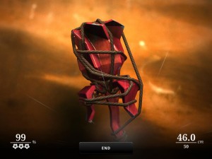
Rose and ropeZen Bound 2 is a sequel to a cell phone game, and a pretty convincing argument that cell phones are where the real innovation in gaming is these days. It’s a game about wrapping things in rope.

Each level gives you a small wooden sculpture with a taut rope tied to a nail in it. Purely by rotating the object, you reel the rope around it to bind as much as it can. Parts of the surface within a certain distance of contact with rope get coated in paint, which comes off if you unwind — clearly it’s not so much paint in the realistic sense as a means of visualizing your progress. Once you reach a minimum of 70% of the surface painted, you can tie the rope off at a second nail to end the level, or you can keep going for more paint and greater glory. Challenge is created by limiting the length of the rope, and through hard-to-reach concavities. Remember, you can’t just thread the rope through things; it’s always taut, and only goes into grooves if the groove is where its tension leads it. On a couple of occasions, I’ve had difficulty just reaching the final tie-off nail because of this. There are a couple of embellishments beyond this — paint bombs that cover a larger area, attached to either additional nails or to your rope — but this is a game of simple design, and getting much beyond the basics would be inelegant.

The “zen” part of the title, apart from supplying a rationale for Japanese garden imagery in the menus, seems to mostly just mean that there’s no time pressure, or indeed pressure of any kind. Getting to 100% coverage on every level would be a feat (and provides an Achievement), but just getting through the minimum seems like it just requires idle fiddling. I don’t think I’ve ever seen a game more deserving of being called “casual”. It’s a simulation of toying with knick-knacks.

The technology necessary for this game to exist, though, is pretty advanced. It needs a way to apply the paint texture to arbitrary portions of a surface. It needs a good physics model — usually in games that mostly means collisions, but here it means tension and friction, making the rope slide along surfaces in convincing ways. And it needs a really good UI for rotating 3D objects. Apparently the iOS version uses tilt and multitouch for this, but that’s not an option on PC. I’ve had to implement rotating things in 3D with a mouse before, and it’s surprisingly hard to get it feeling right — mainly because 3D rotations have three degrees of freedom, but your mouse has only two. Usually, as a player, I can get used to whatever scheme has been implemented, but in this game, absolute control is crucial. So it comes up with a compromise: dragging with the left mouse button pressed rotates things one way, dragging with the right button rotates things another way, and between the two schemes, everything is covered. I’ve played the game enough to internalize this, but I couldn’t tell you exactly how it works geometrically, except that the right button lets you rotate about the direction the camera is facing.

Duels of the Planeswalkers

So, I’m continuing to let that “Treasure Hunt” promotion on Steam dictate what I do with my spare time. The latest round featured two games that I already had. First up is Magic: The Gathering – Duels of the Planeswalkers, the newest and slickest adaptation of the card game. I purchased this a while back when it was on sale for about the price of a booster pack. And now that I’ve spent a little quality time with it, I’ve already completed its single-player campaign, as well as all of its “challenges”. I rather like the challenges. They’re essentially Magic: The Gathering problems, in the same sense as chess problems. You’re shown a situation from late in a game, and have one turn to win, which you can only do by exploiting some unintuitive combo. In other words, it’s the best part of the original game, isolated.
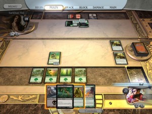
Yeah I'm not winning this one.DotPW is a pretty straightforward adaptation: it’s presented as a card game, and makes no pretense at being anything else, apart from some sound and graphical effects on casting spells or resolving combat. But it’s a card game played on an attractive table, with a nicely responsive UI. There are some interesting things going on with tooltips that expand to give more information if you hover over a card longer. Your hand is displayed as a row of overlapping cards, with mouse rollover bringing specific cards to the front and enlarging them slightly; move the mouse away, and the card reduces to its original size, but stays in front. Spells you can currently cast are highlighted with a sort of glowing aura around their edges. You can zoom into and out of a full-screen-height view of a card with a flick of the mouse scrollwheel, which feels a lot better than it sounds. Still, I have complaints. There are a couple of buttons at the bottom of the screen that overlap with your hand, and when you roll over them, you get the card rollover effect as well, which falsely implies that clicking there will activate the card. The menu at the top of the screen, which you use for things like changing options or quitting the game, always confuses me. The button labeled “menu” toggles it between showing the menu and showing a display of the current phase, with the phase display appearing as a beveled layer on top of the menu, which is painted directly on the surface of the window border. In other games and apps where you have to explicitly summon a menu bar, it appears as an overlay on top of the window, not as the thing remaining when an overlay goes away. So every time I summon the main menu, I’m briefly confused into thinking I’ve accidentally banished it instead, and sometimes click the button again to bring it back, which sends it away for real.

As someone who used to play M:tG but doesn’t follow it any more, it’s always interesting to see how the cards have developed since the last time I paid attention (which is to say, the last time a M:tG computer game game out). I’m noticing that some things that used to be special properties of specific cards are now attributes covered in the general rules, and represented by icons in the UI here. For example, giant spiders have always had the ability to block flying creatures despite not being flying creatures themselves, but nowadays, it seems, it’s because they have the “Reach” attribute, which I assume is shared by some other cards. At the same time, of course, a new set of exceptions move in to take their place. I noticed that there are multiple Flying creatures here that, unlike most fliers (but like all flying creatures in Magic: The Gathering – Battlegrounds), can’t block non-flying creatures. I suppose this means that this could become an Attribute in future editions — call it “terraphobic” or something. Or perhaps not: the main advantage of Attributes over Exceptions seems to be that they can be granted as effects from enchantments and the like, and binding an effect like that to any arbitrary creature might not make good gameplay.

The one really curious choice here is that the game doesn’t let you make your own deck. Instead, you unlock various pre-made decks, then unlock additional cards for use in those decks. This cuts out about three-quarters of the M:tG experience. Furthermore, I’m told by someone who’s a lot more into M:tG than I’ve ever been that the decks available here are substandard. Which, I suppose, is why they don’t let you mix them up: there’s a good chance you’d come up with something better. Me, I’m far enough out of the loop to be satisfied with what I’ve been given, to take the more Etherlords-like constraints as part of this game, as opposed to real M:tG. But that raises the interesting question of just who this game is for.

There are games that you play once and they’re over: adventure games and puzzle games are the firmest examples. Like books and movies, they can enter the cultural vocabularies of the people who have played them, but they’re things that their fans have played, not things that they play. When they’re not freeware, the business model behind games like this is to keep selling you new games. Then there are lifestyle games: things like World of Warcraft and Team Fortress 2, things where the fan community consists of people who play them routinely. One of the hallmarks of this sort of game is focus on multiplayer play, which keeps people invested with minimal effort on the developers’ part. The business model here varies — WoW has monthly fees, TF2 seems to have been basically a loss leader for Steam until they discovered the lucrative hat market, and then there are ad-supported and DLC-supported games. DotP clearly wants to be a lifestyle game supported by DLC. It pushes players toward multiplayer play with its very short single-player campaign, and it has multiple expansions containing new decks (not to mention frippery like the “foil unlocks”, which let you pay a dollar just to make your cards shinier.) But you’d think that the people who’d want to keep paying for extra content would be the die-hard M:tG enthusiasts, whereas this game is set up, at a foundational level, to cater to the newbies. The fixed decks put a limit on the extent to which knowledge and experience of the game can affect the outcome: no one can build a deck significantly better than yours, and luck of the draw plays an even larger role than in normal M:tG. It solves the basic problem with face-to-face M:tG, the problem of how the newcomer can hope to compete with the guy who spends hundreds of dollars getting just the cards he wants in his deck. On the other hand, it seems like this wouldn’t be considered a problem by the guy who spent the hundreds of dollars, or by the vendor he paid them to.

But who am I to talk? Apparently DotP has sold really well. Maybe Wizards of the Coast has the right idea here: the number of dedicated M:tG fans has surely dwindled over time, whereas people like me, who have a slight interest in the game but not enough to actually buy cards or find other players, are surely legion. DotP is a game designed for us, the tourists in the Magic world. It takes us by the hand and shows us the sights, and lets us indulge in a fantasy of playing a game, with all the complicated and unpleasant parts removed. We may not be all that dedicated to the game, but judging by the Steam Global Achievement list, a little over a third of us went as far as to buy the first expansion.

I probably won’t go that far myself. I think I’ve learned what I wanted to learn from this game. But I can imagine it happening after a while, particularly if I can get the online component working. M:tG is moreish: you always want to keep playing until that one ultra-powerful card or combo comes up, and once it does, the match is over before you can really savor it. So I might keep bringing this game out, and if I do, I can imagine getting bored with the decks it provides and wanting a fresh batch. If it happens, I’ll report it here.

Arkham Asylum: Controls and Feel

I’ve heard the controls in Batman: Arkham Asylum described as “solid”. A lot of people seem to have independently hit on this word to describe the feel of the controls, but what does it mean? I think it’s mostly a matter of the feedback: any time you press a button to perform an action, the game plays a satisfying sound cue, and often shifts the camera, the better to show Batman very decisively acting as instructed. Also contributing to the “solid” feel is that your actions pretty much always succeed. When you fail, it’s because you did something foolish, like charge at someone with a gun rather than sneak up on him or take cover and throw batarangs at him. You don’t fail because you attempted the right thing but got the timing slightly wrong and didn’t execute it correctly. After all, you’re Batman. Batman executes everything flawlessly. Even in combat, you don’t throw punches and miss. You press that punch button and someone gets punched. With a bone-jarring thud, and sometimes in slow motion. You can fail in combat, but only by making bad decisions, like trying to do a takedown move on one guy when another guy is preparing to hit you.

I once said that in some console games “the level of detail in the solution… is on a much coarser scale than the level of detail in the presentation“. The feel I’m trying to describe here has a lot to do with that. On the screen, there’s a lot of messy analog stuff going on with physics, but the exact placement of objects in the world seldom matters much. Anything important happens at the story level, the level of deliberate decisions. A lot of what you do is stuff that could be expressed in a text adventure with no loss of detail, like kicking a grating off the wall or using a gadget to make a sentry move away from his post. There may be an infinity of routes you can take from point A to point B, but all that matters is whether you chose one of the routes that has sufficient cover from observation or attack — and that will be a route that a game designer intended. There’s enough simulation that the game doesn’t just come down to CYOA, but the interactions between game elements are all very planned-out in a way that makes me think of the methodologies recommended by Jesse Schell.

Having played the game a bit with both a gamepad and mouse/keyboard control, I find it interesting that the two control schemes are not completely isomorphic. In most games, I’d expect the left mouse button to perform the same function as some particular button on the gamepad, probably the one that performs an attack or whatever the most commonly-executed action is for that game. Here, the left mouse button is indeed the “punch” button, but it’s also the “use gadget” button when you’re in gadget mode. (Being in gadget mode basically means using your analog controls to choose where to aim the gadget.) It makes sense for both of these actions to be on the left mouse button because they’re both your basic “do the thing now” action in their particular contexts. But with an Xbox controller, which doesn’t have a single most privileged button, those two actions are separated: “punch” is the X button, “use gadget” is RT (the right trigger button). It makes sense to put “use gadget” on the right trigger because pressing and holding the left trigger is what puts you into gadget mode in the first place, and the easiest thing to use in combination with a trigger button is the other trigger button. With mouse/keyboard controls, the thing that puts you into gadget mode is holding the right mouse button, which is also the “counterattack/take-down” button if you just click it instead of holding it.

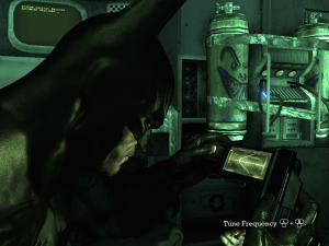
Kind of like playing the videogames in the Strong Bad adventure games.Probably the most problematic adaptation, and the clearest illustration of the fact that the game was designed around a gamepad, is the Cryptographic Sequencer. This is a sort of lockpick for the game’s many electronic locks. You operate it by twiddling a couple of knobs to tune a waveform and holding it for a second in its optimum position when you find it. With a gamepad, you do this with the two analog sticks. A colleague of mine has praised this as being the one thing in the game that makes you feel the most like you’re Batman: he’s on the screen doing exactly the same thing that the player is doing, manipulating a pair of rotary controls with his thumbs, in unison with your own movements. But with keyboard/mouse, you don’t have an analog control under each thumb; only one hand has an analog control. The designers apparently decided that the feel of controlling each knob with one hand was the important part, and made it so that you control the left knob with the keyboard, using the A and D keys to twiddle it clockwise and counterclockwise, and the right knob with the mouse, using the left and right mouse buttons — yes, not even using the mouse as an analog control, presumably for consistency with the other knob. The result is unintuitive and not at all as solid-feeling as using gamepad.

Bioshock compared to another shock

Even if it didn’t have the word “shock” in its title, I think it would have been clear that Bioshock owes a lot to System Shock 2. It’s got the same sort-of-RPG thing going on, and the same FPS-in-presentation-but-not-in-emphasis vibe. It’s got the same sort of backstory revealed by audio messages and journal entries scattered in unlikely places, as well as the occasional pseudo-scientifically-justified “ghost” cutscene, a very distinctive technique. It’s got the whole business of automated gun turrets that can be hacked to be on your side, as well as the equally-hackable security cameras that summon robots (here presented as not very bright, and awkwardly flying on little helicopter blades) if you stand in front of them for more than a second or two. It even keeps some of the really idiosyncratic touches, like the way that cigarettes restore a little mana at the cost of a little health.

Where does it differ from SS2? Well, the setting, obviously. Being under the ocean isn’t very different in practical terms from being in space — in both cases, it means you’re stuck in a constrained environment in the middle of something deadly, and that the authors can make plot points of the limited oxygen supply — but at least it means that when there are windows (or, better yet, glass tunnels), there can be something interesting to see through them, like gratuitous schools of fish.

SS2, like Deus Ex, had an “Inventory Tetris” system, where picking things up required slotting them into the free space in a grid, with bulkier items taking up multiple slots. People generally didn’t like it, so Bioshock scraps it. In fact, it doesn’t have a general inventory interface at all. Some things, like the aforementioned cigarettes, are simply put outside any kind of inventory by making you use them immediately when you pick them up. Health packs and Eve hypos (mana potions) show up as a number next to the appropriate bar in the main UI, and ammo levels can be seen from a special weapon/plasmid selection screen. There doesn’t seem to be any way to get a list of your currently-installed gene tonics other than going to a Gene Bank, the machine that lets you swap different tonics into the active slots. Similarly, the only way to find out how much of the various components for “inventions” you’re carrying is to take them to one of the machines that lets you assemble them. I don’t much like this. Simplifying the interface is one thing, withholding useful information is another. I swap my gene tonics around a lot, adjusting them to the situation; as a result, I don’t necessarily know at any given moment which ones I have installed, and therefore what sort of actions I should be attempting.

Which brings us to the biggest chance from SS2: the ability to swap in different upgrades. In SS2, once you bought an upgrade, it became a permanent feature of your character. Even before the game proper started, you were asked to choose to specialize in weapons, tech, or psi (magic). I get the impression that most players never did much with the game’s magic system as a result. It wasn’t a very attractive option once you knew the rules — just as in Bioshock, the only way to gain mana was with the equivalent of potions, and at the point where you were asked to choose your specialization, you had no idea how abundant they would turn out to be. But Bioshock lets you experiment with things by changing your specialization on the fly. I compared the research mechanic to the Final Fantasy V “Jobs” system before, but this respeccing reminds me of it even more. I made negative comments about killing everything with the wrench, but if that’s how you want to play the game, you can get tonics that support it. You can even be a sneak-attack wrench specialist, thanks to a gene tonic that makes your footsteps quiet and increases the wrench’s damage against unsuspecting foes.

For my part, I haven’t done a lot of sneak wrenching, but I have come to really like another stealth-gameplay tonic, one that turns you invisible when you stand still for a second or two. There’s a particularly joyous scenario this enables: you accidentally trigger an alarm, and the bumbling and buzzing security drones come after you, so you duck behind a corner and then just stand there, and watch the bots just fly past looking for you. And by far my favorite combat technique is to use a certain plasmid to hypnotize a Big Daddy into thinking I’m a Little Sister and fighting in my defense. I don’t remember doing any of this stuff in SS2, but that’s probably just because I didn’t take the right upgrade path.

Freedom Force: UI

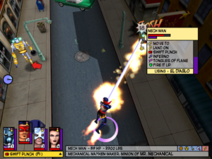
ff-actionmenuThe user interface in Freedom Force is generally a joy to use. It’s a really good example of a mature system, but with a few bits of experimental oddity. The maturity mainly has to do with streamlining commonly-executed actions and providing multiple ways of doing things — for example, that you can select characters by clicking on them, or by clicking on their portrait at the bottom of the screen, or by pressing the number keys corresponding to those portraits. Since I’m used to using the number keys to switch weapons in first-person shooters, I find this last approach easiest. This is why I know that you can also use the number keys in ways more commonly associated with the mouse, such as double-tapping (which centers the viewport on that character), or pressing in combination with the shift key (to select more than one character at once, just like selecting multiple items in a drop-down menu). Of course, when you select multiple characters, it’s most commonly because you want to select all of them, to send them to a particular point on the map. This is simplified to a single key-press, and furthermore, one that’s easily discoverable by accident. (It’s the 5 key, just one to the right of the last hero hotkey.)

The simplest actions within the world can be performed by left-clicking on stuff, thus telling your hero to perform whatever the obvious action is: picking it up, talking to it, or whatever the context demands. If the thing you click on is an enemy, the obvious action is performing your default attack, which you can change at will. If you want to do something else, you can bring up a menu by right-clicking, which automatically pauses the game. Now, there’s a little display area at the bottom of the screen where it gives you a little information about what the cursor is currently over (including a handy summary of what sorts of damage it’s vulnerable and resistant to — yes, even inanimate objects have resistances, which is why, for example, it’s easier to destroy a brick wall with an explosion than with a radiation beam. 1Some seemingly inanimate objects even have mental states. During a mission to destroy a supervillain’s massive ray gun installation, I managed to render it Stunned, complete with animation of stars circling where its head would be if it had a head. ). And this is important information, because sometimes you want to target specific parts of things — the alarm on a guardhouse, for example. But even with that to guide you, it’s easy to right-click on the wrong thing — probably because keeping an eye on that status bar involves looking at a different part of the screen than where the cursor is (a problem with status-bar-based UIs that I’ve noted before). So they made the right-click menu moveable: as long as you keep the right mouse button held down, you can scan around with it, watching the menu change as it goes. This is one of the experimental oddities I mentioned. It should be noted that the background color of the menu changes according to what sort of thing it’s on, making it very easy to stop moving the moment you drag over an enemy.

Hovering over an option in the action menu displays a great deal of information about it: the tooltip area at the bottom turns into a summary of the effects, and the display in the world gives such information as the line to the target (useful for finding out if ranged attacks are blocked), whether or not you’re in range (indicated by the color of aforementioned line), and, if applicable, the blast radius (rendered as a sphere). The action selection menu itself contains a bar chart showing how much Energy you’ll have left if you select the action. You can choose to perform actions you don’t actually have enough Energy for, but you risk winding up Stunned if you do, kind of like spellcasting in Angband. 2It strikes me only now as I write this that I have a couple of heroes that are capable of curing mental states such as Stunned. Perhaps there’s a viable strategem to be made of this, of overpowering all your attacks and letting the cleric take care of the consequences. This is reflected by making the Energy bar flash red — the redder, the riskier. Raising and lowering the charge on your attacks is accomplished by right-clicking on the power to bring up a sub-menu, a rare example of a right-click menu within a right-click menu, and another element that I’d call an experimental oddity. It works, though.

The system for controlling the camera is, in my opinion, the least successful part of the UI.
Using arrow keys or WASD to scroll the viewport is fine, as is zooming up and down with the mouse wheel. (There’s a way to do this with the keyboard as well, but I’ve forgotten it. The wheel is just more convenient.) But I never got the hang of rotating the camera view, which involves combinations of key presses and mouse movement. I generally leave the camera orientation alone, and it works just fine. It means I’m not always ideally situated to see what’s going in in narrow alleyways, but I can always get a good-enough view by zooming way in: once you’re close enough, walls are rendered semi-transparent.

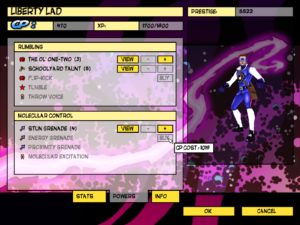
ff-upgradesOutside of the missions, everything is a set of nested menus, with a very satisfying “clunk” sound accompanying every selection. I spend fairly large amount of time in these, specifically in the upgrade section. Whenever a hero levels up, they get 600 “Character Points” to spend on gaining new powers or upgrading existing ones, and it’s always an agonizing choice. (The worst of it is that some powers cost more than 600 CP, so you can only afford them if you forgo upgrading for a level.) This is also where you can get full information on each ability’s stats, available on a separate screen by clicking the “View” button. And here lies my one complaint about the UI. In order to decide whether to spend the points on upgrading an ability, I need to know how the upgrade will affect it. The only way to find this out is by going to the “View” screen, committing its contents to memory, backing out, upgrading it, and then going to the “View” screen again. It could be worse: at least you’re allowed to undo your purchases (until you commit them by leaving the upgrade menu entirely). But I can think of any number of CRPGs that handle this better, displaying the current and improved stats side-by-side, sometimes with highlight colors. I hope the sequel addresses this.

References
1 Some seemingly inanimate objects even have mental states. During a mission to destroy a supervillain’s massive ray gun installation, I managed to render it Stunned, complete with animation of stars circling where its head would be if it had a head.
2 It strikes me only now as I write this that I have a couple of heroes that are capable of curing mental states such as Stunned. Perhaps there’s a viable strategem to be made of this, of overpowering all your attacks and letting the cleric take care of the consequences.

Dino Crisis: Health and Ammo

Ammo is more valuable than medicine. That much is clear.

Medicine allows you to recover from being hurt. This is well and fine when you’re hurt, but why do you get hurt? Because of dinosaurs that aren’t dead yet. This is the only reason. Nothing but dinosaurs can hurt you. And dinosaurs cannot hurt you when they are dead.

Unconscious dinosaurs can’t hurt you either, so that’s almost as good. But they don’t stay unconscious forever, whereas they do stay dead forever. Tranquilizer darts have two advantages over regular ammo, however: they’re relatively easy to produce, and can be enhanced to the point where it takes only one hit to down anything smaller than a tyrannosaurus. 1Yes, I’ve finally encountered therizinosauruses. Just as I thought, they’re basically just bigger, tougher raptors — but also slower, and easier to run past in hallways without taking damage. Taking dinosaurs out quickly is the best way to not get hurt in the short term, but killing them prevents them from ever hurting you again. Every time you take out a dinosaur, you have the choice of taking it out quickly or taking it out permanently. Unless you have the rarest of all ammo types, the instantly-lethal poison dart. Supply boxes sometimes have a single poison dart on top of everything else, and this has been my main impetus to open as many supply boxes as I can. Poison darts are the player’s way of saying “I don’t feel like putting any effort into defeating this guy.”

Now, I mentioned enhancing tranquilizer darts. This is done through the “mixing” interface, which is also used for enhancing healing items. Mixing things is generally worthwhile. Partly this is because of synergy effects: for example, mixing a med pack with a hemostat (medicine that stops you from losing health from loss of blood) produces two units of an enhanced med pack that heals you and stops bleeding. But also, there are things that simply have no use other than to be mixed. They’re like buffs that affect potions.

What happens when you mix a med pack with a tranq? You can’t. You’re simply not allowed to try. When you select an item to mix, anything you can’t mix it with is grayed out. In fact, only those items that can be mixed with something show up in the mixing interface. All of this is admirable UI work, helping the player along by giving them information that they’d otherwise have to discover through frustrating trial-and-error. (There’s still trial-and-error involved in mixing, but since every combination you can try yields results, and is an improvement on what you had before, it’s not so frustrating.)

Now, if you throw enough buffs on a tranquilizer dart, eventually it’ll hit a point where it won’t take any more. The same applies to med packs: eventually it turns into the Resuscitate item, a full heal that’s automatically applied when you die. But both of these unenhanceable things still show up in the Mixing interface. This puzzled me for some time, until I had both of them in my inventory at once — and discovered that they could be mixed with each other. The result? A single poison dart.

Ammo is more valuable than medicine, but now I want to find as much medicine as I can.

References
1 Yes, I’ve finally encountered therizinosauruses. Just as I thought, they’re basically just bigger, tougher raptors — but also slower, and easier to run past in hallways without taking damage.

Evolution: Conclusions

Somewhat miraculously, I managed to win Evolution without going any farther off schedule. My intelligent species was the Silurians Sleestaks Saurosapiens, which evolved somewhat after their time — I had managed to keep a fairly sizeable and diverse stable of dinosaurs alive after the Cenozoic extinction event, which actually doesn’t seem to be all that unusual for this game, despite the game’s arbitrary penalties on the feeding rate for for creatures that are out of their proper era. (It’s a pretty good system for keeping creatures from developing too far ahead of schedule, because getting a toehold is a struggle for any new species, but an established species that isn’t struggling any more is less affected.) But honestly, I think I could have pulled off a win even if my dinosaurs had gone properly extinct. Evolving a different intelligent species would have taken longer, but I was far enough ahead to take that time.

I think I was more or less primed for victory by my previous game, which was the first time I had actually played a game to completion. Well, not played exactly. Most of the Mesozoic era, and all of the Cenozoic, I zipped through at the maximum time scale. There wasn’t much point in interacting with the game at that point: I had failed to get a mammal population going, and the extinction event left me with nothing but a few stegasauri (more or less a dead end, good for a score bonus at game’s end but only capable of evolving into ankylosaurus and triceratops) and one single low-population dryosaurus unit. A dryosaurus can take you places — it’s a potential ancestor of both Saurosapiens and Psittacisapiens, not to mention all other bird species — but the catastrophe had left these particular dryosauri in a bad state, and they weren’t long for the world. Still, I let the game play out to the end, more or less leaving it alone once I had established triceratops and ankylosaur habitats. The ankylosaurs managed to survive to the very end, even as the virtual player named Darwin filled the world with bats and rabbits and thylacines, finally winning at the 57-million-years-ago mark by developing intelligent wombats.

The main thing I got out of watching that session was an appreciation of the degree of multitasking needed to win. There’s something in the neighborhood of 200 species in the game, which is a drop in the bucket compared to reality, but still far more than it’s easy to manage in your head if you’re in a dominant enough position to have most of them coming to you. (And yes, you do want to develop every species you can, if only to keep them out of the opponent clades.) Being the loser is relatively easy: once you start losing in earnest, you only have to keep track of two or three species at a time.

Nonetheless, it’s a lot easier to keep winning than to start winning. The classic strategy-game positive feedback loop definitely applies here. You might think that the periodic cataclysms and die-offs would put everyone on an even footing, but no. The clade that’s most widespread before the event tends to have the most survivors afterward, and also is in the best position to capitalize on any extinctions.

All in all, I’d say this is actually a pretty good game. Seeing it on a store shelf back in 1997, you’d probably assume that it’s just watered-down educational fare, but there’s some real game here. The main thing I’d change is the UI. The game uses a sort of MDI interface, with various components of the game, including the main view and the various information dialogs, placed in distinct windows with their own title bars, which you can drag around and minimize and so forth (all within a parent window). This may have seemed like a good idea in 1997, when people were still figuring out how to best take advantage of Windows 95, but only one of these sub-windows can have focus at a time, and that’s inconvenient — especially when focus is taken away by a modal pop-up.

« Previous PageNext Page »