Games Interactive 2: Cryptograms
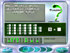
gi2-cryptogramPreviously, I lamented the lack of cryptograms in Games Interactive. Well, in the sequel, my wish is granted! Cryptograms are an entire category — although, weirdly, the name of the category is “Crypto Funnies”. I guess this has something to do with the fact that it’s the name of the first five puzzles in the list. As with the logic puzzles, the category contains four distinct sub-types: Crypto Funnies (four-panel cartoons with ciphered word balloons, which gives you enough context for the deciphering to be really easy), Cryptolists (ciphered lists of things that fit some theme, without the cues you’d get from full sentences), Variety Cryptograms (collections of ciphered texts fitting some theme), and “Dszquphsbnt!”.

This last one is the name of Games Magazine’s regular cryptogram section; it’s the word “Cryptograms” shifted forward one place in the alphabet. The individual cryptograms within a Dszquphsbnt! are unrelated, and, as in Battleships and Paint by Numbers, are only grouped together here because they were originally published that way. Dszquphsbnt! is where the really tough cryptograms are — the ones where they make sentences without articles or other short words and with weirdly skewed letter frequencies, where your only way to get started is by noticing a long word (or, worse, combination of words) with an unusual pattern that identifies it. They don’t start out that way, though. Each Dszquphsbnt! set starts out easy and works its way up. In fact, the first cryptogram in each Dszquphsbnt! is a “Cryptoon”, which is basically the same idea as Crypto Funnies but with one panel and a caption instead of four panels and balloons. Unfortunately, in Dszquphsbnt!, this game leaves out the pictures. The Cryptoons are quite solvable without them, but what you end up with is a punch line without its context, and sometimes it’s a really inscrutable punch line, like “That looks like it says, ‘Machine wash warm, tumble dry medium, made in France'”. I think some of the Variety Cryptograms may have been originally published with pictures too, but that’s just a guess.

The basic cryptogram UI here, shared by all the puzzles in the category, isn’t the best I’ve ever seen, but it’s okay. It lets you select letters with either keyboard or mouse, and in the case of mouse, it lets you click on either a displayed alphabet or directly on the cryptogram. I mostly wound using it in a sort of hybrid style, clicking on the cryptogram to select a ciphertext letter and then typing the plaintext version via keyboard. Selecting any letter highlights all instances of it in the cryptogram, which is handy for eyeballing letter frequencies.

On the downside, it occasionally fails to respond to the keyboard, making me press a key multiple times to get it to register. Also, it lets you bind multiple ciphertext letters to the same plaintext, so sometimes I accidentally wound up with multiple distinct kinds of T on the screen. This is exacerbated by the way it removes the ciphertext letters from view when you bind them to plain text, so you have nothing visible to tell apart identically-bound letters. That is, it doesn’t take them away completely — there’s still a very faint ghost of the letter there, like they tried to gray it out but went too far. At least you can still click on it to highlight it, but what it really makes me want is a way to remove a letter’s binding, and the game doesn’t give us that. The ability to mess up the display without being able to unmess it interferes with the way I want to use the interface: not just as a way of entering answers that I’m sure of, but as a medium for exploring possibilities.

I said the cryptogram UI isn’t the best I’ve ever seen. You know what is? It’s the one where you have just one version of the text displayed, and selecting two letters swaps them in it — that is, selecting A and J, for example, replaces every A with a J and every J with an A. It’s simple, and it just naturally avoids the problems here. And if I’m not mistaken, this was the interface used by Cliff Johnson in games such as The Fool’s Errand and At the Carnival back in the 80s, so it’s not like it was unknown.

Outside and around the cryptogram UI, there’s the UI for navigating through the puzzles within a collection, and that’s where we run into real trouble. Dszquphsbnt! and Variety Cryptograms commit the same sin I previously observed in the Battleships and Paint by Numbers in the previous game: they expect you to solve each puzzle in the group in sequence, and press the “Done” button after each one to score it, but the “Next” button, which advances to the next puzzle without scoring the current one, is still available, even though there’s no way to go back once you’ve pressed it. Cryptolists spreads a single puzzle over multiple pages, one list element per page, and thus allows you to page back and forth freely with the “Next” and “Back” buttons, but it still expects you to press “Done” on every single page to get credit for it. Hitting “Done” on every page isn’t enough to finish the puzzle, though. You signal that you’re finished with a Cryptolist by pressing “Next” on the very last page, which is way too easy to do accidentally, because you’re pressing that button a lot just to see the entire puzzle.

The very worst thing, though, is the Crypto Funnies. Like Cryptolists, Crypto Funnies spreads a single puzzle over multiple pages, one page for each panel of the comic. And like Cryptolists, it lets you page around with “Next” and “Back”, and expects you to hit “Done” on each page. But this time, there doesn’t seem to be any way to signal completion. Pressing “Next” on the last page just keeps you at the last page. The only way to get out is to just quit the puzzle, which leaves no record that you ever attempted it.

Remember that there’s a final puzzle only available to people who have played all the puzzles. It looks like this is impossible to reach without cheating. So I cheated. I think it’s permissible in this case: I’m not lying to the game about my accomplishments, I’m just making it acknowledge the truth by the only means available. Luckily, the game’s record of player progress turns out to be stored as an easily-editable text file. The only complication was that I failed to realize at first that the first thing in that file is a count of the records it contains; if I didn’t increase that, anything I appended to the end would be ignored.

[Update] It turns out there is a non-cheating way to get credit for attempting the Crypto Funnies: pressing Next on the final page works if and only if you have not made any attempt at solving the puzzle. If any letters are bound, it fails. I guess this explains how the unlocking of the final puzzle passed the developer’s tests, if they performed any.

Games Interactive 2: Crosswords

gi2-crosswordLike the first game, Games Interactive 2 divides its puzzles into categories. But this time it gives the categories in alphabetical order, so Crosswords come first.

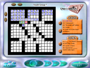
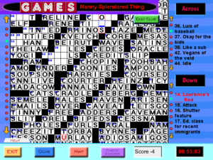
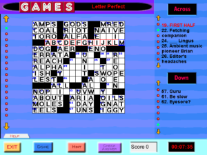
The UI has changed in several ways. The clues are in a smaller font, so it can fit more of them on the screen at once, but it’s wasting even more screen space on headers and frames, so it’s basically a wash. The backspace key, which used to delete the previous letter in the word unless the cursor is on the last letter and the last letter is filled in, now behaves consistently: no matter where you are in the word, it deletes the letter under the cursor and then backs up if possible. This takes a while to get used to, because it’s not how backspace behaves in any other context I can think of. Clicking the grid to navigate, which always selected Across in preference to Down before, now alternates — if you had an Across clue selected, it selects a Down, and vice versa. (Clicking a square on your currently-selected word to switch to the word that crosses it is thus now just an application of the general rule, rather than a special-case behavior.) I thought this was weird at first, but I’ve come to appreciate how it fits a certain solving pattern, where you fill in a word and it gives you enough information to fill in a word that crosses it. But it doesn’t exactly fit the just as frequent pattern where you want to fill in several words that cross it. I still can’t help but feel that there’s a better way to handle this.

Anyway, it’s not all improvements. For one thing, it’s slower. I remember when I tried this game for the first time being disappointed that they hadn’t fixed the speed problems of the crosswords in the first Games Interactive, but now that I’m playing on a faster machine, I see they actually made it worse. When you select a word, it highlights it in the grid, one square at a time, a flashy little transition effect. For the longer words, the resulting delay, during which the UI is unresponsive, can be quite irksome. Another thing: Whenever you select a word, it moves the cursor to the beginning of that word, even if you clicked on the middle. This is something that the first game got right and GI2 gets wrong. And where the first game had some problems with navigating the grid with the arrow keys, this game solves them by scrapping that functionality entirely. You can only use the arrow keys to move the cursor within the current word.

I haven’t seen a whole lot of bugs within the grid data. There were a couple of cases where its notion of where a word ended was a few letters short of where it should have been, but that just meant I had to fill in the rest of the letters via cross clues. Instead, the chief problem this time is typos in the clues. Most commonly, there are a bunch of clues missing their first letters. This is fairly benign; when you see a clue like “ouis Quinze, e. g.”, you can tell what it’s supposed to be. But there are other places where typos just obscure the meaning. For example, “Cop cabana site” was a plausible enough construction that it wasn’t until I worked backward from the cross-letters that I realized it was missing an A.

Games Interactive 2

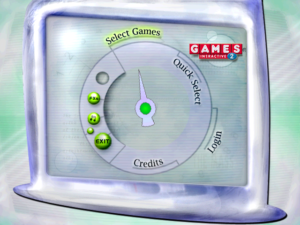
gi2-menuAnd with that, let’s get back to kicking this dreck off the Stack. If you’re wondering why I picked up Games Interactive 2 after my experiences with the first Games Interactive, my thoughts were basically “The underlying puzzles are good, and surely they must have fixed most of the problems by now”. And, well, it looks like they’ve at least addressed some of them. At the very least, it hasn’t thown any “Index Out of Bounds” errors yet.

Installation under Windows 10 had exactly the same problems as the first game, and the same solutions worked. From the very start, it’s clear that it’s going for a different vibe than the original. It’s more retro-futuristic, all curvy, metallic, and skewed, with a fairly subdued color scheme. And instead of jazz, we have electronic music. It’s not as gentle and ambient as the stuff I was just talking about in SquareCells, but it’s reasonably backgroundish. In the puzzles, however, it’s marred by various ticking-clock noises playing over it at a different tempo. I wound up turning off the sound most of the time in Games Interactive, but I’m doing it a lot earlier here.

The main menu is a bit simpler and more reasonable than last time: there is never a stage where you have to select the number of puzzles you want to do. You still have the weird bit where you choose the puzzles you want from a checklist, but at least you can just check off as many puzzles as you want at that list instead of choosing a number and then having to check off exactly that many. You can still have the game choose puzzles for you at random — it’s called “Quick Select” now — but if you do, it seems to just keep feeding you puzzles until you choose to exit.

Finally, one fairly big difference: this time around, there’s an actual ending. After you’ve played all the puzzles, a final bonus puzzle unlocks. Note the word “played”. If I understand correctly, there’s no expectation that you solve all the puzzles correctly. And thank goodness, because I’ve already seen enough typos in the crossword clues to make me think that there’s probably some not-completely-solvable puzzles to come.

Games Interactive: Helter Skelter

So, with the cryptics down, it’s time to turn to the rest of Special Crosswords. I discover I was mistaken earlier: there are several World’s Most Ornery Crosswords in here. My mistake stems from the fact that they’re not all listed together in the puzzle selection menu. Most puzzles are grouped by type, but that’s because the list is alphabetical and most puzzles have names like “Cross Numbers 1”, “Cross Numbers 2”, and so forth. But the World’s Most Orneries all have individual titles, like “A Manny Splendoured Thing” or “O. C. Can You Say”, alluding elliptically to the theme of the longer clues.

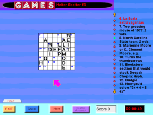
gi-helterApart from that, there seem to be only two other puzzle types I haven’t described yet. First, there’s the Helter Skelters. There are ten of them here. The idea behind them is that the clues aren’t separated into Across and Down because the words can go in any direction, including diagonals. Each word starts at a number and goes towards the next number, but there’s no indication of where the word ends. This is another of the puzzle types where computerization has a noticeable effect on the experience: on paper, you have to repeatedly pause to hunt for the next number, which is a distraction that can break the flow of clue-solving. These puzzles are on the small side, so it didn’t take long to get through them all. After doing half of them, I actually chose multiple puzzles from the main menu for once, to do the rest in a lump. The only real difficulty is that some of the squares, usually along the edge, have only one word passing through them. I know I’ve seen similar words-going-in-all-directions puzzles elsewhere that came with a promise of two clues per square, but not here.

Only one of the Helter Skelters here is severely messed up. In these puzzles, the cursor normally advances as you type, and does so correctly even on diagonals. But in this one puzzle, the cursor doesn’t advance at all — if you type an entire word, you’ll just repeatedly overwrite the same square. Even navigation with the arrow keys is broken. To enter a full word, I had to click each square with the mouse. And for my pains, I wound up with a score of 0% for that puzzle, because about half the letters in the game’s solution are blatantly wrong to the point of not even spelling pronounceable words. I assume this is somehow connected to the cursor movement problem, but I don’t see how. I suppose that it’s harder to spot major problems like this for a Helter Skelter than for a normal crossword because the actual solution looks like nonsense too until you trace through it. But I’d think someone would have noticed the problem if the game had received any playtesting whatsoever.

The other Special Crossword type is the Clueless, which I’ll describe in my next post.

Games Interactive: Cryptics

gi-crypticI like cryptic crosswords. Not everyone does, but I do. I like the way they make me look at every word in the clues slantwise. I like how they show off the author’s cleverness, and make me feel clever for following their thought processes. And I like the way that the clues are self-contained and self-confirming. When you enter a word into the grid, you know it’s the right answer, because you built up that word out of pieces.

Or, well, sometimes you haven’t done that yet; particularly in these computerized ones, where erasure is free and doesn’t leave any marks, sometimes I’ll enter a word that I think is right without a firm idea of how it’s formed, just so I can figure out the rest of the clue by looking at it. But then, if I can’t figure out how it works, I’ll delete it. I’ve seen people who aren’t as hip to the cryptic ways as me fill in answers speculatively, without being able to explain the entire clue, and it bothers me. To do this is to treat it like an ordinary crossword, where you expect to get a few answers wrong at first because the clues are individually ambiguous. This is entirely the wrong mindset for a cryptic.

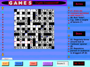
Anyway, I’m pretty sure that Games Magazine is where I first learned to do cryptics, so it’s good to see them represented here. There are eleven cryptics in Games Interactive, and I’ve found them to be the most pleasant thing in the entire collection. Not just because of the content, but because this is the one place where the UI really works. The puzzles are 15×15, so navigating with the arrow keys works properly, and they’re of the “lattice” type, with cross-clues on only half the squares of each word, which means that when you navigate out of the current word, you wind up in a square that has only one word going through it. Thus, it doesn’t keep switching me into an Across clue like the other crosswords.

However, true to form for this game, there are some bugs in the data. One puzzle has a misplaced number, with the result that you can’t fill in that word directly — and, unlike in the normal crosswords, the lattice format means you can’t work around the problem by filling in all the words crossing it. One of the official solutions puts an M where there should obviously be an N, creating the words “contemd” and “arsemal”. And one of the clues is “Load one admitted to prying”, which looks plausible as a clue in a cryptic, put which really should be “Loud one admitted to prying”. (The answer is “noisy”: “i” added to the middle of “nosy”.) I’m of two minds about the severity of this. On the one hand, I feel like cryptic clues need to be letter-perfect. On the other hand, I managed to figure it out anyway.

Games Interactive: World’s Most Ornery Crossword

gi-wmocGames Interactive seems to have only one World’s Most Ornery Crossword. I suppose that’s fitting. The magazine only ever carried one per issue, as a sort of capstone to the “Pencilwise” section. If they had published more than one at a time, it would cast doubt on the “World’s Most” claim. Things are no different here.

There are two distinguishing things about World’s Most Orneries. First, there’s the size. The grid is 25×25, which is larger even than the Sunday puzzle in the New York Times. The makers of Games Interactive decided not to fit this all onto the screen at once, instead making it scroll vertically, even though they really didn’t need to. Even under the constraints of the game — running at 640×480 resolution, with a 43-pixel header and a 50-pixel footer — there’s room enough for 25 rows of 15-pixel squares, which is large enough to hold the font used for the clues, along with a black line separating rows and a two-pixel margin. As it is, we instead have 19-pixel squares. 25 rows of 19 pixels takes 475 pixels. So perhaps 19 pixels was chosen because it’s the largest size that they could use and still fit an entire World’s Most Ornery Crossword on a 640×480 screen. If so, it’s too bad they messed it up by using up vertical space with headers and footers.

Selecting a word, whether with keyboard or mouse, automatically scrolls the grid to make the entirety of that word visible. This is fortunate, because the scrollbar is unreliable. Navigating between words with the arrow keys is also broken: trying to move up or down instead moves the cursor a bunch of spaces left or right. I haven’t probed this deeply, but I’m guessing that the navigation code is assuming a 15×15 grid, the size of all the easy crosswords in the collection.

The other distinguishing feature of the WMOC is that it has two sets of clues: the Hard Clues and the Easy Clues. In the magazine, the Easy clues were printed on half of an adjacent page, with the intent that you’d use the Hard clues by default and could switch to Easy by folding the page over. Resorting to Easy always felt a little like cheating, but it was at least a relatively honorable form of cheating. In Games Interactive, there’s a button for switching to Easy, but, interestingly, it only affects the currently-selected word, minimizing the cheat factor.

There’s another cheat mechanism shared by all the crosswords in the game: the Hint button, one of the few ways that the puzzles in this game benefit from being computerized. Pressing this button deducts a point from your score and reveals a random letter in the current selected word, possibly a letter you’ve already filled in correctly. I’ve resorted to requesting hints on a few occasions when the puzzles expected me to know the names of athletes or musicians, but it’s not clear to me if it hurts your score less than just getting a letter wrong. Anyway, even though Easy is cheaty, and the game treats it as such, it doesn’t consider it to be the same sort of cheaty as Hints. Easy doesn’t affect your score at all. The only motivation you have for not dropping down to Easy is your own sense of honor — which is the case for a lot of computer games, come to think of it.

Games Interactive: Crosswords

gi-crosswordI guess it’s time to move on to the Crosswords section. Actually, I’ve done a fair number of them already. I wanted to get a jump on them simply because it’s by far the most numerous section, and also I find they make a good palate cleanser between other puzzles. They’re so reassuringly easy! Games Magazine gives its puzzles a difficulty rating from 1 to 3 stars, and the puzzle selection menu in Games Interactive displays these ratings. All the puzzles in the Crosswords section, without exception, are rated at 1 star.

“But not all of the crosswords in Games are easy!” you may be saying. “Some of them are even World’s Most Ornery!” Those are off in the Special Crosswords section, along with the Cryptics. We’ll get to that. Keeping the easy crosswords separate from the hard ones is a good idea if you think your players are going to let the game select them at random, because a one-star ordinary crossword and a Cryptic are certainly not adequate substitutes for each other. But then, as I’ve said, I don’t think the randomization feature in this game is at all useful.

The crossword UI here is less annoying than I remember. When I first played it, it was weirdly slow to respond to input. I had seen web-based crosswords written in Javascript that were more responsive, and I didn’t really understand what it could be doing that was more wasteful of resources than running in circa-2000 Javascript. After a general system upgrade failed to make it noticeably better, I concluded that it must actually have some kind of deliberate built-in delays. But it runs so much better on a machine built approximately 15 years later that I guess it really was just wasteful code after all.

The UI is actually mostly pretty reasonable. At any moment, there is a cursor at one square in the grid, and an entire word space highlighted, along with its clue. You can navigate arbitrarily by clicking on either the clues or the grid, but I don’t like doing that. Because interacting with a crossword consists mainly of typing in words, I want to keep both my hands on the keyboard most of the time. And it lets me do that. Pressing enter moves to the next clue, cycling from the last Across to the first Down and vice versa. In the easy puzzles, I can fill in most of the grid on a single pass through the full clue list, so navigating this way is optimal. The harder ones are another matter. There, I want to go straight from filling in a word to considering the clues that cross it. You can move the cursor around arbitrarily with the arrow keys, but there’s one problem: when you do that, it automatically switches you to an Across clue. You can switch to Down by clicking the current square with the mouse, but as far as I can tell, there’s no way to do it from the keyboard. I haven’t looked at other computer crossword interfaces in a long time, but I’m guessing that by now there’s a semi-standardized hotkey for that, known to all enthusiasts.

There’s also a bit of a problem with erasure, because it uses the Backspace key for that. Backspace normally deletes the letter before the cursor, but if it applied that rule consistently, you wouldn’t be able to delete the last letter in a word. So it applies it inconsistently instead. I think what I’d really like to do is use the space bar to erase the current square and advance the cursor as normal. That is, I want it to act like a text editor in overwrite mode. As it is, the space bar moves the cursor forward without changing anything — which is the same thing that all unrecognized keys do.

Games Interactive: Paint By Numbers

gi-paintI’ve been sampling various puzzle types, but wound up spending most of my time on Paint By Numbers. This is Games Magazine’s name for the puzzle more often known as “Picross” or “Nonograms”. Games Magazine was one of the first publications to print nonograms in America — possibly the very first — so I don’t think they can be blamed for picking a nonstandard name. You’ve probably seen this puzzle type before, but just in case, here are the rules: A monochrome pixelated picture is encoded in terms of the runs of black tiles in every row and column. Thus, if a row is labeled “3”, then it contains three consecutive black tiles and all the other tiles are white, and if it’s labeled “3 8 5”, then it contains black tile runs of length 3, 8, and 5, in that order, all separated by at least one white tile. It’s a puzzle that gets a lot of mileage out of a simple ruleset.

Once again, the puzzles are grouped into sets that have to be solved together, even though each individual puzzle is quite substantial on its own. Solving an entire set is basically a full workday, and this weekend I’ve already done two of the four sets available. I think I’ll have to leave the rest to next weekend. I’ve found it easier to stay with these puzzles over a span of hours than I did with Battleships, possibly because the puzzles themselves give a stronger sense of internal progress. Solving them is a matter of laying visible foundations, which gradually turn into sensible structures. An isolated pixel becomes a line, a line becomes the stem of a flower.

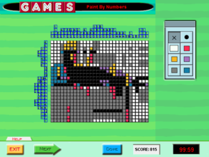
The UI here could be better: it doesn’t recognize any sort of hold-and-drag, so every tile you want to set has to be clicked individually. It does, however, provide the one affordance I was wishing for in the Battleships puzzles: the ability to take notes on the grid. Although the solution is always entirely black-and-white, the game lets you draw in five other colors, just so you can mark the uncertain tiles in different ways. For example, I mostly used grey for areas where I had no ideas, red and orange for marking the possible extents of a specific run, and occasionally purple for shapes that I just wanted to try out to see if they worked.

There’s actually a sixth color you can mark tiles with, but it is vital that it never be used. That’s because it is exactly the same color as the white tiles. It just doesn’t count as white when the game evaluates your solution. How did a UI failure like this happen? My speculation is that at some point in development, the tiles defaulted to a color other than white. This would really have been better; as it is, I usually wind up coloring most of the grid grey anyway, tile by tile, click by click. If the game once had “white” and “default color” as distinct notions, that would explain why the UI has separate “white” and “erase” buttons. But, I speculate, at some point, probably late in the development process, a decision was made to make the grid start off white, just like it is in print, even though there was still this distinction between “white” and “default” internally and in the UI. This explanation is plausible to me because it seems like a lot of this game’s sins stem from adhering to how things were in print.

Games Interactive: Wordplay

Setting the Battleships aside for a bit, I skip to the “Word Play” section, where Games Interactive puts all its word puzzles that aren’t crosswords. Disappointingly, it doesn’t feature cryptograms. The cryptogram is a form that really benefits from a computer interface, removing the drudgery and letting you focus on the figuring out.

Instead, has four puzzle types: Bulls Eye (or Bullseye, or Bull’s-Eye — the game isn’t terribly consistent about this sort of thing), Quote Boxes, Mind Flexers, and Solitaire Hangman. Why these four out of all the nonstandard word puzzles Games Magazine has ever done, I don’t know. Solitaire Hangman is an especially odd choice. The whole appeal of it in the magazine was the ingenious cross-referencing mechanism they had invented for playing Hangman in a static, printed medium. Think about it for a moment. How do you make it possible to look up the positions of one particular letter without making it too easy to inadvertently get extra information about other letters? It’s not an easy problem, and the puzzles provided a way to observe and appreciate the solution they had come up with. Whereas in the computer version, it’s just, well, Hangman. There have been computer Hangman programs for decades, and this is not fundamentally different from any of them.

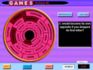
gi-bullseyeThe Bulls Eye puzzles give you a set of words to be matched up one-to-one with a list of unusual criteria, like “consists entirely of letters from the second half of the alphabet”, or “can be broken into two words for men’s garments”. Some of the answers are difficult at first, but they get easier as you use up the possibilities. It’s called “Bulls Eye” because the word list is presented in a circular formation, which is a bit rough and hard to read in the game. There’s no in-puzzle reason for it to be this way. I vaguely recall a puzzle like this from the magazine had some clues that actually took advantage of the arrangement of words, like one of the clues made reference to the relationship a word bore to the words immediately surrounding it or something. But there are no clues like that here, and so the words might as well be just arranged in a list. You page through the clues with “Next” and “Previous” buttons. The instructions state that you can also navigate the clues by clicking on numbers, but there are no numbers to click on. Just another symptom of what went wrong with this whole collection.

Mind Flexers are similarly based on matching words or short phrases with clues, although it blurs the distinction between clues and answers. The idea is that both items in a pair describe the same thing through puns or other wordplay, frequently involving inserting or moving whitespace. For example, “pet duck” gets paired with “touchdown”, and “dozen” with “meditate”. With these pairs of definitions, often one straightforward and one not, it has something of the same feel as a cryptic crossword, albeit far easier. It does start feeling repetitive before long, though, even in the small selection found here. That down-in-the-sense-of-feathers gimmick gets used a lot.

Quote Boxes are made by taking a quotation, arranging it in a grid, chopping it up by columns, and then mixing up the letters in each column. It’s the closest thing this game has to those cryptograms whose absence I was lamenting, and is susceptible to some of the same solving techniques, such as looking for common words like “the”. It’s a serviceable puzzle form, meatier than the others in this section but not too long or difficult, even though it’s senselessly put into groups just like the Battleships. The choice of quotations is decidedly middlebrow and inoffensively bourgeois, even when the source of the quotation is Ayn Rand or Virginia Woolf. It somehow seems even moreso when accompanied by the game’s fedora-jazz soundtrack. I haven’t looked at Games Magazine in many years; is this really the sense of taste it had? I can’t really say I object. I’m pretty middlebrow myself, if I’m honest. It just seems more obvious here than I remember.

At any rate, I’ve made my way through the entirety of Word Play in a single session. I wasn’t planning on this, but I kept making such good progress that it seemed a shame to stop. This whole section seems like it must be what they had in mind in setting up the main menu. I could even imagine requesting puzzles at random from here, if there weren’t so few. Goodness knows “I want to play six rounds of hangman” isn’t an unreasonable thing.

Games Interactive: Battleships

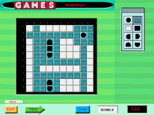
gi-battleshipsGames Interactive doesn’t really have an explicit win state, but I’m taking “do all the puzzles” as the obvious goal. To that end, I’ve started plowing through them all in order. I’ve already gotten through the entire Trivia section, but the next thing after that is the Logic puzzles, which starts with multiple Battleships. I’m pretty sure that this is the stuff that caused me to shelve the game on my first installation.

It’s not that I dislike the Battleships puzzles. I like them quite a lot, or at least I did in their original form. Understand that every game here is a reprint from the magazine. I had done Battleships puzzles before, and likely some of the very same ones that appear in this game. They’re basically a cross between the board game Battleship and Picross: you have to locate a collection of ships of varying length on a 10×10 grid, on the basis of the number of ship tiles in each row and column. The rules have enough restrictions on top of that to keep it interesting.

Transferring this puzzle type to a computer has the same basic disadvantage as it does for other similar logic puzzles: it loses you the ability to make notes on the grid. I do this a lot, and not just for Battleships. In Sudokus, if I don’t know what’s in a square but can narrow it down to two or three possibilities, I’ll mark those possibilities in faint pencil, the better to explore their consequences. Taking my paper away forces me to do it all in my head (or provide my own paper, although I haven’t gone that far yet).

But that’s a small matter. The worse thing that this game does is completely unnecessary: it puts the individual Battleships grids into groups of six, which it treats as one puzzle, so that you have to solve all six of them at once. There’s no way to play just one of them and save your progress. A typical Battleships puzzle takes me something like ten minutes to solve, and an especially difficult one — of which there seems to be at least one per set — can take twice that. So to get credit for any of these puzzles, I have to spend more than an hour at a stretch on them. Why? Because these puzzles were originally printed six to a page. That is the only reason.

To add insult to that, there’s the matter of how you progress from one puzzle in a set to the next. Just filling a complete answer into the grid isn’t enough. You have to confirm that it’s what you want. Now, part of the basic UI shared by all puzzles of all types is a pair of buttons at the bottom of the screen, one labeled “Next”, the other labeled “Done”. Which of these do you think you should press? If you guess wrong, the game won’t bother evaluating your current grid to see if it’s right. It will interpret your button press as giving up on it, and it will proceed to the next one without any feedback indicating that this is what it did, until the very end of the sequence, when it informs you that you scored 0% on the whole thing. (The correct answer is “Done”.)

« Previous PageNext Page »