Litil Divil: Load Screen

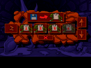
Let’s have a UI post, because the load menu is the very worst part of this game. Take a look at it! Oh, sure, it doesn’t look that bad out of context, but you have to remember one thing: This game does not support a mouse. Input is strictly through the arrow keys and two action buttons, approximately equivalent to a NES controller. NES games often have pretty good menus, based around moving focus around with the D-pad. Now look at that screenshot again and ask yourself: Where is the focus?

The menu here indicates focus by a red border around the selected element, which blinks on and off, staying in each state for about a second. A second is a long time in UI-land, and it’s an especially long time for important visual feedback to be invisible. On top of that, whenever the focus moves, it starts over from the beginning of its cycle — which would be great, if that were the part where it’s visible, but it’s not. The whole thing is set up to make you either wait for a second after each keypress, or operate blind. Neither is ideal, but it might not be so bad if the whole thing weren’t also set up to make you need to move the focus multiple times in succession: it starts in the “cancel” button at the bottom, but usually the very first thing you want to press is the up/down arrows on the right, which control which level you’re dealing with, and you have to go through multiple save slot buttons to get there, even if they’re empty and disabled. I usually find myself keying in multiple presses to move to the button I want, then waiting to confirm that I’m on the right one before pressing it.

The leftmost button is for starting the level over rather than loading into its save room. That seems like it should be useful: if you haven’t found the save room on level 4 yet, you could use it to start from the beginning of level 4 instead of the save room on level 3. But in fact it’s disabled on levels where you don’t have a save yet.

Dark Souls: UI Thoughts

There’s been a small online kerfuffle about Elden Ring‘s UI. What do I think of the Dark Souls UI?

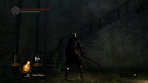
Mostly it’s fine. It’s designed for a controller, and that’s how I’ve been playing, and it’s serviceable enough. There’s a useful health gauge permanently affixed to the top left, and below it, a stamina gauge that’s less useful, as stamina refills so quickly that it’s going to be full any time your attention isn’t on the stamina-draining actions you’re performing. I think the stamina gauge is mainly there to explain to the player how stamina works, rather than to provide up-to-the-moment information. To give you a strong intuitive sense of why sprinting into battle is a bad idea. At the bottom, there’s a readout of what you currently have equipped, which is a little redundant with what you can simply observe in your character’s hands, but less ambiguous in situations like “I’m climbing a ladder so my hands are empty right now” and “The graphical representation of my weapon is penetrating a wall and partly occluded”.

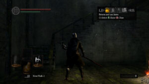
The one really troublesome part of the UI is the menu that comes up when you press the “Start” button on the controller. This is how you access your inventory, so you bring it up whenever you want to change weapons or chug a potion that isn’t in your quick-select slot or something. And the inventory sub-menus are perfectly fine, just your standard equip-slots and scrolling lists, with a nice set of different information displays to toggle. But the parent menu is troublesome as a result of a combination of two things. First, it’s not a full-screen menu. The sub-menus are full-screen, but not the principal one, which sits up in the upper right of the game, not drawing attention to itself. Second, it doesn’t pause the game. In fact, you can still run around while it’s open — although you can’t do much of anything else, as all the button presses you’d use to perform attacks or interact with the environment are absorbed by the menu. The combination means that it’s way too easy to not notice that it’s still open. A noticeable fraction of my deaths in the game are caused by switching weapons in preparation for the next enemy (fast, unarmored zombies being better suited to a light, quick weapon, while zombies in full plate need something that can punch through it), only to discover too late that I only closed the equipment sub-menu and my attacks aren’t doing anything.

And look, I kind of get why they made it possible to run around with the menu open. This is a game with a multiplayer component, so you can’t just freeze the world. And since the controls for maneuvering around the menu are distinct from the controls for running, the decision to let you run away from stuff while the menu is open is, if questionable, at least understandable. But if you’re going to let me run around, you should really let me perform attacks as well. And contrapositively, if you’re going to lock away my attacks, I’d prefer that you just take away my movement, and in fact all of my in-world interaction. It’s the partial disabling that’s so confounding.

Anyway, I assume that all this has been hashed out online a thousand times already, but you wouldn’t be reading this blog if you didn’t like seeing decade-old games relitigated.

Accidental Gating in Alien Logic

I’ve been doing a little UI work lately, prototyping a system that needs to be able to display a list of options, where there’s no hard limit to the number of items in the list. Any such system needs to address the question of what happens when there are too many choices to display at one time. And that brought to mind an anecdote about a game I played approximately 20 years ago.

Alien Logic is a 1994 DOS CRPG based on the Skyrealms of Jorune campaign setting, and if you haven’t heard of Jorune, you probably didn’t have a subscription to Dragon magazine in the 1980s. I don’t think it was advertised more heavily than other game systems of the time, but its ads were highly noticeable and memorable. Haunting art featuring hovering islands and weird alien lifeforms rendered in an unsettling fleshy style, all bulges and bone structure. Usually they featured one or more Shantha, weirdly tall humanoids with bulbous faceless heads. I was always curious about it as a child, but didn’t have any actual knowledge or experience of it until I bought a remaindered Alien Logic CD-ROM.

Now, this game is not fresh in my mind. I don’t remember the story at all. I remember it had a real-time combat system presented in side-view like a brawler, and, like many brawlers, I recall that it fell to a dominant strategy, although I don’t remember what that strategy was. The setting, I learned, is an alien planet dotted with mysterious ruins, colonized by humans and other intelligent species long enough ago to have multiple layers of history there. It was apparently meant to appeal to both sci-fi fans and fantasy fans, and has been compared to both Jack Vance and Barsoom in its pseudo-scientific trappings and quasi-magical forgotten technology. Mana is called “isho” and spells are called “dyshas” as a way to let the sci-fi fans pretend they’re not talking about magic, and apparently some fans get quite huffy when you point this out.

The original tabletop game supports player characters of various races, including furries, but the player character of Alien Logic is human, or at least human-passing. You start off, however, in a Thriddle city called Mountain Crown. I’d describe Thriddles as the setting’s functional equivalent of halflings or gnomes, except instead of small humans, they look like plucked chickens with eyestalks with elbows in them. There’s a sort of mentor figure, an elderly Thriddle named Salrough, who gives you your initial quest and invites you to come back and talk to him whenever you have more developments of interest. And I remember trying to come back to talk to him fairly early in the game, only to be blocked at his door by another Thriddle, named Herrid Go-Otgo, who insisted that I give him a certain item with a silly alien name to be allowed through.

“Oh well”, I said, “I guess the game doesn’t want me going back in there just now. It’s gating that content until I find that thing Herrid wants. So until I find it, I’ll just keep on exploring and pursuing quests.” And I did. There was plenty more to do, goals both stated and implicit, and I just kept on going, without ever finding the thing Herrid wanted, until I hit a wall towards the end of the game and could make no more progress. Hitting up a walkthrough, I learned that I needed to talk to Salrough again to get any farther. But what about Herrid? Ah, I just hadn’t been persistent enough! If I had just tried entering Mountain Crown again, even just exited to the world map and gone right back in again, there would now be some more Thriddle NPCs who could get me the item. But why would I have tried going back to Mountain Crown when I still didn’t have it?

Still, I knew now, so I got rid of Herrid, and I went to talk to Salrough… and the game crashed.

The reason it had crashed? The creators of the game had simply not anticipated that a player would do literally everything else possible in the world before getting rid of Herrid. There are various events, news you can hear and discoveries you can make, that you can ask Salrough about. All through your progress in the story, the game is tacking new items onto Salrough’s dialogue tree, and assuming that you’re visiting him to clear them out once in a while. If you don’t, it grows long enough for the list to overflow the screen. And that crashes it. Since this is a DOS game, maybe it just kept on rendering text past the end of video memory and into the game’s executable or something.

I remember finishing the game. I don’t remember if I managed this by finding a patch that fixed the problem or if I just loaded successively older saves until I found one that didn’t crash, but I do strongly remember a very long list of dialogue options relating to plot long since passed, hints I no longer needed, overdue explanations, maybe even some locations of low-level dungeons I had inadvertently skipped over. I don’t remember much about the game, but I do remember that.

There’s an obvious design lesson here: Be careful about gating. If you want the player to do something, if you want them to do it early and repeatedly, don’t put a barrier in front of it that they don’t know how to overcome.
Games Interactive 2: The Final Puzzle

OK, I finally convinced myself that the last Battleships puzzle really is impossible, and gave up on it. This decision hinged on the realization that the puzzle could be wrong without any errors in the row and column numbers. See, most Battleships puzzles start off with at least one tile already filled in, either with a ship piece or empty water, to eliminate ambiguity and guarantee unique solutions. (Annoyingly, the game lets you delete the pre-set tiles just like any tiles you’ve placed yourself, so you have to remember where they are so you don’t do that. The print version doesn’t have this problem.) This puzzle had one pre-set tile, a right-side endcap for a ship. When the game revealed the correct solution, sure enough: that endcap had been placed one space away from where it should have been. In retrospect, it’s a miracle that there weren’t more mistakes like this throughout the logic puzzles, given how many there are elsewhere.

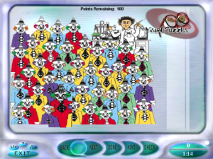
gi2-clownsThe remainder of the game went quickly. I finished the rest of the Trivia section, discovering as I did that one entire set of trivia questions had been accidentally put in twice under different names, then blasted through the Visual section in a sitting. Mainly it’s more of the visual puzzle types from the first game, this time with color added. In one case, the added color actually interferes with the puzzle: you’re asked to identify the one clown in a clown crowd that doesn’t match any of the others, and the clowns were colored without regard to whether they were supposed to match or not. But then, the scan was bad enough that it was more or less ruined anyway.

There’s a whole lot of puzzles where you have to type in phrases clued by cartoon images, and I’ll note that the typing interface here doesn’t have the problems it did in the Trivia section. There’s three of the sort where you have a line drawing overlaid on a grid, and have to find squares in the picture that match a set of clue squares. This was never all that hard a puzzle type, but the addition of color makes it downright trivial. Also, in the first game, I noticed that the clue squares, which were supposed to be in random orientations, were all in the same random orientation. It seems like they didn’t fix that. Probably they didn’t even notice it.

There’s one Cross Comics puzzle, where you have to arrange a bunch of comic panels into crossing but independent strips, like in Scott McCloud’s Choose Your Own Carl. The first game had one of these as well, although I didn’t describe it before. The UI for it there was terrible, and here it’s slightly less terrible — it’s a little easier to select panels — but still terrible in fundamentally the same ways. The basic problem is that the panels are displayed at a size that’s illegible at the game’s resolution. When you select a panel, a blown-up version is displayed on the right so you can actually read it. However, once you’ve selected a panel, you have to place it in the grid. You can’t even click on another unplaced panel to change your selection until you’ve placed the one you’ve selected. So you can’t read all the panels in advance, and it’s hard to check what you’ve already placed without accidentally rearranging it. Also, there’s one panel already placed, and you can’t select that one, which means you can’t read it. I can think of a simple change that would solve all of this: displaying the blow-up on rollover instead of click.

That done, all that remained was the final puzzle. I may well be the only person in the world to see it, other than the developers.

The main menu displays your options as green circles, and has one spot that looks like an empty depression where a green circle belongs. I had been assuming that this was where the button to access the final puzzle would appear when it was unlocked, but no. Instead, the final puzzle comes up automatically when you unlock it, and also every time you try to play any of the puzzles afterward. That’s right, unlocking the final puzzle locks you out of everything else. I can see a little sense to this: it’s a metapuzzle that’s intended to test your memory of the other puzzles. But you still can’t access the other puzzles after you’ve solved it, except by making a new profile.

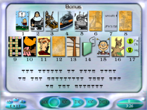
gi2-finalThe way it works is: At the top of the screen, you get a bunch of pictures from the other puzzles in the game. The first letters of the names of those puzzles form the key to a cryptogram. Again this shows the designers’ ignorance of what they were making. To get to this point, the player has been through an entire section of cryptograms far harder than this one. The key is unnecessary.

When you solve the cryptogram, and enter the correct answer, the game will tell you that it’s wrong. This is because their solution has the word “then” where it should have “than”. “Then” doesn’t even fit their own key. This is pretty much the perfect ending to the game, if you ask me. Just one last really obvious boneheaded mistake before saying goodbye.

It still hasn’t fully sunk in that it’s all finally over. This game is going to haunt me for a while. I knew before starting my posts that the the two games were buggy, but I didn’t realize just how bad it was going to be. But it feels good to have a record of it all. Perhaps it can serve as a warning.

Games Interactive 2: Trivia

Yeesh, did I really just make a “definition of ‘game'” post? I must really be running out of steam. Doubtless this has to do with my continued inability to solve the very last Battleships puzzle. (And I do mean the very last — I’ve solved the rest of the set.)

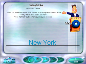
gi2-triviaTo counteract this, I’ve moved on to the Trivia section for a bit. It turns out to be annoying — enough so that I didn’t finish it in one sitting like I had planned, even though it’s half the size of the other sections. Partly this is due to the design. You may have noticed from my screenshots that every puzzle type in Games Interactive 2 has its own logo, with a picture labeled in a zany font. Usually this is something you can ignore, but for Trivia, they animated it and made it part of the game. The picture is a caricature of a game show host, which makes sense, I suppose, but honestly isn’t the feel I’d have gone for. He wiggles his head back and forth while waiting. His facial expression changes with your guesses. When you get something wrong, a buzzer sounds and the light on his podium turns red; when you get something right, a brief latin-rhythmed victory ditty plays. If you have sound turned on, you hear this enough for it to become irritating. If you don’t, you just get a pointless pause for a few seconds before it goes on to the next question.

But the worst part of the Trivia section is the questions where you have to type in an answer. This isn’t always the case — most of the questions are multiple choice. But some are type-ins, and a lot of them aren’t really designed for this game. For example, at one point it asks you for the two ways, other than Lisa’s saxophone tune, that the opening credits sequence from The Simpsons varies from episode to episode. Nobody is going to get that one right, because nobody, even if they know the answers, is going to phrase it in exactly the ways that the computer is checking for. But let that slide for the moment; a lot of the questions are reasonably answerable. The more consistently annoying problem is that the game isn’t very responsive to typing. You pretty much have to hold keys down for half a second or so to make sure they register. This is basically intolerable, and I don’t remember the first Games Interactive having this problem.

Games Interactive 2: Word Search

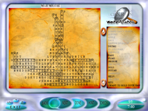
gi1-wordsearchIt is with some relief that I report that I have finished the Paint by Numbers puzzles, and made some progress on the Battleships. I’ll be closing out the Logic section entirely before long, and that will leave just the three most lightweight categories: Trivia, Visual, and one that’s new to Games Interactive 2: Word Search. I haven’t mentioned the word searches yet, because they’ve never been the focus of my play sessions. And yet I’ve almost finished them.

Let me get this out of the way: Word searches are a joke. They’re the puzzle type that fans of all other types of puzzles look down on. Logic puzzles require real thought, crosswords test your knowledge and vocabulary, and cryptograms combine all of the above, but all a word search requires is the ability to not be bored by word searches. The reason I’ve gotten so many of them done is that I’ve been doing them one at a time between other puzzles in order to avoid having to do them all at once. It’s one thing for a variety puzzle game to have one or two word searches for variety’s sake — one per issue of the magazine was pretty much the right amount, if you ask me — but this game has twenty. That’s more than any other single puzzle type except crosswords.

The word searches from Games Magazine have one real point of interest: The unused letters spell out sentences, usually some quotation linked to the puzzle’s theme. As far as I know, this was never stated outright in the magazine. It was just a little bonus for those who noticed it. The closest they came to spilling the beans was in a March issue with an Irish-themed word search for St. Patrick’s Day: the editor’s message for the issue mentioned that the editor had suggested slipping some Irish names into the unused letters, only to be told “Wait til you see what we’ve already got going on there”. So at that point, not even the editor of the magazine was in on the secret. But that anecdote was enough for me to catch on, and now, the information proves useful: looking for the hidden sentences provides a welcome shortcut to finding all the words, in addition to making the whole process less tiresome.

As you’re probably expecting if you’ve been following these posts, there are problems. There are occasional typos in the word lists: SUBSITUTE for SUBSTITUTE, BARBEQUE where the grid contains BARBECUE. Such words cannot be marked in the grid; the game only accepts what’s in the word list. Occasionally there’s a word that’s left out of the word list entirely. You can tell that it’s supposed to be part of the solution because it interferes with the secret unused-letters text, but it’s just not there. One particular puzzle is missing something like half of its word list. I only have a vague sense of what the unused letters were supposed to spell out in that one. In one of the puzzles, part of the grid was actually misplaced, showing letters one space to the right of where they should have been. It took me a while to figure out what was going on there. Once again, I find myself thinking that some of these bugs could make good puzzles in their own right if deployed deliberately.

The UI is mainly reasonable, but has one biggish problem: words are marked with ovals around them, and these ovals are sometimes wide enough to intersect with adjacent letters, especially when the ovals are diagonal. Now, the puzzles come in different sizes, and the larger grids are fit on the screen by using a smaller font. Throw a couple of lines across the smaller font and it becomes illegible. It’s not hard to think of solutions to this. Like, instead of circling the words, put a line through the marked letters! Ideally, make the line a light color and display the letters on top of it so you can still read them. But I suppose you can’t do that in the print version, so it violates the game’s prime directive.

Games Interactive 2: Thinking About Battleships

I find that there are two distinct modes of thought involved in solving Battleships puzzles. It’s not quite the “logic vs intuition” thing again, though.

On the one hand, you have the same sort of approach as Paint by Numbers puzzles: proving things about the grid. You have certain constraints, including puzzle-specific ones like “this row has exactly three occupied spaces in it” and general ones like “there is exactly one set of four consecutive occupied spaces”, and from these constraints you construct chains of reasoning about what must be in specific spaces. “There are two three-tile long ships and only three places where they can fit. So at least one of them must be in one of these two places, both of which border on this square. Therefore, this square is unoccupied.” You then mark the square as unoccupied, and start using that as a constraint in further proofs.

On the other hand, you can also think of it as an assembly puzzle, like pentominos or tangrams. You have ten pieces of varying length, and you have to put them together into a shape that fits certain constraints. True, most assembly puzzles use a target shape where the pieces touch each other, and that’s specifically forbidden here, but that doesn’t really make much difference. You’re still thinking about it in terms of moving pieces around. There’s typically a very limited set of places where the four-long ship can go, so you try it out in one of those places, and when you see that it prevents the rest of the pieces from fitting in nicely, you move it somewhere else. This is really equivalent to reasoning from trial-and-error, but I find that conceptualizing it as moving pieces around makes it a lot easier. Sometimes I’ll mark in all the pieces in an way that doesn’t fit the numbers, because it helps me to see how to fix the problem by moving something.

Usually my trajectory through a puzzle starts with the former approach, and switches to the latter when progress fizzles out. In some puzzles this happens very quickly. Notably, the UI discourages the assembly model. I can think about it in terms of moving pieces around, but I can’t actually remove an entire ship from one place and put it somewhere else as an action. The only form of interaction is marking and erasing individual tiles, which fits better with the other approach. This sways how I want to solve the puzzle. I can’t blame Games Interactive for this, though. The same applies even more strongly to the print version.

Games Interactive 2: Planet of Strangers

gi2-strangersI decided to ease myself back into the Logic section by tackling the one-off puzzles. This time around, it turns out none of them are logic puzzles in the traditional sense. There’s an easy tile-based dissection puzzle, a memory challenge, a sort of visual trivia thing where it gives you the top and bottom thirds of a bunch of circular logos and other symbols and you have to match them up. This last one has a non-intuitive UI: all the pieces are displayed on the screen at once, but whenever you want to match a pair, you have to click “Done”. I don’t think I’d have guessed that if I hadn’t seen it do something similar in the Cryptograms.

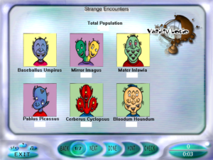
There’s one puzzle in the assortment that I could see calling a logic puzzle, although it’s really more of a math puzzle. It’s a more complicated variant on the old chestnut where you’re given a head count and a leg count and have to derive how many cows and how many chickens there are. The premise here is that there’s a planet occupied by six species of aliens with lame jokes for names. The number of eyes, noses, mouths, eyebrows, ears, and heads varies by species. Given a total count of each body part, can you figure out how many of each alien there are? Well, maybe you could in the magazine. Here in Games Interactive 2 it’s impossible because they left out the body part count. That’s like asking us to solve a crossword without the clues. We’ve seen other puzzles where there was information missing, and I’ve always done the best I could. But this time, the best I can do is just hit the “Done” button and let it give me a rating of -100% for not having any of the answers right.

Games Interactive 2: Last of the Crosswords

Well, I’ve completed the Special Crosswords. The remaining Orneries fell in a single session. It’s a lot quicker to get these things done when you’re fully alert, and can get your mind into a thinking-of-words zone. But then, it’s also quicker to get them done when you already did half the puzzle in a previous session, and that’s probably the larger factor here.

That left just the sole remaining Clueless, which was one of the difficult ones I mentioned before, where all the words come in just two lengths and there isn’t much obvious constraint about what goes where. Such a puzzle offers no clean way to get started. The only workable approach I’ve found is trial-and-error, picking a space with lots of crossings and trying out each of the words from the word list in that spot and exploring the consequences until you hit an impossibility. If you’ve picked a good spot — which I didn’t on my first couple of attempts — then you eventually find a word that forces a lot of other words, and the pattern grows until not being right would be a weird coincidence. If you haven’t, you eventually find a few different words that don’t force anything much.

gi2-loserThis last and hardest Clueless turned out to be the only one in Games Interactive 2 with a typo in the word list: the word “power” was listed twice and “loser” omitted, as if the extra power had forced the loser out. Fortunately, due to changes in the UI, I was able to get a perfect score anyway. In the first Games Interactive, if you tried to put a word in a place where it conflicted with existing letters, the game just didn’t let you. In Games Interactive 2, it lets you and it just overwrites any conflicting letters. And the way the word “loser” was situated, it had words crossing it at the L and S. So I could put “power” into its spot, then re-enter the crossing words to overwrite the P and W. I can’t help but think that there’s a metaphor in that, but I don’t know what.

Games Interactive 2: Starting Logic

Next up: the Logic section. As before, we’ve got Battleships, Paint By Numbers, Cross Math (not to be confused with Cross Numbers), and a bunch of one-offs that may or may not really be logic puzzles. I’m pleased to see that, although the Battleships and Paint By Numbers puzzles are still grouped into unwieldy sets, the navigation between puzzles within a set is more sensible now. As you may remember, the behavior in the first Games Interactive was: Pressing “Done” scores the current puzzle and goes to the next one, pressing “Next” goes to the next puzzle without increasing your score, and either way, there’s no going back. In Games Interactive 2, it works the way I originally expected: You can navigate freely through the entire set with “Next” and “Back”, and pressing the “Done” button indicates that you’re done with the entire set, at which point it scores all the puzzles at once. But the irony of suddenly switching to what I originally expected is that I didn’t expect it any more. After the first game, and the cryptogram section in this game, the obvious thing to do on completing the first puzzle in the first Battleships set was to press “Done”.

I do appreciate the freedom to switch around between the puzzles in a set. I’ve pooh-poohed the decision to keep the sets together as units instead of dividing them up into individual puzzles, but as long as you have the entire set available simultaneously rather than sequentially, it’s a better imitation of how you’d solve them in the magazine, skipping around whenever you run out of leads. Unfortunately, it seems to be unsafe to do! Every once in a while, on paging backward in Battleships, I’m horrified to find that the entire set of puzzles, including ones I had completely solved, has gone completely blank. Understand that most Battleships puzzles don’t even start out blank; they usually have a tile or two already revealed and playing a crucial role in figuring out the rest. I don’t know what causes this, but since it seems to only happen when I page backward, I guess I’m going to stop doing that. So long, lovely new feature that I wanted to use.

Next Page »