Pool of Radiance: Same Old

I’ve really been getting into the swing of this game. Once you’re used to the stupidity of the interface, it goes pretty quickly. I’m completing multiple missions per day now, each yielding a substantial experience bonus. (Or maybe that’s just the experience for receiving the cash reward. That’s something I had almost forgotten about the AD&D rules: you get experience points for treasure, not just for defeating enemies.) There’s a nearly one-to-one correlation between missions and map sectors (16×16 segments, just like in Might and Magic), and judging by a map I found in Phlan’s library, I’ve subdued most of the map by now (barring secret dungeons).

It probably helps that it’s all so familiar. Apart from the fact that it’s mostly above ground, this is very much a by-the-book D&D campaign. You’ve got your sequence of progressively-tougher humanoid opponents, starting with kobolds and goblins, working up through orcs and hobgoblins to gnolls and bugbears — all of which functionally equivalent, but rendered distinct in the mind by the way that each takes a turn at being the new, tougher-than-normal thing. At the same time, you’re also climbing a parallel ladder with the undead, starting with skeletons and zombies, moving up to ghouls and wights and so forth — which aren’t functionally equivalent, because ghouls paralyze and wights drain experience levels. 1Level drain a pretty big deal here, because the game provides no way to restore lost levels other than by re-earning the experience. It’s not clear to me whether this is because the game doesn’t support experience levels high enough to learn and cast Restoration, or whether the Restoration spell didn’t exist at the time. The latter is plausible; the first edition rules had all sorts of nastiness, including the infamous “saving throw vs death” effects. If you’ve ever played a D&D campaign from experience level 1 to 5 or so, this probably sounds very familiar to you — not just the general idea, but the specific monsters in the sequence, which most CRPGs would make up from scratch (or imitate and get slightly wrong). What I’m describing may not be how every campaign goes, but it’s certainly one of the standard openings. As the first officially licensed D&D adaptation, Pool of Radiance is basically trying to be the definitive computerized D&D experience, and that means hewing close to the typical.

It’s kind of fortunate that it’s so familiar, because sliding down that groove keeps me from having to think too hard about what I’m really doing. It’s been said many times before that the typical CRPG is about killing people and taking their stuff. 2Where “people” is taken to include any being sentient enough to engage in conversation, which applies to all of the monsters on the goblin/orc track, and some on the undead track. Here, it’s even worse: it’s about killing people and taking their land, which makes it uncomfortably close to a number of real-world situations that I’m sure the authors didn’t intend. And sure, the enemy isn’t even human, but I don’t really have to comment on the implications of that one, do I? Should I even mention that the land used to be ours long ago? Good thing morality is objectively determinable in the world of D&D or I might start to wonder who the “good guys” are. I guess this is what happens when you start to work real plot into your games.

References
1 Level drain a pretty big deal here, because the game provides no way to restore lost levels other than by re-earning the experience. It’s not clear to me whether this is because the game doesn’t support experience levels high enough to learn and cast Restoration, or whether the Restoration spell didn’t exist at the time. The latter is plausible; the first edition rules had all sorts of nastiness, including the infamous “saving throw vs death” effects.
2 Where “people” is taken to include any being sentient enough to engage in conversation, which applies to all of the monsters on the goblin/orc track, and some on the undead track.

Pool of Radiance: Storytelling

I’ve had a lot of negative things to say about this game, but it’s not all bad. It handles the story progression pretty well, especially in contrast to my last two games. Wizardry was pretty much a pure context-irrelevant dungeon crawl with occasional elements that hinted at a story somewhere in the author’s mind. Might and Magic had a more thoroughly-developed environment, but pretty much left discoveries up to the player. PoR exerts authorial control.

It does this chiefly through the author’s representative in the gameworld, the Council Clerk who offers you missions. There seem to generally be two missions available at a time, in addition to an ongoing reward offered for documents relating to the town’s history. Some of the missions are as simple as “Clear the monsters out of the indicated area”, others have story built in. For example, there’s one mission to stop someone from auctioning a powerful weapon to the monsters. When you get to the area where the auction is to take place, you have a choice: stride boldly forward, sneak around unobserved, or disguise your party as monsters. The latter two options allow you to overhear monster conversations, as they wonder if “the Boss” is going to place a bid, or gossip about how the ogres that had taken up residence in the castle got kicked out by giants.

Even the apparently simple missions can suddenly take a turn for the plotty. On a mission to a haunted keep, I unexpectedly found that the central chamber is guarded by a small army of orcs and hobgoblins — the toughest fight I’d found yet at the time. Before I finally beat them, I had to return multiple times, always wondering what was in that room that the mysterious “Boss” needed to guard so badly. Ultimately, it turned out to be nothing at all. After victory, I found a note — one of those look-it-up-in-the-manual journal entries — giving the guards their orders: they had been sent there specifically to prevent me from telling the Council that the keep was abandoned. It also specifically mentioned that they have spies among the settlers, which ties in with some things that a fortune teller in the slums said, about finding enemies where friends are expected.

There’s nothing really groundbreaking about any of this — or at least, not today. Remember, this was released in 1988, the year of the year of Ultima V and Final Fantasy II — a time when CRPGs in general were really just beginning to experiment with narrative techniques. In that context, it’s probably a bit ahead of the pack. And that’s probably attributable to what I’ve been saying all along: that this game, more than a typical CRPG, is designed like a D&D module.

Pool of Radiance: Documentation

One peculiar thing about Pool of Radiance: A lot of the game’s text isn’t in the game. Every once in a while, it directs you to read a passage from the manual: there’s a section of the manual for journal entries you can find, and a section for proclamations posted outside the town hall, and even a section of tavern rumors, all tagged with identifiers referenced in the game content. The player is more or less on the honor system to not read ahead (although there are apparently red herrings sprinkled in amongst the legitimate content to mislead the cheaters). And that’s fine by me; these days, with walkthroughs for nearly everything readily available online, we’re always on the honor system.

While it isn’t common practice today to leave in-game text out of the game, Pool of Radiance is not unique in this regard. For example, Wasteland, PoR‘s contemporary in the post-apocalyptic sci-fi genre, did something similar, with important plot events described in a big list of numbered paragraphs. The very first CRPG I ever played, Temple of Apshai, had printed descriptions of each room, in imitation of the style of D&D modules. Presumably the same inspiration applies in part here, but Apshai at least had the additional excuse of being really, really old. I’ve described Wizardry and Ultima as the foundations of the CRPG genre, but Apshai predates them both; it just wasn’t as influential (and for good reasons). It was originally written for the TRS-80, with all its limitations, and shipped on a cassette tape rather than floppy disks: moving as much data as possible out of the executable and into the manual was a practical matter. (It even went to the extreme of putting treasure on the honor system. When you returned from the dungeon, you were expected to look up how much all your collected items were worth and type in the sum.) For PoR and Wasteland, which routinely contain text passages without this look-it-up-in-the-manual nonsense, the motivation probably had more to do with casual piracy. Copying disks was easy and essentialy costless — floppy disks are reusable. But not so the manual — at least not in the 1980s, when scanners were scarce.

Mind you, photocopiers were plentiful. But the cost of photocopying the text pages (in both money and time) increases with the number of pages copied. This would give the designers a motivation to make the game text items as long as possible, and sure enough, they occupy the bulk of the PoR manual. Notably, they take up the space that old fantasy RPGs normally devote to spell lists.

Bulky spell lists are another thing that the genre got from D&D, so it’s a little ironic that they’re crammed onto a single page here in the first official D&D adaptation — both magic-user and cleric spells together, taking up less total space than the damage stats for all the polearms. All that’s listed is the spell names, not what they do. I guess you’re expected to already be familiar with the effects from playing D&D, but D&D has changed a lot in the last twenty years, so I’m left guessing about some of them. “Friends”? There was a spell called “Friends” in 1e? (It’s a charisma buff, it turns out.) “Spiritual Hammer” seems to create a hammer in the caster’s inventory, but I have no idea what its advantages are over a normal weapon. “Read Magic” seems straightforward, but casting it has not enabled me to tell what spells are on the scrolls I’ve found — perhaps I’m just doing the wrong thing in the UI?

[Added 6 February 2010] OK, it turns out that The Forgotten Realms Archives (the anthology package I’m playing from) contains more documentation than I knew about. The Gold Box games apparently had three pieces of printed documentation: the Reference Card, the Journal, and the Manual. This anthology comes with a thick printed book containing the Reference Cards and the Journals. The Manuals are on the CD, in PCX format, with a DOS-based viewer — I think I prefer the HTML transcription that Jason Dyer links to in the comments below. They include a great deal of gameplay information that I had been missing — not just the spell descriptions, but things like race/class limitations and what exactly all the menu options are supposed to do. I wish I had known about this while I was creating my characters.

Pool of Radiance: Other UI

I’d like to expand a little on what I said in my last post. What I said about combat mode applies just as well out of it: frequently, just when you think you’ve given the game enough information for it to execute your intentions, it asks for one more key.

For example, consider the act of memorizing spells. This is a (pre-4th edition) D&D game, and, as such, it uses the absurd Jack-Vance-inspired notion that spells have to be re-memorized every time you intend to use them. 1By 3rd edition, D&D was trying to mask the absurdity by replacing “memorize” with the more ambiguous “prepare”. That fixed the conceptual weirdness, but still left the problem that the mechanic itself was unfun and didn’t really fit what we expect of a wizard. So, every time I rest, I go into the spell-selection menu for each spellcaster, and I select “Cure Light Wounds” three times or whatever, and I hit “E” for Exit. But before the game allows me to actually exit, it asks me if the spells I just selected are the ones I want to memorize. 2[Added 5 February 2010]Actually, it’s even worse than I remembered. You have to press E twice. Once to get to the screen showing the spells you’ve selected, and one more time, once you’re there, to bring up the confirmation question. The second one in particular is completely unnecessary. You can do nothing at that screen except bring up the confirmation. It’s as if a Windows app popped up a dialog box saying “Press OK to bring up confirmation dialog”. Why, yes, I do, that is why I chose them. I can see why they did this: the interface that they chose for spell memorization otherwise provides for no way to see what you’ve selected, and no way to undo your choices. Thus does one bad design beget another. Once you’ve chosen the spells to memorize, you have to rest in order to do it. This involves hitting the “R” key twice — hitting it once brings up a menu where you can select how many days, hours, and minutes you want to rest, which is unnecessary detail most of the time, and best skipped unless the player requests it. Mercifully, if you’ve got spells to memorize, it automatically populates this form with the time necessary to memorize spells under the first-edition D&D rules — four hours and fifteen minutes for a level-1 spell, apparently. If your rest is interrupted by a wandering monster, however, it forgets all about what you were trying to memorize and you have to go through the spell-selection process from the start.

At the end of combat, there is loot. Let me switch gears and talk about Final Fantasy for a moment. Some (all?) of the Final Fantasy games prompt you to take loot after a battle. Sometimes it’s presented as an explicit question: Do you want to take this stuff? And it’s always struck me as unnecessary, because you never answer “No”. But it’s always seemed excusable there as providing a modicum of agency: you could turn down free stuff if you wanted to, and that makes it feel a little different from just having it foisted on you. It’s tolerable mainly because all it takes is a press of the default do-thing button, which you already have your thumb on at the time. In Pool of Radiance, you’re expected to press “T” for Take, then choose Money or Item, and then choose the individual moneys or items one by one from a further menu. For money, you get a menu of all the coin types, and have to select the type(s) you want (even if there’s only one type available), and then type in the quantity of that coin you want to take. And again, I can see where they’re coming from. In D&D, unlike in Final Fantasy, your carrying capacity is limited, and even coins have weight. There are definitely situations where you’d want to refrain from picking up a heap of copper pieces. But those are the exceptional cases. What you want to do most of the time (at low levels, at least) is take all the coins of every type. So that should be made easy.

I suppose the underlying problem is that, unlike other early CRPGs, Pool of Radiance wasn’t free to come up with game mechanics that suit the medium. The designers were trying to stay as close to the actual D&D rules as they could, or at least maintain the appearance of doing so. But even taking that into account, the UI here seems more demanding than it needs to be. It’s easy to say that today, with the benefit of more than two decades of usability research and gaming experience behind us, but it suffers even in comparison to its predecessors.

To take one final look at combat mode: I mentioned that there were two ways of selecting targets, “manual” mode, in which you move a cursor around (starting from the fellow doing the targeting), and the default mode, in which you cycle through possible targets with next/previous keys. Manual mode is a lot easier to deal with. You know why? It doesn’t require visual feedback between keypresses. You can look at the screen and say “I want to cast this spell at the guy three squares up and one square to the left”, then type M Up Up Up Left Enter and you’re done. With the cycling targeting, you have to check after each press of N to see whether you’re on the right guy yet or not. They made the cycling targeting system the default. This says to me that they were taking significant pauses between keypresses for granted — which is probably reasonable, given the state of hardware at the time. So is it just by luck that Wizardry and Might and Magic failed to fall into this trap?

References
1 By 3rd edition, D&D was trying to mask the absurdity by replacing “memorize” with the more ambiguous “prepare”. That fixed the conceptual weirdness, but still left the problem that the mechanic itself was unfun and didn’t really fit what we expect of a wizard.
2 [Added 5 February 2010]Actually, it’s even worse than I remembered. You have to press E twice. Once to get to the screen showing the spells you’ve selected, and one more time, once you’re there, to bring up the confirmation question. The second one in particular is completely unnecessary. You can do nothing at that screen except bring up the confirmation. It’s as if a Windows app popped up a dialog box saying “Press OK to bring up confirmation dialog”.

Pool of Radiance: Combat UI

I haven’t made a lot of progress in Pool of Radiance; I’m really only beginning the urban renewal of the city of Phlan (going through the slums, rousting out the squatters and slaughtering them with cold steel). I’ve honestly been avoiding it. Not because of any moral qualms — if there’s one thing D&D has taught us, it’s that there’s nothing bad about charging into someone’s home, killing them, and taking their stuff, as long as they’re the wrong race. Rather, I’ve been putting it off because the combat UI is so abysmal.

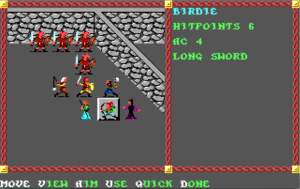
por-combatCombat, unlike navigation, is conducted in a third-person tactical icon-based view, with mechanics similar to playing D&D with miniatures. (This is where the icons that you customized during the character creation stage come in, which I suppose means that the whole color-selection interface is analogous to painting your minis.) That is, it’s turn-based, with each combatant taking actions in an order determined by an initiative roll. (Initiative seems to be re-randomized every round, which I think was officially part of the rules of D&D at the time, although it was often house-ruled away.) There’s nothing really objectionable about the underlying mechanics here, and I do appreciate the way the battlefield is based on the actual arrangement of walls around you when the encounter occurred. My objection is the way you interact with it. It involves far too many keystrokes, and they’re often odd choices of key.

For example, suppose you want to hit someone next to you. You’re expected to press “A” for “Aim”, then select a targeting mode — either cycling through possibilities with the “N” and “P” keys, or using the arrow keys to select a target with a cursor. Why not have both selection modes active simultaneously? Alternately, why not remember what targeting mode the player selected last time and have it automatically use that one until the player explicitly asks to switch? Or suppose you don’t want to attack — it’s the magic-user’s turn, and you’re out of spells, so you just want to move back away from the monsters. You have to enter Movement mode, then use the arrow keys to move, then hit the enter key or “D” (for Done). But “Done” doesn’t mean you’re done: you have to additionally choose whether you’re actually through with this character for the turn or take additional actions from your new position or defer so another character can act and then resume later. This is probably the most consistently aggravating thing. I understand the need to be able to say “I’m done with moving but I still want to do something else”, but I want to say “I’m all done” frequently enough that I should be able to do it with a single input.

It may seem that I’m straining at gnats. After all, I’m talking about single extra keystrokes here. But they’re not really single; they’re repeated over and over again. What the underlying game mechanics really demand is something more like a roguelike interface. And to its credit, the game takes one small step in that direction: if you’re in Movement mode and you bump into a monster, this is interpreted as taking a melee attack. All I really want is to be able to activate other commands from this mode without exiting it, and to not have to hit an extra key to enter it.

Fortunately, the game provides a command, “Q” for Quick, that puts a specific character on autopilot, making them exactly the same kind of mindless killing machine as the enemies. Unfortunately, there’s no obvious way to turn it off, and it seems to stick between encounters. I’m going to have to read up on this in the manual.

To make things worse, the movement/targeting controls are set up for the standard PC numeric keypad, with the Home, End, PgUp, and PgDn keys in the diagonals. This is bad for me because I’m trying to play it on a laptop that doesn’t have that arrangement. On this machine, those keys are normally done via chords: Home (representing left-up in this game) is fn+left, End (left-down) is fn+right, PgUp (right-up) is fn+up, and PgDn (right-down) is fn+down. Avoiding diagonal movement is impracticable, so as I see it, I have four options: I can learn to get used to these chords (bothersome), I can stop playing on the laptop and only play at home (also bothersome; if I’m going to play a game of this vintage, I at least want the convenience of playing it wherever I like), I can carry an external keyboard with me to plug into the laptop whenever I feel like playing it elsewhere (yeah right), or I can try to figure out how to remap keys in DOSBox. The last is clearly the most reasonable solution, but I don’t know if it’s really doable, because the game binds other keys to context-specific commands more or less at random (that is, by their initials).

Pool of Radiance was ported to the NES. I’m having trouble deciding if the interface there would be better or worse. On the one hand, the roguelike interface I advocate here would be pretty much impossible with the limited number of buttons. On the other hand, the same limitation would enforce some simplicity: none of this nonsense about pressing the A key then the M key to enter manual targeting mode if there is no M key. But then, entering diagonals with an NES controller can’t be easy either. Perhaps I should count my blessings.

Pool of Radiance: Navigation mode

The navigation mode in Pool of Radiance is Wizardry-style, but not too Wizardry-style. The biggest difference is that you can’t see as far ahead: where Wizardry and Might and Magic let you see three map tiles in front of you (in addition to the tile you’re on), PoR lets you see only two. As a result, the perspective is stretched out in a way that I found rather confusing at first, having come straight off those other games: walls that are right in front of my nose look like they’re one space away. At the same time, it corrects Wizardry‘s chief deficiency, its tunnel vision. Walls are rendered to the full width of the view pane (which takes up a rather small portion of the screen).

Like Might and Magic, PoR uses the first-person navigation mode even in the city. (In fact, the basic premise of PoR is that you’re helping to reclaim an abandoned city that’s become infested with monsters.) Unlike M&M, it actually tries to make it look like a city. Buildings are largely freestanding structures, with different wall textures than their neighbors, all rendered in 16-color EGA and very much looking it. (Finally, we’ve got a game where the PC version isn’t a port of the Apple II version. PoR seems to have been developed on multiple platforms simultaneously, fully using the graphics capabilities of each platform, which, given the time period, means that the Amiga version looks the best.) And instead of inky blackness wherever there isn’t a wall (as was the case even in the wilderness areas of M&M), there’s a sky, which changes color with the time of day. The very concept of “time of day” isn’t found in those previous games; to the extent that time passes in them, it passes whenever you choose to rest. I don’t yet know the full extent of how time of day affects things in PoR, but at the very least it seems like the town guard comes out at night in the civilized areas to hassle adventurers trying to sleep on the street.

Both Wizardry and Might and Magic had a spell that revealed your current map coordinates. This was crucial for effective mapping (particularly after you got teleported or fell down a chute or something), and my first impulse was to look for such a spell here as well. But it doesn’t exist — how could it? This is an official Dungeons & Dragons game, and D&D doesn’t have such a spell, or even the underlying concepts to support one. Instead, your grid reference is simply displayed on the screen in navigation mode, right under the party roster. Clearly we’re not going to be seeing Wizardry-style interference with navigation: like Pratchett’s elves, our heroes always know exactly where they are. But even the coordinates are a little confusing at first, when coming off of Wizardry and Might and Magic, because those both put the origin in the southwest corner, and PoR puts it in the northwest. Seriously, if there’s one thing this game reveals to me, it’s just how closely Might and Magic imitated Wizardry.

Pool of Radiance: Getting Started

Onward to 1988, when SSI acquired the Dungeons & Dragons license and started churning out what would be called the “Gold Box” games. I know a lot of people have fond memories of these, but my first impression here is of a game that really doesn’t want me to play it.

First, it throws up a deliberate obstacle to running the game at all: key-word copy protection. Every time you start up the game, it needs a word from the code wheel included with the docs; I’ve already made a sheet with equivalent information so I don’t have to go fiddling with the wheel. Then come the perverse UI design decisions. In the PC version, the keys that cycle through vertically-arranged menu options are not the up/down keys, but “home” and “end”. I suppose I see where they were coming from here: you have to be able to select characters while in navigation mode, and up/down already has a meaning there. But, well, other games managed to come up with better solutions. And by “better”, I mean ones that didn’t make me read the manual.

Then there was the matter of file access. At first, the game was incapable of reading or writing saves, and would just get stuck asking me repeatedly to “insert disk for drive D:”. I can’t fully blame the game for this, though: it was because I had run the installer directly from Windows at first, but run the game itself from DOSBox (after finding that it had the same video problems as the other games I’ve played lately — I should probably just assume that anything that runs in EGA mode will be affected.) It turns out that the installer had set up some configuration files with absolute paths in them, which became wrong when I used DOSBox’s virtual drives. This was easily corrected by editing the configuration files, but it took me a while to figure out. Anyway, it’s a problem that the previous games this year didn’t share. They just assumed that whatever directory they were run from was the one they should be using.

Anyway, after a lengthy character creation process (lengthy mostly because of the optional icon customization, which I may describe in more detail later), I got into the game, and went to the part of town labeled “Taverns and Shops” on the map in the manual, hoping to buy some basic equipment — just armor and weapons for each character. But there’s no obvious way to tell whether a given door leads to a shop or to a tavern, so I wound up blundering into the latter before the former. I tried to make a quick exit, but the game wouldn’t let me; I got caught in a tavern brawl that wound up killing my entire party. But even with everyone dead, the brawl continued for a long time, preventing me from doing anything else in the game. I’ve heard stories about terrible dungeon masters who play out battles that don’t involve the players at all, essentially treating the players as a passive audience. If that’s part of the D&D experience, SSI captured it well.

« Previous Page