Archive for August, 2010

Freedom Force: UI

ff-actionmenuThe user interface in Freedom Force is generally a joy to use. It’s a really good example of a mature system, but with a few bits of experimental oddity. The maturity mainly has to do with streamlining commonly-executed actions and providing multiple ways of doing things — for example, that you can select characters by clicking on them, or by clicking on their portrait at the bottom of the screen, or by pressing the number keys corresponding to those portraits. Since I’m used to using the number keys to switch weapons in first-person shooters, I find this last approach easiest. This is why I know that you can also use the number keys in ways more commonly associated with the mouse, such as double-tapping (which centers the viewport on that character), or pressing in combination with the shift key (to select more than one character at once, just like selecting multiple items in a drop-down menu). Of course, when you select multiple characters, it’s most commonly because you want to select all of them, to send them to a particular point on the map. This is simplified to a single key-press, and furthermore, one that’s easily discoverable by accident. (It’s the 5 key, just one to the right of the last hero hotkey.)

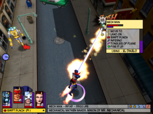
The simplest actions within the world can be performed by left-clicking on stuff, thus telling your hero to perform whatever the obvious action is: picking it up, talking to it, or whatever the context demands. If the thing you click on is an enemy, the obvious action is performing your default attack, which you can change at will. If you want to do something else, you can bring up a menu by right-clicking, which automatically pauses the game. Now, there’s a little display area at the bottom of the screen where it gives you a little information about what the cursor is currently over (including a handy summary of what sorts of damage it’s vulnerable and resistant to — yes, even inanimate objects have resistances, which is why, for example, it’s easier to destroy a brick wall with an explosion than with a radiation beam. 1Some seemingly inanimate objects even have mental states. During a mission to destroy a supervillain’s massive ray gun installation, I managed to render it Stunned, complete with animation of stars circling where its head would be if it had a head. ). And this is important information, because sometimes you want to target specific parts of things — the alarm on a guardhouse, for example. But even with that to guide you, it’s easy to right-click on the wrong thing — probably because keeping an eye on that status bar involves looking at a different part of the screen than where the cursor is (a problem with status-bar-based UIs that I’ve noted before). So they made the right-click menu moveable: as long as you keep the right mouse button held down, you can scan around with it, watching the menu change as it goes. This is one of the experimental oddities I mentioned. It should be noted that the background color of the menu changes according to what sort of thing it’s on, making it very easy to stop moving the moment you drag over an enemy.

Hovering over an option in the action menu displays a great deal of information about it: the tooltip area at the bottom turns into a summary of the effects, and the display in the world gives such information as the line to the target (useful for finding out if ranged attacks are blocked), whether or not you’re in range (indicated by the color of aforementioned line), and, if applicable, the blast radius (rendered as a sphere). The action selection menu itself contains a bar chart showing how much Energy you’ll have left if you select the action. You can choose to perform actions you don’t actually have enough Energy for, but you risk winding up Stunned if you do, kind of like spellcasting in Angband. 2It strikes me only now as I write this that I have a couple of heroes that are capable of curing mental states such as Stunned. Perhaps there’s a viable strategem to be made of this, of overpowering all your attacks and letting the cleric take care of the consequences. This is reflected by making the Energy bar flash red — the redder, the riskier. Raising and lowering the charge on your attacks is accomplished by right-clicking on the power to bring up a sub-menu, a rare example of a right-click menu within a right-click menu, and another element that I’d call an experimental oddity. It works, though.

The system for controlling the camera is, in my opinion, the least successful part of the UI.
Using arrow keys or WASD to scroll the viewport is fine, as is zooming up and down with the mouse wheel. (There’s a way to do this with the keyboard as well, but I’ve forgotten it. The wheel is just more convenient.) But I never got the hang of rotating the camera view, which involves combinations of key presses and mouse movement. I generally leave the camera orientation alone, and it works just fine. It means I’m not always ideally situated to see what’s going in in narrow alleyways, but I can always get a good-enough view by zooming way in: once you’re close enough, walls are rendered semi-transparent.
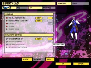
ff-upgradesOutside of the missions, everything is a set of nested menus, with a very satisfying “clunk” sound accompanying every selection. I spend fairly large amount of time in these, specifically in the upgrade section. Whenever a hero levels up, they get 600 “Character Points” to spend on gaining new powers or upgrading existing ones, and it’s always an agonizing choice. (The worst of it is that some powers cost more than 600 CP, so you can only afford them if you forgo upgrading for a level.) This is also where you can get full information on each ability’s stats, available on a separate screen by clicking the “View” button. And here lies my one complaint about the UI. In order to decide whether to spend the points on upgrading an ability, I need to know how the upgrade will affect it. The only way to find this out is by going to the “View” screen, committing its contents to memory, backing out, upgrading it, and then going to the “View” screen again. It could be worse: at least you’re allowed to undo your purchases (until you commit them by leaving the upgrade menu entirely). But I can think of any number of CRPGs that handle this better, displaying the current and improved stats side-by-side, sometimes with highlight colors. I hope the sequel addresses this.

References
1 Some seemingly inanimate objects even have mental states. During a mission to destroy a supervillain’s massive ray gun installation, I managed to render it Stunned, complete with animation of stars circling where its head would be if it had a head.
2 It strikes me only now as I write this that I have a couple of heroes that are capable of curing mental states such as Stunned. Perhaps there’s a viable strategem to be made of this, of overpowering all your attacks and letting the cleric take care of the consequences.

Freedom Force: Legion

I’m well over halfway through Freedom Force now, and slightly into the bits I’ve never seen before. And at last, I remember the game’s greatest cruelty: the cruelty of choice.

Progressing through the game means gaining access to more and more heroes. Some of them are simply slotted into your roster automatically. Others are made available for hire, and must be purchased with Prestige points. But you can only take four of them into a mission — and sometimes not even that; sometimes a slot has to be kept clear for a new arrival. And when I say “mission”, understand that most missions consist of two or three levels, with no opportunity for swapping in different heroes between. Furthermore, you don’t get the full experience of playing with a particular hero from just taking it out on a single mission as soon as it joins the team. Every hero needs to level up in order to get their full set of powers. The game is considerate enough to level up heroes that are just cooling their heels back at base, but at a slower rate than the ones in the field. If you want a hero to reach its full potential, you have to neglect others.

Pokémon had a similar dynamic, but with one crucial difference: there, you could always go back to places you had already visited for the sake of leveling up the newcomers. In Freedom Force, there is a finite sequence of missions. A single play-through is simply not long enough to fully explore the potential of all the heroes, and the closer I get to the end, the more I become aware that my opportunities are dwindling, even as my choices grow. It’s like a metaphor for mortality. I suppose the real point is to encourage replay, but that’s not something I’m likely to do soon, enjoyable as the game is.

Freedom Force: Prestige and Perfection

I describe myself as a completist. This is a matter of habit, and the habit was formed when I was a child and didn’t have the disposable income to buy a new game whenever I wanted one. Scouring a game for every last crumb was a way of extending the experience. But while it extends, it also dilutes. I can’t deny that completist habits can interfere with the enjoyment of a game, dragging it out past the point where it has anything to teach you. But then, sometimes failing to go for 100% means you see only half the content. It all depends on the game — some are calibrated for completism, some are not.

If a game designer wants to encourage completism, it’s easy to do: just tell the players what they have and have not accomplished. Freedom Force does this at the end of every level. Every primary and secondary objective is listed — if you’ve completed the level, you have by definition executed all the primary objectives, but secondary objectives can wind up with a big X of incompletion next to them. Also, every type of enemy you encountered is listed, with the number defeated out of the number available to be defeated, like “Thug with bat: 11/12”. Any completist looking at that will want to hunt down the twelfth thug with bat. Which is a problem, because it’s not really worth it, in terms of entertainment or in terms of gameplay mechanics. The real point of this summary screen is not to encourage completism, but to tell you where your Prestige Points are coming from. Prestige is kind of like XP for the whole team, but its sole effect on gameplay is unlocking optional heroes, and the quantities of prestige needed for this are large enough that picking off a few more thugs won’t make a difference.

It seems like the designers of the game were aware of the problem, because there’s a pair of levels that are positively designed to break the completist mindset.

First, there’s “Prehistoric Panic”, a level in which a dinosaur-emitting portal opens up in the middle of the city. (It’s not yet clear why this happened. Presumably Energy X is involved somehow, because that’s the explanation for everything else in the game, but if I meet a scientist named Kirk I’m gong to hit him very hard.) There are a number of set encounters here, but there are also additional dinosaurs that simply come out of the portal over time. Allegedly in the original version you could exploit this to get as much Prestige as you wanted by just standing by the portal and trouncing the dinosaurs as they came through, although a later patch capped the prestige bonus at 20 of each type of creature. Either way, this is the first occasion where the number of enemies is not fixed. You’re required to defeat every dinosaur that appears, but regardless of how many that is, the Prestige report treats it like completion: “Raptors: 6/6” if that’s how many there were. Knowing that the maximum can vary makes it seem less important somehow.

This is immediately followed by a level involving giant ants destroying the city. Once again, the number is not fixed, and you can stand there and farm prestige if you really want to, but the goal is to destroy the holes they’re emerging from. In fact, the ants simply vanish when you destroy their holes, so you can complete the level without harming any ants at all. The key thing about this level is that it is impossible to completely avoid prestige penalties. That’s another thing reported between levels: collateral damage in the form of civilians harmed and buildings destroyed. Usually, it’s not hard to keep that section of the report clear, as small items like cars and lampposts aren’t counted. But here, even if you did everything perfectly, there will be buildings destroyed when the ants create holes directly under them.

The interesting thing is that this time around I knew what was coming, but still felt the need to try for perfection in the levels before these two. I suppose it’s due to the content. Up to this point, the level goals were generally to prevent chaos and destruction. For example, when a villain called Nuclear Winter (basically Mr. Freeze as a soviet agent) tries to detonate a stolen atom bomb, you have no choice but to prevent it from going off. But in these levels, preventing chaos is not an option. Chaos has already begun. You’re there to stop what has already started, and anything that delays you in this errand is a bad thing, even if it does net you a little more Prestige.

Freedom Force: Combat and Character

So, let’s talk mechanics. In any mission, you have up to four characters, controllable independently. Clicking on stuff lets you assign actions like moving, talking to NPCs, picking up and throwing environmental object such as crates and automobiles, and most importantly, attacking the various thugs, monsters, and supervillains that try to stop you. All actions are performed in real time, although you can pause the action at will — in fact, bringing up the action menu automatically pauses the game. The whole UI is very well-designed, but I’ll get into that more fully in another post.

Now, every hero has a distinct set of powers, which are mostly attacks of various sorts. There are melee attacks and ranged attacks, ones that simply do damage and ones that do elemental damage and ones that cause status effects — in short, your usual assortment for a modern CRPG. Since this is a game that takes place in a three-dimensional space, knockback from attacks can be a significant factor, especially when you’re fighting near a cliff or atop a tall building. In general, specific attacks can be made stronger over the course of the game as the characters level up.

Most powers use greater or lesser amounts of “energy” (which basically means mana). A hero’s energy naturally replenishes over time, quickly enough that you never have to wait long for it to fill up, but not quickly enough to keep you from frequently running out during fights. Making the most of your energy is thus a big part of the game’s tactics, and it always feels like a big win when you can take out enemies without using any energy at all (for example, by hurling boulders at them). You can actually choose to spend less energy than normal on a power, if you’re willing to accept weaker effects, and likewise you can spend more energy than normal for stronger effects — there are five settings, with the default in the middle four settings, two above and one below normal power, accessible through an additional right-click menu in the action menu. I find that I frequently overcharge my powers and almost never undercharge them. As in Pokémon, efficiency in this game means favoring the one-hit KO, and overcharging is key to that. Furthermore, some powers only really become useful when overcharged. For example, Minuteman has an attack that sweeps an arc, knocking back anyone it hits and doing a certain amount of damage, but not as much damage as his regular attack. At normal power, this is seldom worth it. But turn it up to max, and the knockback becomes strong enough to send normal humans sailing through the air like cannonballs, taking substantial amounts of falling damage when they hit the ground.

The thing that really impresses me is the degree to which the designers managed to come up with powers that complement the heroes’ personalities. For example, Minteman is courageous. We know this because he’s always charging into the middle of the fray and emerging victorious — and the reason he does this is that his powers are mostly short-range melee attacks and defenses that allow him to ignore the people shooting at him. His only ranged attack does a very small amount of damage, but it has a large chance of temporarily stunning its target and can ricochet to multiple foes if they’re close together. In other words, it’s basically an aid to those melee attacks, a way to make it easier to get within striking distance without getting shot. Similarly, El Diablo, the Human Torch imitation from the barrio, is impulsive, reckless even. His chief attack, a blast of flame, uses lots of energy and only affects one target at once, so it’s easy for him to run out of energy, especially if he’s fighting multiple enemies by himself — which tends to happen if you’re not careful, because his ability to fly lets him get ahead of the pack. To make things worse, he doesn’t regain energy as fast when he’s airborne. Using El Diablo effectively largely means reining him in, not letting him use his powers to their full extent lest he get himself in trouble. It takes a few failures to learn this, and it’s easy to attribute the player’s learning experience to the character.

Freedom Force as Early Marvel Pastiche

Freedom Force is definitely trying to evoke early Marvel. For one thing, most of the heroes are closely based on familiar Marvel heroes, in some combination of theme, powers, and/or personality. It’s loose reinterpretation, though, rather than strict adherence. We’ve got a Captain America-like super-patriot called the Minuteman, but instead of a soldier, he’s a former atomic scientist. We’ve got a flying fire-thrower like the Human Torch, and also like the Human Torch he’s hotheaded and impulsive, but here it’s because he’s a Latino stereotype (and, true to context, therefore a former gang member as well). I remember from my previous go-rounds that the player eventually picks up a Spider-Man-like wisecracking nerd who climbs walls, but here he’s themed around ants, and capable of spitting acid (a power that would probably be too grotesque in its effects to use in an actual silver-age comic, but the combat system here abstracts the melted flesh away.) And no one here has the same origin story as their Marvel counterpart, because they all basically have the same origin story, one involving canisters of Energy X that fell from an alien spacecraft.

It all reminds me a bit of Alan Moore’s 1963. This was likewise a fairly detailed variation on the theme of early Marvel (and, to a certain extent, silver-age DC), but with a greater emphasis on satire, on casting a spotlight on the illogical and exaggerating the already-exaggerated, carrying the pomposity and the bathos and the pointless alliteration to the point of complete ridiculousness. I draw a contrast here, but sometimes Freedom Force feels the same way. Sometimes there’s a fine line between homage and mockery.

It really comes down to this: When you want to imitate something respectfully, how do you handle its glaring flaws? Freedom Force aims to be a celebration of a style that was, when you come right down to it, pretty goofy. It wants to capture the open-mouthed childlike “Whoa, cool!” reaction, but that comes as a package deal with the flat and childish characters, the frankly stupid stories, the awkward and overenthusiastic narration. You can’t throw that stuff out, because if you do, it doesn’t seem like early Marvel any more. It becomes something else — not necessarily something better, but less evocative of that particular point in the medium’s history, with all its unpolished verve and energy. But if you include it on purpose, it becomes camp. And that’s not what they’re aiming at either.

If you ask me, Freedom Force errs on the side of camp. I remember that when I first started the game, Treyarch’s Spider-Man was still fresh in my mind. This had a strong sense of goofiness as well, but it somehow contrived to seem much more sincere about it, more like an actual Spider-Man comic. Freedom Force is handicapped by its wannabe status from the very start.

Freedom Force

Freedom Force is a game I’ve started several times over the past eight years, each time with the intention of seeing it through to the end. Somehow it’s never quite worked out. Something about its highly episodic structure makes it easy to abandon in the middle.

It’s a game about superheroes, which is something that actually used to be pretty rare. Sure, there have been superhero games for a long time — The Marvel “Questprobe” illustrated text adventures by Scott Adams 1That’s “Adventure International” Scott Adams, not Dilbert Scott Adams. and the Atari 2600 Superman come to mind as early examples — but they didn’t form a genre that you could rely on seeing every time you walked into Gamestop. Hollywood changed this: once superhero movies became staple summer blockbusters, superhero movie tie-in videogames became inevitable, and by now it’s a sufficiently established genre that companies are comfortable devoting major resources to superhero games that stand on their own — one of the best-regarded A-list titles of last year is a Batman game that isn’t linked to a movie at all. But this only started happening after the wave of movies inaugurated by 2000’s X-Men, and even then, it lagged behind the movie industry somewhat. Freedom Force, released in 2002, was something of an anomaly.

It’s also anomalous in other ways. For one thing, it takes the Astro City-like approach of making up its own roster of heroes and villains rather than licensing them. That’s actually not so weird under a broad understanding of the word “superhero”. Plenty of games have original super-powered protagonists — like Prototype and Crackdown, to name a couple of relatively recent examples from the Zero Punctuation archives. (Even the player character in venerable Doom is arguably superhuman, seeing how he can run at about 90 miles per hour while not only lugging a chain gun around but actually firing it.) But games not based on pre-existing heroes usually stray pretty far from what we usually understand to be the superhero genre in other media. (Even the licensed heroes sometimes have problems sticking to genre norms when they’re plunked into a game. Treyarch’s unjustly-neglected 2000 Spider-Man gave the player every incentive to throw policemen off of tall buildings.) Freedom Force, on the other hand, is not only about super-powered characters, it’s conspicuously superhero-styled. Or, to put a fine point on it, comic-book-styled. More specifically, the style of Marvel comics from the early 1960s. There’s a mention early on of someone working on the Mahattan project “twenty years ago”, which definitely fixes the setting between 1962 and 1965, but even without that detail, the game goes to great lengths to establish the style and zeitgeist of that era. I’ll have more to say about that later.

The final major strangeness that I’ll note before signing off is that it’s not an action game. It’s essentially a hybrid of RPG and squad-based tactical combat, with something like a streamlined Baldur’s Gate interface (complete with pressing the space bar to pause the action so you can give new orders to the entire team). I’ll probably have more to say about this later as well. It’s not the only non-action-oriented superhero game, of course — for starters, there’s the aforementioned Questprobe adventures. But those at least still provided the fundamental draw of the superhero game: the appeal of putting yourself in the superhero’s shoes, of having superhero experiences. Freedom Force actively interferes with identifying with the characters. It’s impossible to play without being constantly reminded that you’re acting on the gameworld from outside. For one thing, you have to play the whole team at once, juggling their actions. For another, the default (and most useful) perspective is highly elevated, looking down on your heroes like they’re toy soldiers, or possibly action figures. Which, I suppose, at least jibes with the affectations noted in the previous paragraph. This isn’t a real world that you can walk around in. It’s a brightly-colored, highly artificial comic-book world. It exists to be played with. The same is true of most games, but this one isn’t even dreaming of being anything other than what it is.

Well, except a Marvel product. It really, really wishes it were written by Stan Lee and illustrated by Jack Kirby.

References
1 That’s “Adventure International” Scott Adams, not Dilbert Scott Adams.

Bioscopia: Final Thoughts

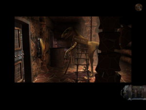
bioscopia-dinoBioscopia is now off the Stack. I resorted to a walkthough once — I tried to avoid it, out of a suspicion that once I started on the hints, I’d keep on hitting them. A game like this is pretty reliant on the wandering-around-confused phases, because that’s when you notice the hotspots you missed before, and find clues and items you’ll need for puzzles you haven’t encountered yet. But toward the end, when I had more or less exhausted the environment, this rationale wore thin.

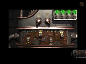
bioscopia-lettersThere was one point earlier on when I was severely tempted to cheat: it involved four dials, each of which could be set to any of eight letters. A word puzzle? Unlikely in a game translated from a foreign language. The letters conspicuously included A, T, C, and G, the abbreviations of the bases that form DNA, so it seemed reasonable that these would be the four letters in the combination. But in what order? Only one ordering was accepted, it turned out, but if there was a clue about it, I missed it — and having looked at a couple of walkthroughs after the fact, I find that I’m not the only one. But assuming that it’s a permutation of these four elements reduces the solution space from 4096 possibilities to a mere 24, amenable to brute force search. Riven had similarly subjected the player to trying out the remaining possibilities in conditions of incomplete information four years previously, but it somehow seemed more acceptable there. Probably it’s because Riven was aiming for believability, and the occasional lack of pat clues worked into that. Bioscopia is far too fundamentally contrived to ever use realism as an excuse.

The game involves more situational use of biological knowledge than I gave it credit for at first, although it never really gives up on merely using science as inspiration for increasingly-elaborate combination locks. Also, I wondered earlier if the authors were aware of the irony of using robots prominently. It turns out that they are: the robots, it turns out, are the bad guys; the disease that overcame the researchers is caused by their fumes. So it’s kind of a nature-vs-technology plot, except that the whole place is still extremely artifical. There are no living animals to be seen anywhere in the game, which is particularly weird given that there’s an entire section about zoology.

Actually, there’s technically one animal: a human, a fellow explorer, trapped and sick and occasionally sending you text messages stressing the urgency of her situation. Curing and rescuing this damsel in distress produces the ending cutscene, a disappointing and slightly confusing piece of work, with some of the silliest-sounding maniacal laughter I’ve ever heard.

I’ve finished this game a full week ahead of schedule, but that’s OK, because the schedule itself has already slipped by two weeks. So I’ll be proceeding to 2002 without further delay.

Bioscopia: Symbols and Learning

Since my last post, I’ve started making progress again, mainly by revisiting places a lot to see if I noticed anything new. If nothing else, wandering in this way exposes the player to more “educational” content: in order to keep using doors, you have to periodically recharge your keycard by playing biology trivia at the card-recharging stations located in each major section, conveniently near the “big brain” machines that give you access to the in-game textbook containing all the answers.

The keycard turned out to be the key to my earlier stuckness, as it turned out that my initial low-clearance one could open two doors from the hub, not just one as I had believed. I could have sworn I had tried it on all of the doors, but I guess not. And by now, I have a superior card that lets me through any door with a slot. Not that all doors have slots. There are still puzzles to solve.

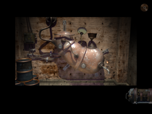
bioscopia-organOne of the first things I found this time around was an outsized organ attached to a wall, with an intake funnel and an outflow valve, like something out of a Fritz Kahn illustration. I’m not sure what organ it’s supposed to be — to me, it looks like a pancreas more than anything else, but that doesn’t fit the plumbing. At any rate, it was clearly a new type of puzzle: one based on interacting with biological mechanisms rather than just displaying knowledge of them. Mentally squinting, I think I can make out some less-obvious examples of this in the architecture, situations that are symbols of the processes that I’m supposed to be learning about, like how the circuitous entry into the inner part of the microbiology lab reflects the way a carrier protein transports a molecule through a cell membrane.

This sort of architectural symbolism was found abundantly in Chemicus, where the whole layout of the game was an imitation of the periodic table of elements (with the noble gases only accessible through a secret passage, indicating their resistance to ordinary connections). I suppose Bioscopia‘s overall layout similarly resembles a cell, with the inaccessible tree in the middle representing the nucleus. I’ve been assuming that crossing that chasm is the passage into the endgame, which means symbolically, what, impregnating the compound? Virally infecting it? The ultimate goal of the game is to rid the place of an infection, a plague contracted by the previous tenants.

At any rate, the organ on the wall is one of the few cases of the game attempting to teach through an approximation to what Ian Bogost calls “procedural rhetoric” — that is, instead of presenting the audience with a statement directly, presenting a rule-based system that embodies the statement and letting the audience discover it by interacting with the system. It’s not a very advanced example of this technique, though, and it pretty decisively fails at its pedagogical purpose: I interacted with it, I solved the puzzle it was part of, and I still don’t know what I was supposed to learn.

Bioscopia: Stuckness

My second session of Bioscopia was completely unproductive. There’s a circular hub with a large tree in the middle and keycard-activated doors all around; I’ve managed to access exactly one of these doors, in addition to the sector from which I entered, for a total of two. This is my realm, which I wander, looking for hotspots. They’re hard to find.

There are obvious places to click, to be sure: doors, drawers, levers, etc. But they’re not always clickable. Things that are locked or otherwise inactive don’t even let you give them a futile rattle. And sometimes the difference between clickable and unclickable things simply makes no sense. There’s one room containing a bunch of desks, which visibly have a pair of drawers on the left and right sides, but only the left drawers can be opened. Even worse, one of those drawers contains a pair of projector slides, only one of which can be picked up.

You can tell when the cursor is over a hotspot, because it changes in appearance. (When it works, which it doesn’t always — this sort of game has a perennial problem with things changing under the cursor when the cursor isn’t moving.) Thus, my adventures at the moment consist mainly of waving the cursor around on every screen, hoping to strike gold. There may not be any, mind you. There’s also the possibility of using inventory items on the environment, which provides no visual feedback about when it’s possible: you just have to look for plausible places to try each item. And even those won’t always work. I have a bucket in my possession, and I’ve tried it on every body of liquid I’ve seen, but apparently it can only carry the right liquid.

Sadly, I can’t even talk about how much better Physicus and Chemicus were in this regard. I recall them having similar problems, although I don’t think I ever got stuck for so long in them — since the puzzles were more tightly-bound to the lesson plan, I could always go to the in-game textbook for ideas.

Bioscopia and its kin

Around the turn of the millennium, Tivola Publishing released a series of three German-developed Myst-style first-person adventure games with educational aspirations, each focusing on a different science. The most celebrated of the three, and the one with by far the highest production values, is Chemicus. Andrew Plotkin’s review of Chemicus got me curious about it, and by extension, the other two, Physicus and Bioscopia.

Physicus and Bioscopia are both blatant Director games, Made in Macromedia and not too proud to show it, like many of their generation of cheap Myst imitators. All three games follow the basic model of wandering around a strange and deserted environment, poking at things with your cursor and solving puzzles that open up new areas — the puzzles, in these particular games, being to a large extent (but not entirely!) tests of your knowledge and understanding of the subject matter, which is also available through a sort of narrated and animated textbook within the game (sometimes a little shaky in its English translation). Physicus was much shorter and easier than Chemicus, basically a one-sitting game. I can’t really speak to the length of Bioscopia, though, because I haven’t finished it yet. I stopped playing fairly early on, finding it far less interesting than either of its brethren.

This isn’t because the curriculum was less interesting. It’s because it was less well-integrated into the gameplay. Chemicus worked as well as it did because it used practical chemistry to solve adventure-game puzzles — for example, freeing a golden object embedded in a block of silver by immersing it in nitric acid. Physicus was more like a bunch of concretized word problems: there were lots of machines that needed just one or two things adjusted, like the right weight to balance a lever, or the right amount of power through an induction coil. It was more contrived than the situational puzzles in Chemicus, but it was still based on interacting with the environment as an environment. Bioscopia, from what I’ve seen so far, mainly just tries to teach biology by occasionally quizzing you in various ways. There are puzzles about manipulating the environment, using objects on other objects and whatnot, but these puzzles have absolutely nothing to do with biology. They’re mostly about manipulating machines, prominently including robots — were the authors aware of the irony here? And some of the machines require you to demonstrate biological knowledge, but they could just as well be asking you about art history or Doctor Who trivia.

I suppose it shows something about the way the three subjects are taught in school. Chemistry and physics are presented as techniques, and techniques are things that can be applied in a simulated world. But biology is presented mainly as a collection of facts. It’s impossible to perform science of that sort.

Perhaps it’s best to not even think of Bioscopia as educational and just approach it as a game. We’ll see how well that works. But right now, I don’t think it works very well that way either.

Next Page »