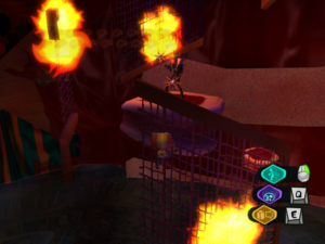
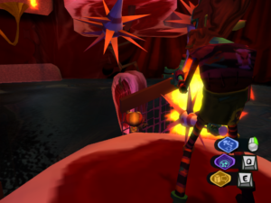
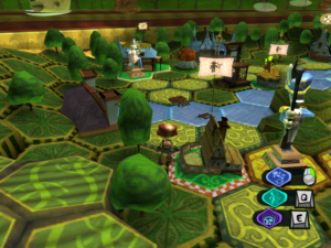
 Frankly, I find it hard to play Psychonauts without thinking of the Ratchet & Clank games. I suppose that they’re both basically just swimming in the general soup of 3D platformers, all of which imitate each other to some degree, but there are a few specific aspects that seem particularly Ratchettian. There’s the general approach to combat sequences: in most cases, battles can be won by either having skill and good reflexes, or by assessing the situation and choosing the one weapon in your arsenal that makes it easy. There’s the sliding-along-a-rail sequences, although the two games approach that in different ways: R&C made the “shredding” into something set apart in special areas that demanded tricky sequences of timed jumps, and while Psychonauts has a couple of bits that seem to be intended to evoke the same experience (but aren’t as difficult), it mainly just adds the rails to bits of the regular terrain, letting you slide down bannisters as an alternative to walking down the stairs and the like.
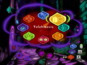
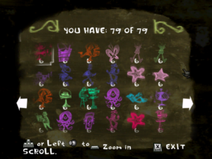
And then there’s the pie menus. This is the main thing that keeps reminding me of R&C, because it’s something I use all the time. If you want to select a psychic power or an inventory item in Psychonauts, or a weapon or gadget in Ratchet & Clank, you can do it through an interface that shows eight choices in a circle, from which you select one by pointing the analog stick in the appropriate direction. This is one of R&C‘s most distinctive features, and the menu in Psychonauts resembles it more strongly than other pie menus I’ve seen (such as the one in The Sims), which tend to be based on using a mouse rather than a joystick, and have a variable number of slots rather than always eight (resulting in, for example, a triangular configuration if there are only three options). And the strange thing is that, even though this resemblance is strong, it’s very superficial.
See, the point of the pie menu in Ratchet & Clank is that it was your quick-selection option. That game had a lot more than eight weapons, and the pie menu wasn’t the primary way to select them. You always had the option of opening up the screen that had the full set displayed in a grid, pushing a cursor around to select the correct square, and resuming the game. But if you were using a particular item a lot, it was more convenient to put it into one of the eight quick-selection slots where you could just press a button, flick the joystick, and release. In the sequels, bringing up the circle menu didn’t even pause the action. Crucial to the way it worked was that you could assign which item went in which slot yourself. If you got used to flicking upward for your main weapon, and then decided to switch to using some other weapon as your main one, you could just replace it.
This conceptual niche, the user-assignable quick-selection option, exists in Psychonauts, but not through the circle menu. Rather, the game lets you assign three different psychic powers to different buttons — on a gamepad, keyboard, or mouse — while a fourth button activates the currently-selected inventory item. That’s your quick-selection: selecting which button to press. The pie menu, then, takes the role of that page with the complete grid in R&C. There are exactly eight psychic powers, so they all fit on the same circle, and you can’t alter their positions on it. There are sometimes more than eight inventory items, in which case the game lets you page between multiple batches of eight.
It really seems like this aspect of the user interface was decided on because it was cool, not because it was appropriate. It’s a menu in which you don’t use any particular option frequently (because the powers you use frequently are the ones you never remove from their button assignments), that isn’t user-alterable, and which, in the case of the inventory menu, sometimes changes itself spontaneously. All of which means it loses the chief advantage of the pie menu: its “gestural” nature, the ability to use it from muscle memory. It might as well be a traditional list.
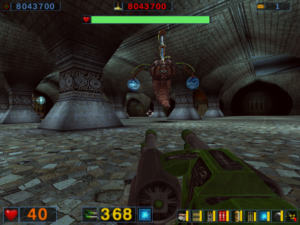
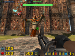 It turns out that the final levels shed the halloween motif pretty quickly and settle into something more like the knightly stuff I was expecting. Not that this has a very great effect on on the game — the monsters are the same as always, and not even reskinned. But the ultimate goal is the Holy Grail (which helps you get a spaceship somehow), and the final boss is a gray-robed wizard-looking guy, albeit one who’s 80 feet tall according to the stats provided in-game. His schtick is that he summons random assortments of the standard monsters, which makes for a difficult fight until you find out about the cheap trick that lets you take him down with near absolute safety. Something of a letdown, but then, the end boss in Serious Sam: The First Encounter is a really tough act to follow.
 Comments(1)