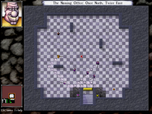
 I’ve come to really like the improvements that have been made to the DROD user interface. Basically, each episode makes more information available.
For example, one of the basic mechanisms in DROD is orbs that open, close, or toggle gates when struck. The City Beneath also has pressure plates that do the same when trod on (which means you can trigger them from a distance by inducing monsters to walk over them). But the orbs and pressure plates are not necessarily near the gates they affect. In the original DROD, if there were multiple orbs in a room, the only way to know what they did was to try them out, which you could only do for the ones that are acessible at any moment.
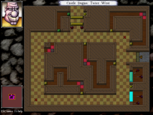
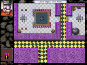
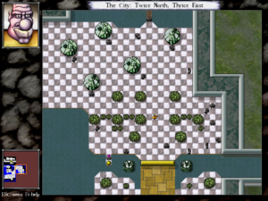
Well, ever since Journey to Rooted Hold, you can click on these controls to highlight the doors they affect, in colors indicating whether it opens, closes, or toggles each door. I didn’t use this feature much when I learned about it, but it’s become a very big deal. One of the basic DROD room patterns is making the player hit a series of checkpoints in a specific order by giving each an orb that unlocks the door to the next. With the new UI, I can know in advance the order I’ll have to hit them in, and plan accordingly. Even in rooms where all the orbs are accessible from the beginning, it’s nice to not have to try them all out (and possibly render the puzzle unsolvable in the process because you let the cockroaches out too early or something).
Once they implemented this click-to-highlight system, the designers started using it in various other ways, such as clicking on an Evil Eye to show its line of sight, or (new in The City Beneath) clicking on a bomb to highlight the area that will be affected by its blast. This was never secret information. All bombs in the game have the same blast radius. So displaying that radius on demand is just a convenience. You know something? Conveniences are nice.
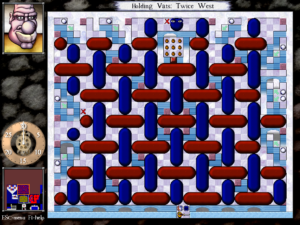
I actually didn’t notice most of these features in Journey to Rooted Hold, which wasn’t as aggressive about pointing them out as the new episode, but there was one enhancement that was hard to not notice: it added a clock to the screen whenever there was a timed event pending. Mainly this meant timing the spawn cycle of Roach Queens and Tar Mothers, both of which cause new stuff to appear every 30 turns. Knowing exaclty how soon that’s going to happen is often crucial, and it was easy to lose track when playing the original DROD.
The general principle here is that providing easy access to crucial information helps the player, by making the process of solving the puzzles easier, but doesn’t actually make the puzzle itself easier. A subtle distinction, perhaps, but an important one, and one that’s illuminated by my recent experiences with Roberta Williams’ Time Zone. Williams chose to make things inconvenient for the player, making you reload saves and do things over again because you used the wrong weapon or brought the wrong selection of objects into the endgame. She chose this, I think, because she was trying to create a difficult game, and the understanding of the time did not differentiate between difficulty in solving a game and difficulty in playing it.
The designers of DROD have a better idea of what their gameplay is about. It’s not about keeping secrets from the player. It’s about applying known rules in complex and novel ways.
 It’s interesting, then, that they still choose to retain the possibility of hiding information in some ways. Let me explain: I’ve just reached the point in The City Beneath where the Living Tar makes its appearance. Living Tar, and its variant Awakened Mud, form DROD‘s version of ooze monsters. In its simplest state, tarstuff (the word applies to both forms) lies in inert pools covering multiple tiles, not crossable and only partially vulnerable to attack: Tar is invlunerable on its convex corners, while Mud is invulnerable everywhere but its corners. Either must be cleared away one tile at a time.
Now, until cleared, tarstuff conceals any terrain features in the tiles it occupies, including orbs, pressure plates, gates, and even walls. This is significant information-hiding. The original King Dugan’s Dungeon had some puzzles that relied on tarstuff’s concealing properties. For example, there was a maze completely covered in tar, which you had to cut carefully lest you wind up with an invulnerable tar corner blocking the path you needed to take. This isn’t really in the DROD style as I’ve described it above, but it’s typical for the first game in a series to have a few klunkers.
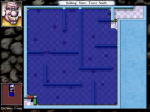
 The City Beneath provides a way to see what’s under tarstuff, but it isn’t a user-interface feature like the other things I’ve been describing. Rather, there’s an in-game “token”, a special tile type that effectively gives Beethro X-ray vision when activated, rendering all tarstuff translucent.
I can think of three possible reasons why tarstuff visibility isn’t handled through a simple click like the other new information features. First, it could be that there will at some later point be puzzles that rely on concealing information with tarstuff. I hope this isn’t the case, because it’s difficult to imagine the result being anything more than a guessing-game, and I think the DROD designers are past that now. Second, it could be that the designers wanted to preserve the ability to play levels created in the older engines without drastically altering the play experience. I don’t know that that’s a great priority for them, though: surely some of those old levels are drastically altered by the ability to click on an orb to see what it does. Third, it could just be the difficulty of creating a user interface to deal with it reasonably. If you click on tarstuff to see under it, and you click on orbs to see what they affect, how do you see what’s affected by an orb concealed by tarstuff?
 Comments(0)