Wizardry III: Graphics
The bulk of dungeon level 3 is taken up with a big mass of one-way walls. These are in some ways equivalent to one-way doors, in that they allow you to pass through in only one direction, except that from the passable direction they’re completely invisible. The effect is fearsome. Before this point, you could rely on having an escape route behind you most of the time, and even the introduction of one-way doors meant that getting cut off was the result of a conscious decision to go through an unexplored door. But now, any step can cut you off. Even worse, though, the geography simply doesn’t make intuitive sense any more.
The underlying model must involve separate records for each map tile for what lies in each of the four directions, because there’s clearly nothing enforcing consistency between adjacent tiles. Presumably the renderer has some way to determine which tiles to consult about what to render for each particular wall slot — for example, tiles to the left of the player’s view determine the visibility of their own left walls but not their right walls. This is all more complicated than the contemporary 3D dungeons in the Ultima series, which were simply grids of blocks, each of which could be either solid or empty. In fact, it’s kind of like a primitive version of portal rendering, with each map tile treated as its own sector. (The effect of looking into a teleporter square is particularly suggestive of this: the renderer displays the sectors adjacent to the teleporter’s destination. Which can be really confusing if you don’t know there’s a teleporter there.)
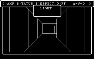
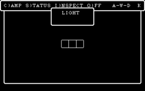
 Note that when I say “primitive”, I mean primitive. We’re talking low-res black-and-white line drawings here. Any significant dungeon features other than walls and doors — whether it’s a staircase, a signpost, an altar, or a mysterious cloaked figure beckoning to you — is rendered as a smudge on the floor. Even worse, the player character apparently has tunnel vision: the view is only three tiles wide. I suppose it was optimized for corridors, where all you need to see is the walls to your left and right, and the immediate entrance to any side corridor.
  But there are a lot of wide-open spaces in this game — or, in the case of dungeon level 3, spaces that look wide-open from one side. You can be facing a distant wall (where “distant” means four tiles away, the longest distance you can see) and see only three little wall segments in the middle of the screen. The kicker is that Wizardry III is a step up from the original Wizardry engine. The original versions of I and II put their line drawings in one small corner of the screen in order to make room for the party stats and other information. Wizardry III (and versions of I and II ported to the Wizardry III engine) renders full-screen line drawings, and overlays information windows on top of it as and when needed.
Still, I can’t help but feel like the graphics here have stood up to time better than the graphics in more advanced games like The Bard’s Tale. As with the pixel art beloved of indie game developers, it’s primitive enough to have a minimalist aesthetic. There is no unnecessary detail, just enough to convincingly put you in a barren and claustrophobic network of corridors. Which means it’s a little embarrassing when the in-game text tells you that you stand before a mighty castle or you’re on the shore of a lake or something. Just let it be what it is, guys.
 Comments(1)
I think the art is better in Bard’s Tale 1 than in 2 or 3, but it has more to do with the artistry than with any technical considerations.