Dark Souls: UI Thoughts
There’s been a small online kerfuffle about Elden Ring‘s UI. What do I think of the Dark Souls UI?
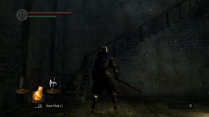
 Mostly it’s fine. It’s designed for a controller, and that’s how I’ve been playing, and it’s serviceable enough. There’s a useful health gauge permanently affixed to the top left, and below it, a stamina gauge that’s less useful, as stamina refills so quickly that it’s going to be full any time your attention isn’t on the stamina-draining actions you’re performing. I think the stamina gauge is mainly there to explain to the player how stamina works, rather than to provide up-to-the-moment information. To give you a strong intuitive sense of why sprinting into battle is a bad idea. At the bottom, there’s a readout of what you currently have equipped, which is a little redundant with what you can simply observe in your character’s hands, but less ambiguous in situations like “I’m climbing a ladder so my hands are empty right now” and “The graphical representation of my weapon is penetrating a wall and partly occluded”.
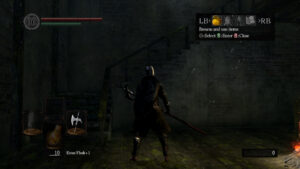
 The one really troublesome part of the UI is the menu that comes up when you press the “Start” button on the controller. This is how you access your inventory, so you bring it up whenever you want to change weapons or chug a potion that isn’t in your quick-select slot or something. And the inventory sub-menus are perfectly fine, just your standard equip-slots and scrolling lists, with a nice set of different information displays to toggle. But the parent menu is troublesome as a result of a combination of two things. First, it’s not a full-screen menu. The sub-menus are full-screen, but not the principal one, which sits up in the upper right of the game, not drawing attention to itself. Second, it doesn’t pause the game. In fact, you can still run around while it’s open — although you can’t do much of anything else, as all the button presses you’d use to perform attacks or interact with the environment are absorbed by the menu. The combination means that it’s way too easy to not notice that it’s still open. A noticeable fraction of my deaths in the game are caused by switching weapons in preparation for the next enemy (fast, unarmored zombies being better suited to a light, quick weapon, while zombies in full plate need something that can punch through it), only to discover too late that I only closed the equipment sub-menu and my attacks aren’t doing anything.
And look, I kind of get why they made it possible to run around with the menu open. This is a game with a multiplayer component, so you can’t just freeze the world. And since the controls for maneuvering around the menu are distinct from the controls for running, the decision to let you run away from stuff while the menu is open is, if questionable, at least understandable. But if you’re going to let me run around, you should really let me perform attacks as well. And contrapositively, if you’re going to lock away my attacks, I’d prefer that you just take away my movement, and in fact all of my in-world interaction. It’s the partial disabling that’s so confounding.
Anyway, I assume that all this has been hashed out online a thousand times already, but you wouldn’t be reading this blog if you didn’t like seeing decade-old games relitigated.
 Comments(0)