The Art of Demoniak
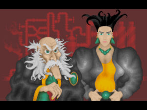
I’ve played Demoniak only a slight amount since yesterday, so I’m just going to take a moment to describe a very slight feature of the game: the graphics. This is fundamentally a text adventure, but it has occasional full-screen interstitial graphics, either character portraits or establishing shots of locations, displayed just long enough for you to press a key. I’m guessing they took a significant time to load on the original hardware. Also, there’s an intro with a certain amount of animation. In the PC version, the intro is actually a completely separate executable from the game proper; the official way to launch the whole thing, documented in the manual, is to run a .bat file that executes the intro and then the game.
 And the thing is, the pictures mainly serve to make the whole thing seem a little more amateurish. They’re the sort of illustrations that I can imagine thinking were the coolest thing you’d ever seen when your classmate in middle school draws them. Lots of squiggly spikes and lumpy gradients, relatively little thought to composition or readability. The irony is that this is the stuff that they had to use in all their promotional screenshots, even though it’s really not representative of the game’s content, because the alternative was to just show screenfuls of text, which would have turned people off even more.
 Comments(0)