Thimbleweed Park
I was a Kickstarter backer of Ron Gilbert and Gary Winnick’s retro point-and-click adventure Thimbleweed Park, and have my name in the in-game phone books to prove it. As such, I’ve had a copy since its release. I finished it just last night.
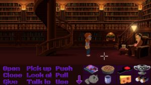
I feel like this may be the game that the people disappointed by Broken Age had been expecting. I mean, both games had more or less the same mandate: to revive old-fashioned point-and-click adventure games. But where Broken Age tried to reinvent the genre afresh for today’s world, with a unique style and a sleek modern UI, Thimbleweed goes flat-out for the nostalgia factor. It’s set in 1987 inside and out, storywise and stylistically. The art is pixely and proud of it — character dialogue even explicitly calls attention to it sometimes. The command interface is a throwback to early Lucasfilm games, with the bottom quarter of the screen devoted to a grid of verbs. It even takes the time to throw some barbs at Sierra adventure games, even though it’s been nearly twenty years since Sierra last made an adventure game.
The verb-selection interface, by the way, is almost unnecessary. Right-clicking on an object selects a default verb for that object, and that’s usually all you need. Offhand, I can think of one object in the whole game that can have multiple different verbs usefully applied to it. Verbs like “Push” and “Pull”, “Open” and “Close”, are only narrowly applicable and might as well be merged with “Use”, while “Give” might as well just be the result of applying an inventory item on another character. And yet all these verbs permanently occupy space on the screen. Even though I know from the kickstarter that this isn’t the case, it almost feels like the game content was originally designed for a more modern verbless point-and-click-adventure interface. But I guess that wouldn’t have felt retro enough.
Ron Gilbert has said that the design goal here was to make “the game you think you remember”: not exactly a recreation of the classic Lucasfilm games, but an imitation of what you imagine they were like when you think of them fondly. Thus, we have big chunky pixels, but the color resolution is high, and the game freely breaks the grid when it wants to do a screen-warp effect or scale a character down with distance. The game’s audio meets modern expectations instead of faking period instruments like the Ad Lib sound card or, worse, the PC Internal Speaker.
 The strange part is exactly what it’s imitating. Usually, things that look back fondly on the glory days of Lucasfilm Games focus on Secret of Monkey Island. And for good reason! But Thimbleweed Park is more focused on Maniac Mansion. And very blatantly so: all the characters are drawn in a MM-like big-head style, at least three characters from MM are significant NPCs, and the famous library scene, with Chuck the Plant and the out-of-order staircase, is reused here, albeit rendered in more detail. Most of all, though, it uses multiple playable characters in a very MM-like way. Unlike Broken Age or Day of the Tentacle, the playable characters are all in the same environment, and can largely do the same things, apart from a few special talents or limitations. While you’re piloting one around, the others just stand there waiting. This may be why later Lucasfilm adventures avoided putting multiple playable characters in the same place. It’s not very natural for a person to just be on standby like that. It is, however, conspicuously retro, so it fits right in here.
I’ll have more to say about the use of multiple characters in my next post, wherein I’ll talk about the story.
 Comments(0)