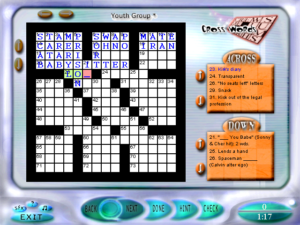
Games Interactive 2: Crosswords
 Like the first game, Games Interactive 2 divides its puzzles into categories. But this time it gives the categories in alphabetical order, so Crosswords come first.
The UI has changed in several ways. The clues are in a smaller font, so it can fit more of them on the screen at once, but it’s wasting even more screen space on headers and frames, so it’s basically a wash. The backspace key, which used to delete the previous letter in the word unless the cursor is on the last letter and the last letter is filled in, now behaves consistently: no matter where you are in the word, it deletes the letter under the cursor and then backs up if possible. This takes a while to get used to, because it’s not how backspace behaves in any other context I can think of. Clicking the grid to navigate, which always selected Across in preference to Down before, now alternates — if you had an Across clue selected, it selects a Down, and vice versa. (Clicking a square on your currently-selected word to switch to the word that crosses it is thus now just an application of the general rule, rather than a special-case behavior.) I thought this was weird at first, but I’ve come to appreciate how it fits a certain solving pattern, where you fill in a word and it gives you enough information to fill in a word that crosses it. But it doesn’t exactly fit the just as frequent pattern where you want to fill in several words that cross it. I still can’t help but feel that there’s a better way to handle this.
Anyway, it’s not all improvements. For one thing, it’s slower. I remember when I tried this game for the first time being disappointed that they hadn’t fixed the speed problems of the crosswords in the first Games Interactive, but now that I’m playing on a faster machine, I see they actually made it worse. When you select a word, it highlights it in the grid, one square at a time, a flashy little transition effect. For the longer words, the resulting delay, during which the UI is unresponsive, can be quite irksome. Another thing: Whenever you select a word, it moves the cursor to the beginning of that word, even if you clicked on the middle. This is something that the first game got right and GI2 gets wrong. And where the first game had some problems with navigating the grid with the arrow keys, this game solves them by scrapping that functionality entirely. You can only use the arrow keys to move the cursor within the current word.
I haven’t seen a whole lot of bugs within the grid data. There were a couple of cases where its notion of where a word ended was a few letters short of where it should have been, but that just meant I had to fill in the rest of the letters via cross clues. Instead, the chief problem this time is typos in the clues. Most commonly, there are a bunch of clues missing their first letters. This is fairly benign; when you see a clue like “ouis Quinze, e. g.”, you can tell what it’s supposed to be. But there are other places where typos just obscure the meaning. For example, “Cop cabana site” was a plausible enough construction that it wasn’t until I worked backward from the cross-letters that I realized it was missing an A.
 Comments(4)
What?! I just discovered these games were developed by WayForward? How on earth do you get from here to Shantae?
I know, right? Looks like the first Shantae game was released only two years after Games Interactive 2, too.
Must have been some kind of B team.
As for navigating around the grid, the New York Times crossword’s ios app handles it by maintaining the same direction as the clue you’re currently looking at, but it toggles if you click on the same square you’re already on or if you click on the clue itself. It seems to work reasonably well.